tekering
-
Posts
4265 -
Joined
-
Last visited
Content Type
Profiles
Forums
Events
Gallery
Everything posted by tekering
-
Maj. Pain Gen. Admission Prv. Plane
-
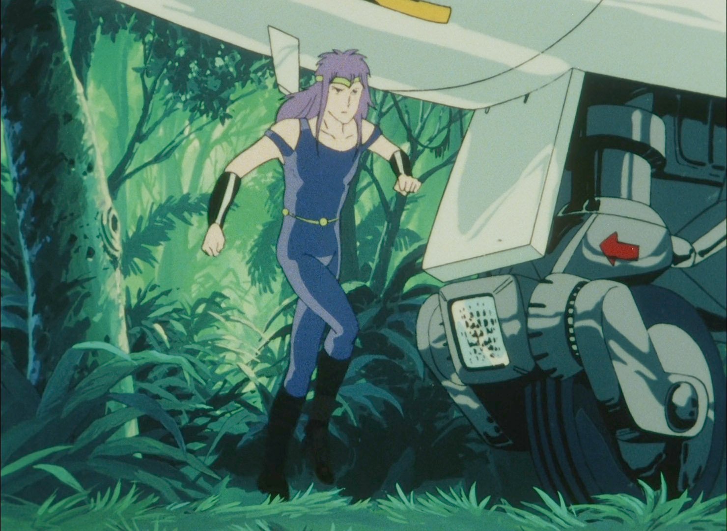
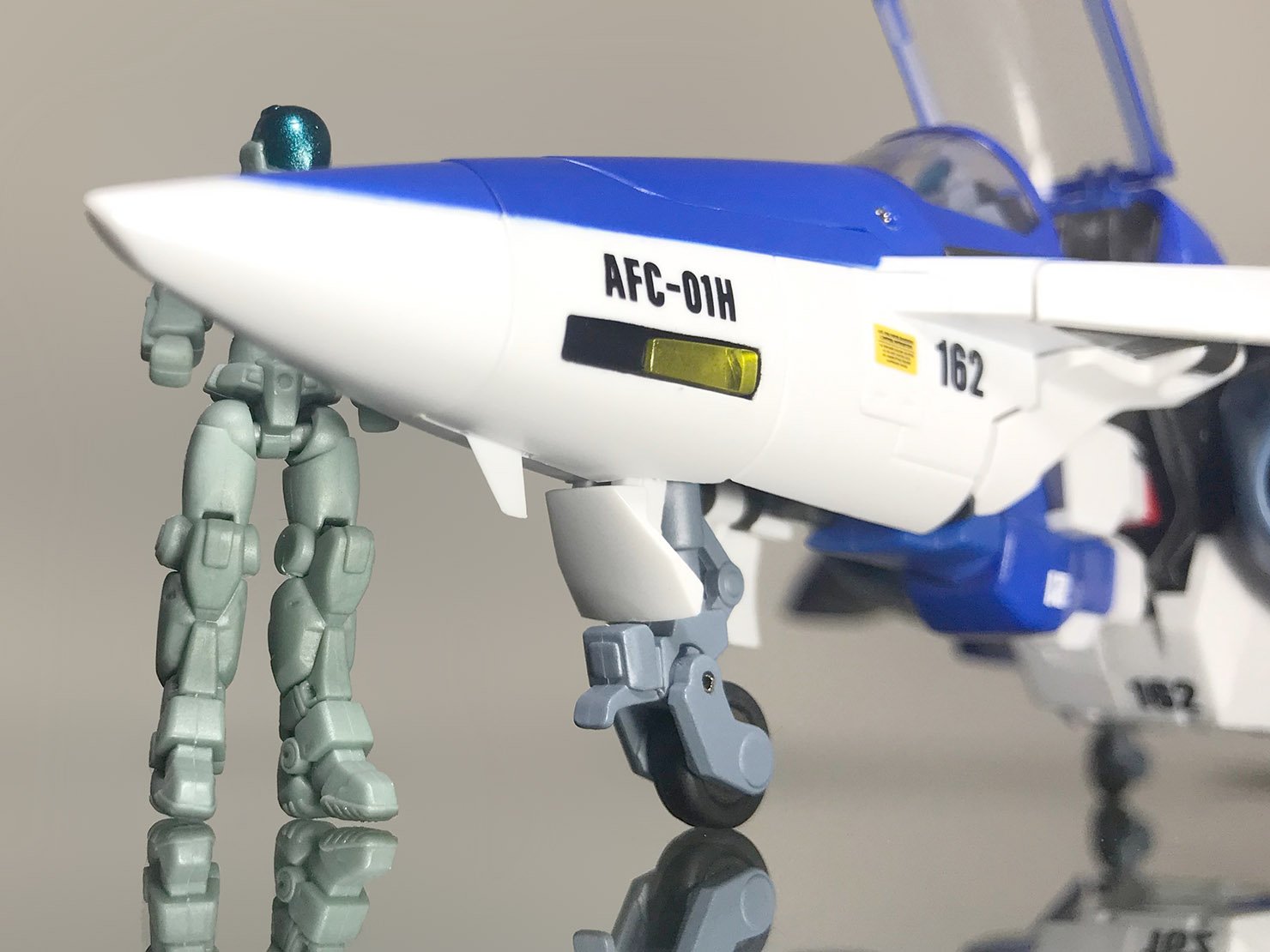
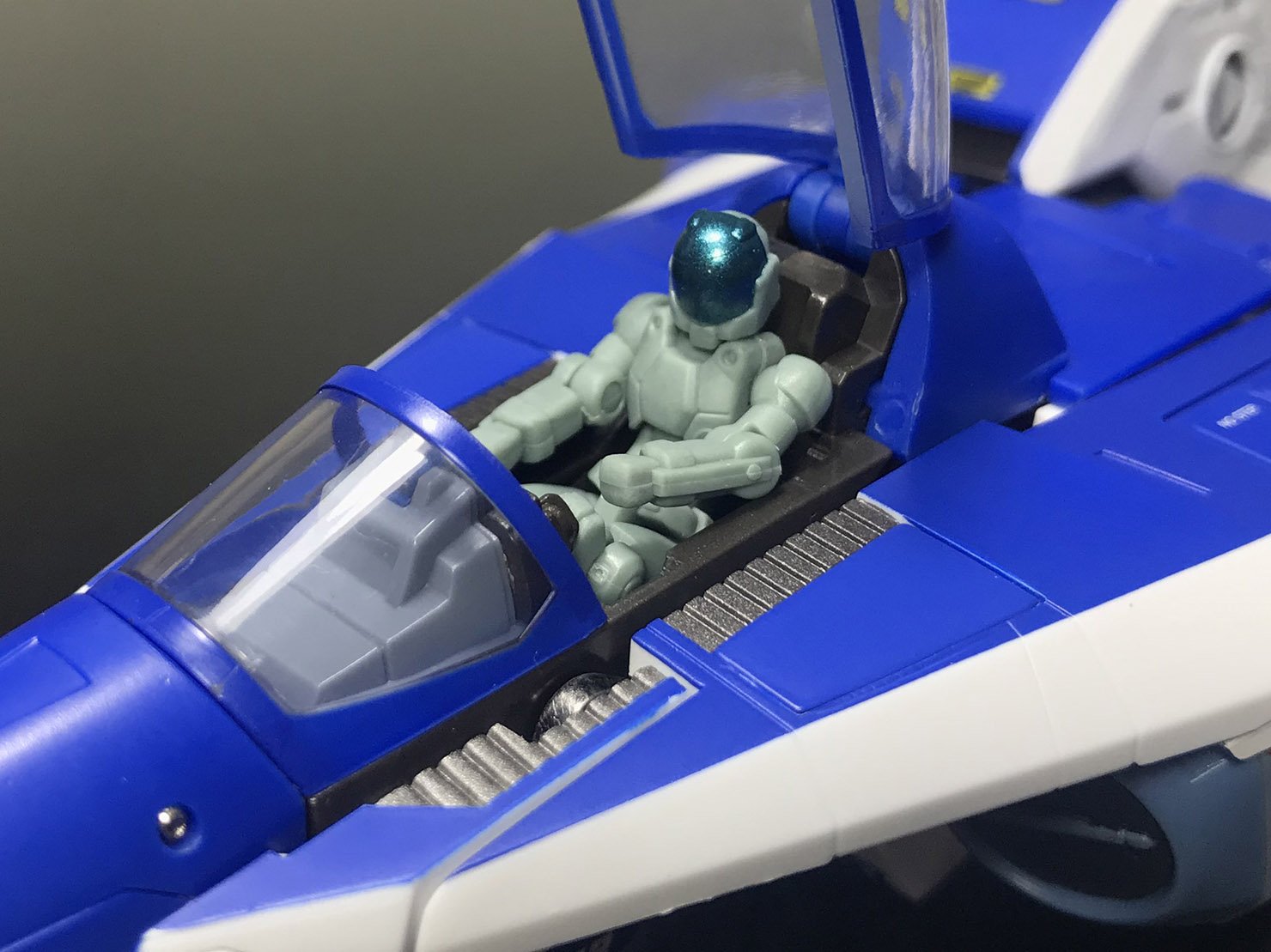
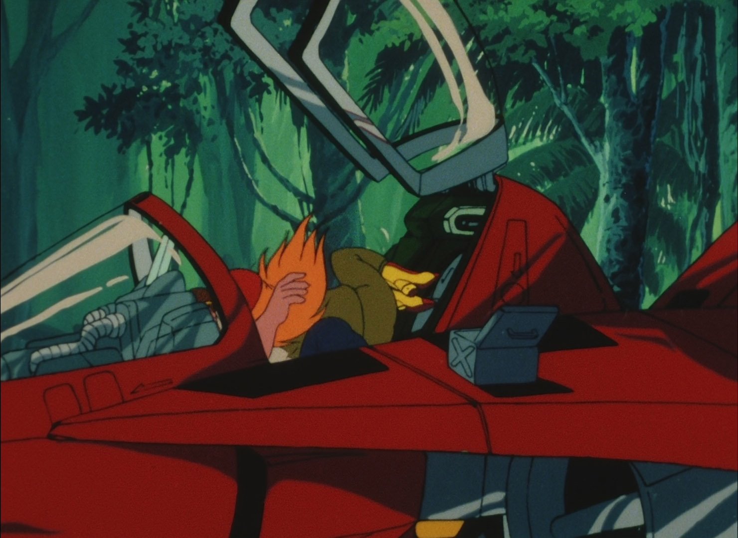
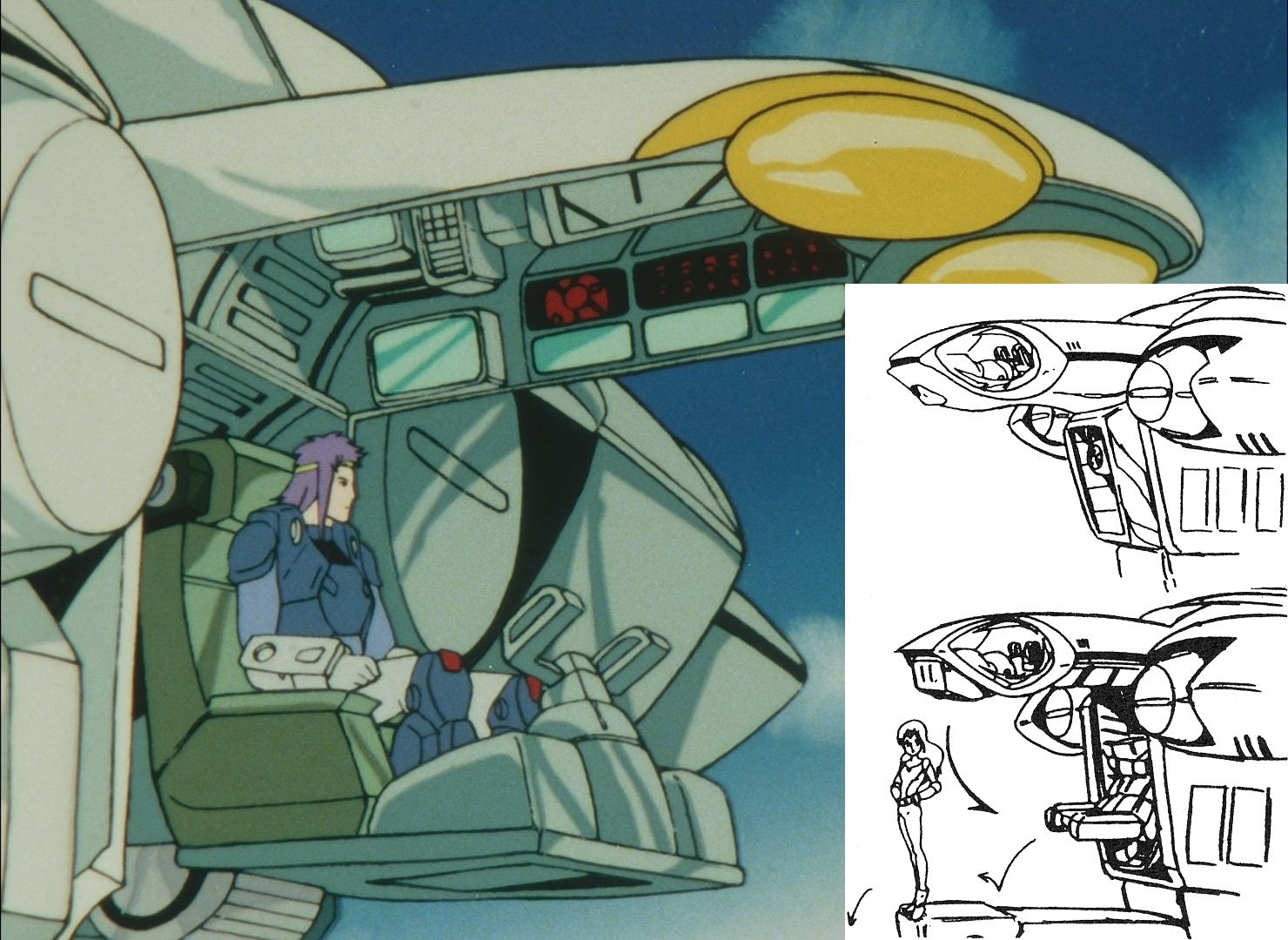
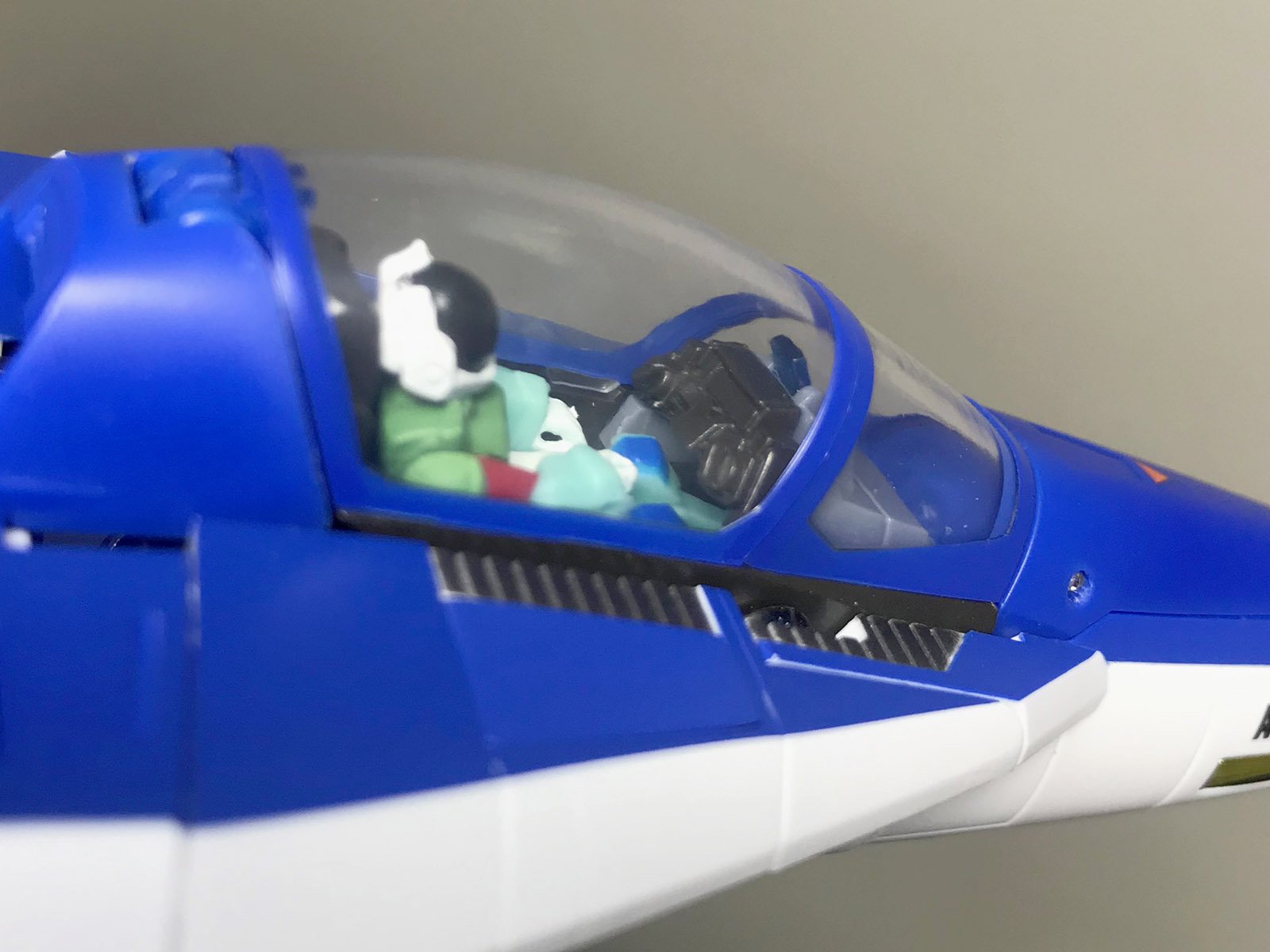
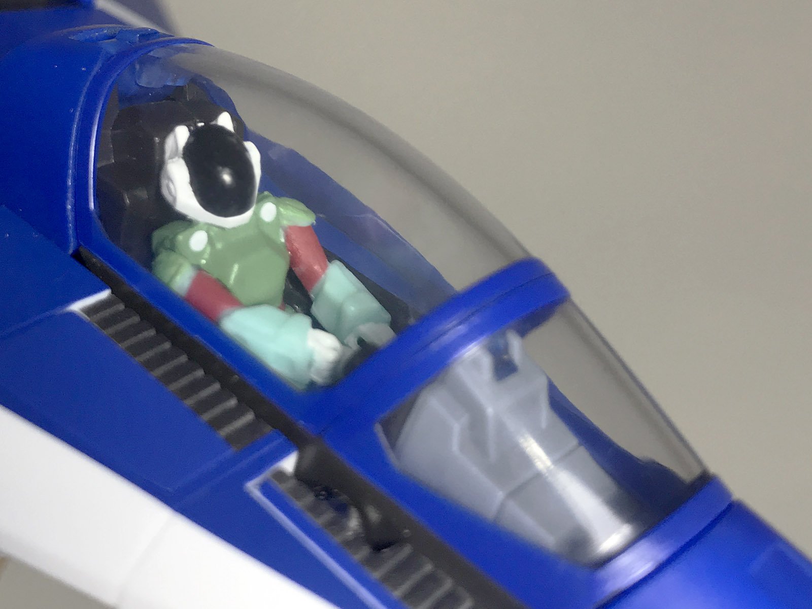
Yes, that's correct. Yes, that's correct. Although, just to clarify for fans that don't actually watch the show (like @jenius), my issue isn't with Sentinel's Legioss; it's with those nonsensical "official" measurements, that are inconsistent with both practical real-world physics and the animation itself. See Yellow run under the Legioss nosecone... without even needing to duck: Most manufacturers (including our own Captain America) have taken steps to rectify these inconsistencies, which is why pilot sizes vary so wildly from one company's products to the next... and by giving us a perfectly-scaled 1:48 Stig Bernard pilot who barely fits into his Legioss cockpit, Sentinel has produced a mecha that would be impossible for a tall pilot like Yellow to fly (much less Jim "Lunk" Cooper). Jim and Mint fit into that cockpit, but neither would fit in this one: If Sentinel does end up producing a Tread, mark my words, it's gonna have a much smaller pilot figure... or a disproportionally large cockpit module. Note how the animation itself features a pratically-scaled Yellow, whereas the animation model sheet depicts an impossibly large Houquet.
-
A properly-scaled pilot makes a big difference, too... ...especially when it comes pre-painted.
-

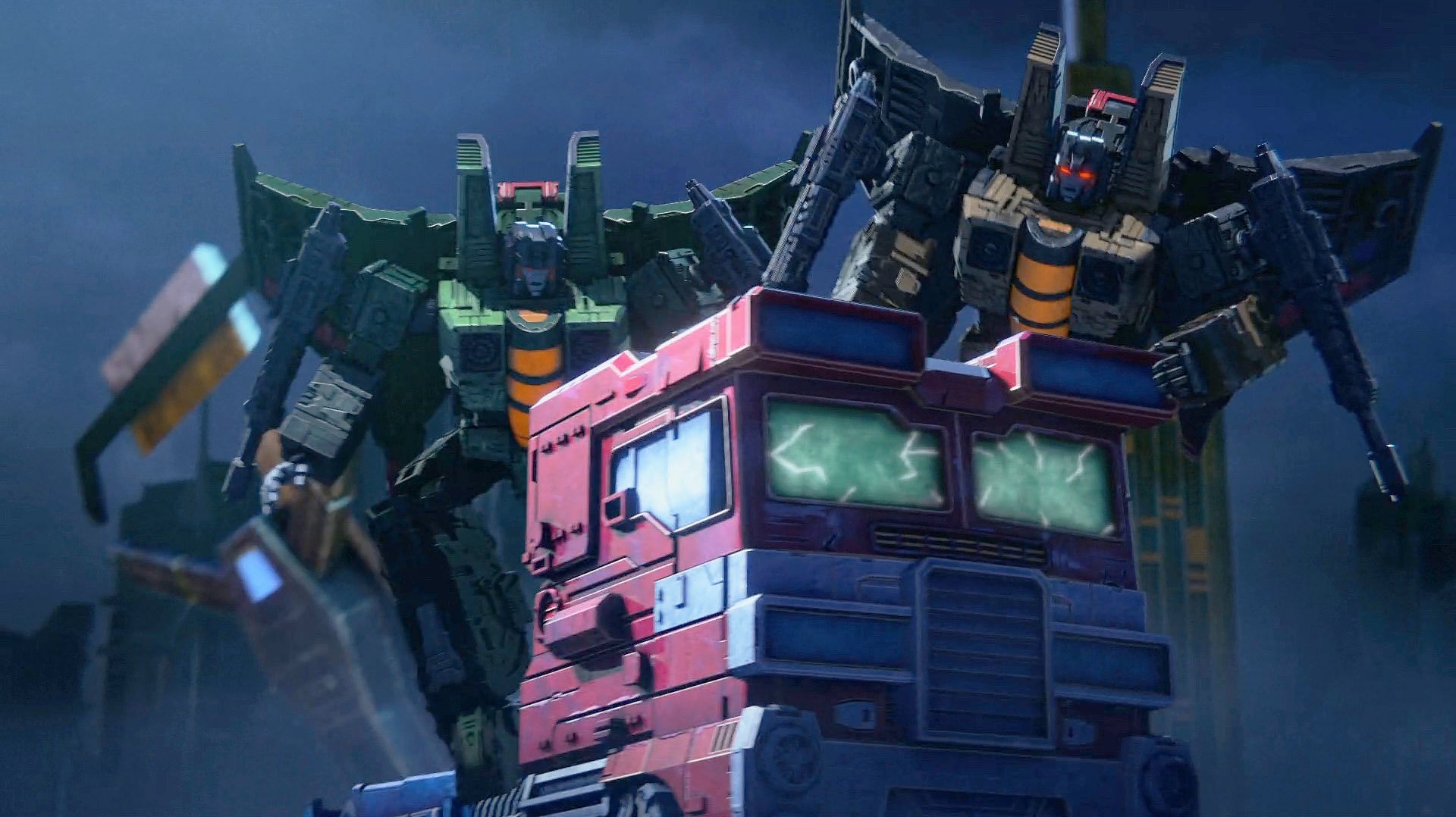
[Netflix] Transformers: War For Cybertron Trilogy: Siege
tekering replied to Old_Nash's topic in Anime or Science Fiction
Honestly, Bumblebee is a much better movie. In terms of structure, characterization, plot and dialogue -- everything a functional story relies on -- Michael Bay's films aren't any better than The Transformers: The Movie, but Travis Knight has proven he knows how to construct a cohesive narrative. The '86 film has some great vocal performances, and a driving soundtrack, but it's virtually incomprehensible without prior familiarity with the TV series (despite how inconsistent with the TV show it really is)... and the plot is a disjointed mess, to put it mildly. Without the benefit of nostalgia glasses, it would be difficult to appreciate as an adult. Oh, and I agree both Animated and Prime are superior to Sunbow's original series, both in writing and execution. -
New 1/350 MOSPEADA Garfish Project?
tekering replied to captain america's topic in Anime or Science Fiction
You know I'm down! -
[Netflix] Transformers: War For Cybertron Trilogy: Siege
tekering replied to Old_Nash's topic in Anime or Science Fiction
Not at all! Filoni and Favreau kept Hasbro in the dark about "the child" until The Mandalorian was released. Lucasfilm was more concerned with spoilers than merchandising sales, bless their hearts... To Hasbro's credit, they've gotten the Baby Yoda merch out pretty quickly (especially compared to other Star Wars licensees equally blindsided by the premiere). However, now that Siege is finally streaming, anyone looking to pick up the toys the show was explicitly designed to advertise will find they've long since been phased out: Studio Scale, Cyberverse, even Movie Masterpiece figures are easier to find than Siege products.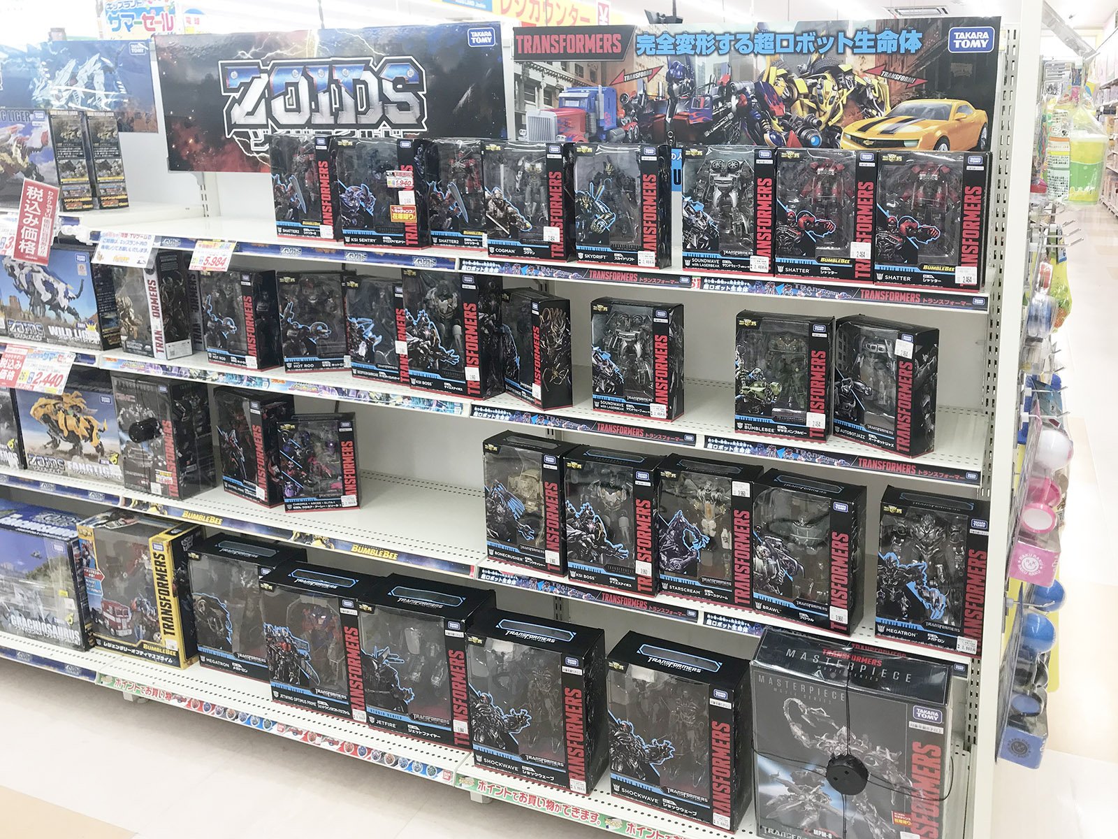
-
[Netflix] Transformers: War For Cybertron Trilogy: Siege
tekering replied to Old_Nash's topic in Anime or Science Fiction
Watch Bumblebee. The opening sequence on Cybertron looks like a photo-realistic version of Siege, but with much more dynamic action... and far better voice acting. And Ultra Magnus, even more so... as if approaching the Decepticons with his face obscured by a hood did anything to hide his distinctive shoulder pylons...! Just a word of warning, then: As a post-war Transformers story set on a starship in deep space, More Than Meets the Eye features almost no transformations whatsoever. They've been pretty on-the-ball when it comes to Star Wars and MCU releases (as opposed to Bandai, MAFEX or Hot Toys)... but Transformers seems to be their Achilles' heel. -
[Netflix] Transformers: War For Cybertron Trilogy: Siege
tekering replied to Old_Nash's topic in Anime or Science Fiction
More Than Meets the Eye, by James Roberts. Nothing else in Transformers fiction will ever compare (except perhaps Roberts' debut mini-series, Last Stand of the Wreckers). -
[Netflix] Transformers: War For Cybertron Trilogy: Siege
tekering replied to Old_Nash's topic in Anime or Science Fiction
So, it turns out those rather amateurish voice actors were all non-union; Netflix didn't want to pay out for the real voice talent, despite their enthusiasm for the roles. -
Fantastic interview! Thanks for sharing.
-
1/48+fp's, 1/60+fp's, 1/72, 1/2k, 1/3k,1/100 and now 1/144
tekering replied to VF-18S Hornet's topic in Toys
I hesitate to do the same to mine, knowing its aftermarket value... but damn, you really demonstrate the potential there! You could probably turn around and sell it for a lot more, too. -
Nor was I, until I transformed mine for the first time... That's precisely why I love it.
- 1113 replies
-
- 1
-

-
- vf-4 lightning iii
- arcadia
- (and 5 more)
-
Still way more than I'd pay. They sell for about ¥4000 on Yahoo! Japan auctions, as this completed auctions search will demonstrate.
-
I managed to track them all down on the secondary market, mostly near their original retail prices... sometimes less than that, even. The only pricey ones are Jeanne and Lana.
-
Arcadia's only asking ¥5500 extra for the premium finish... Seems like a no-brainer to me. Ah, but how much longer is it when engaged in diplomacy?
- 1113 replies
-
- 1
-
-
- vf-4 lightning iii
- arcadia
- (and 5 more)
-
[Netflix] Transformers: War For Cybertron Trilogy: Siege
tekering replied to Old_Nash's topic in Anime or Science Fiction
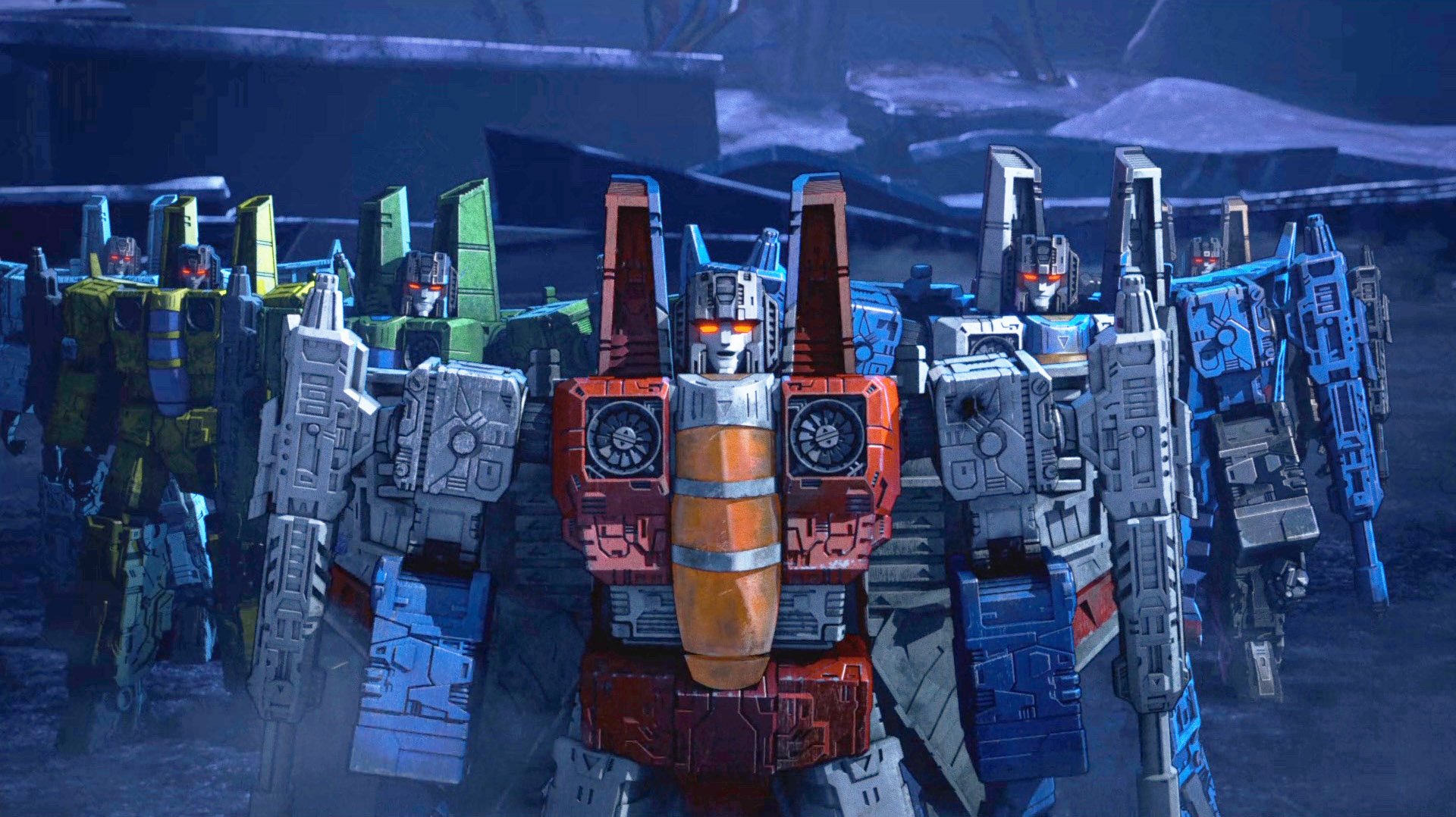
Well, I see more muted colors with a lot more detailing and color separation in Siege. That's perhaps the most egregious error, as it was with the Prime Wars cartoons... As toy commercials go, their timing is atrociously bad.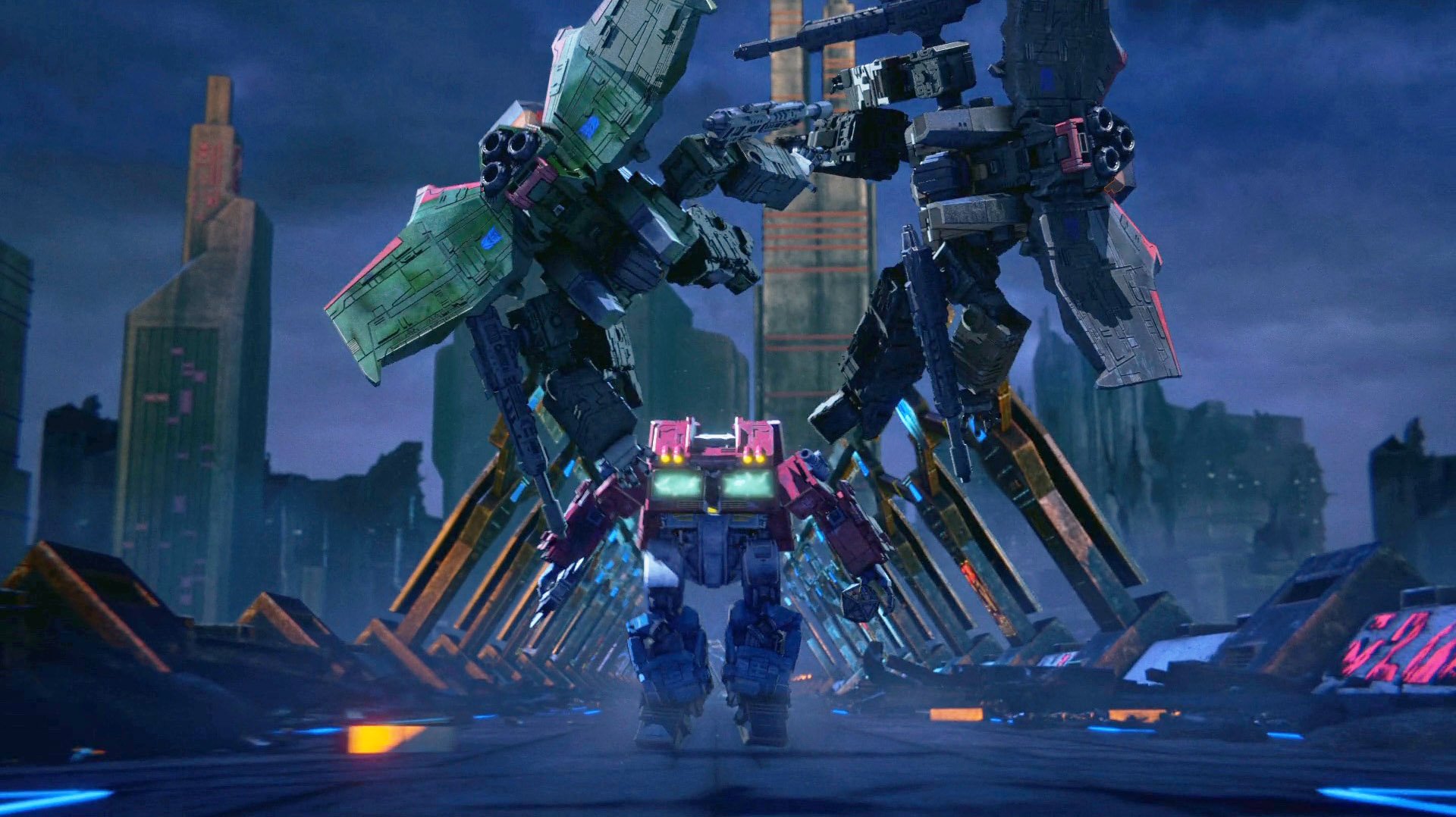
-
Quite the opposite! Since the relatively higher gravity on Glorie exacerbates the problem, young women are fast-tracked into military and civil service at an early age, and quickly retired before the onset of menopause. That's why Lana occupies such a high-ranking position within the military police, even though she's still a teenager... ...and hell, Jeanne's not even old enough to have graduated high school, but she's already an ATAC squad leader. By anime standards, of course, this doesn't even bat an eyelash.
-
Removable chest plates are standard issue in the Grorie Miritally Police. Bras are not.
-
[Netflix] Transformers: War For Cybertron Trilogy: Siege
tekering replied to Old_Nash's topic in Anime or Science Fiction
I only bought the ones available at MSRP, "Sheige Star Screen," "Sander Lacquer," and "Warfork Cybertron Hot Link." I'm tempted by Redwing, but I can't find him under ¥6000... ...and Siege Skywarp was apparently some impossible-to-obtain US exclusive... ...and I wouldn't be caught dead with that ugly "Seeker Ion Storm" set. I have CHMS knock-offs that look more legitimate than that crap. I actually laughed out loud when the Autobots starting sprinting from Megatron and the seekers, and the Decepticons gave chase on foot...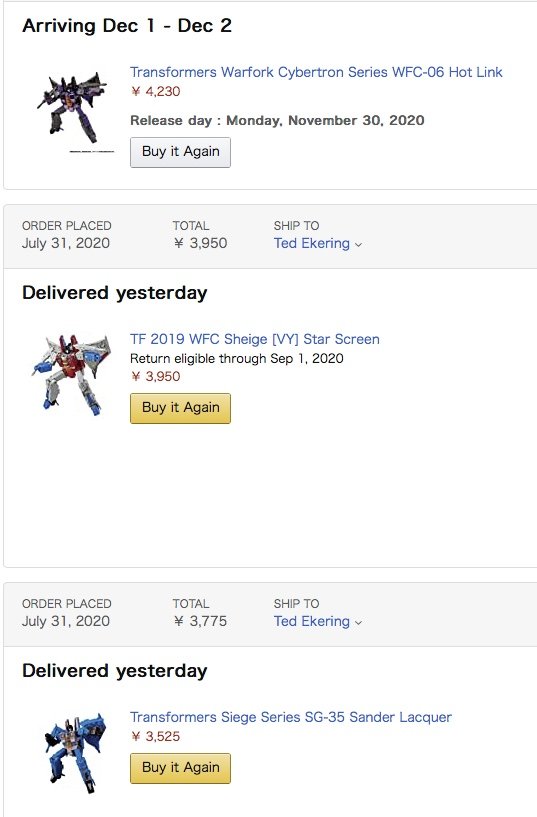
-
That's a good idea. I have thousands of images on my hard drive, but only a YouTube video online... I doubt your wife would appreciate my greatness any more than my wife does.
-
Your most recent Macross or toy purchase! General thread.
tekering replied to Gakken85's topic in Hall Of The Super Topics
You can have this one, buddy. I've got more exciting new toys to play with...
-
[Netflix] Transformers: War For Cybertron Trilogy: Siege
tekering replied to Old_Nash's topic in Anime or Science Fiction
That's a great deal on Gabe! More than can be said for most Transformers fiction, sad to say. I think you meant unremarkable. Most of the voices were so indistinct as to be interchangeable. What really elevated the experience for me, though, was seeing so many onscreen characters depicted almost exactly as their toys look. It was so satisfying that I bought a bunch more figures I hadn't been interested in before... Unfortunately, the characters that hadn't already been designed as toys (Bumblebee, Elita-1, Arcee) will end up looking quite different as action figures.
-
Your most recent Macross or toy purchase! General thread.
tekering replied to Gakken85's topic in Hall Of The Super Topics
That's for sure... but only Banpresto made Roy's VF-1A!
-
Sacrilege! Whether it's been said or not, it's wrong. Mikimoto is credited as "guest character designer," for EVE (and they did a wonderful evoking his unique style in her depiction), but the other characters are the work of Toshihiro Hirano, famous for the Iczer-One and Dangaioh series. His girls are way sexier than Mikimoto's.
-
I don't have to guess. Sorry, no DX VF-1 news today!