Mercurial Morpheus
-
Posts
1623 -
Joined
-
Last visited
Content Type
Profiles
Forums
Events
Gallery
Everything posted by Mercurial Morpheus
-
Macross Δ (Delta) - Mission 11 - READ 1st POST
Mercurial Morpheus replied to azrael's topic in Movies and TV Series
I actually thought that was the case too before they started mentioning logs. XD Bad use of a reflective surface. -
Macross Δ (Delta) - Mission 10 - READ 1st POST
Mercurial Morpheus replied to azrael's topic in Movies and TV Series
After fighting it, I finally post here about Delta after years of PFTSSD - Posting about Frontier Shipping Stress Disorder! Mercurial is back and likely not missed. XD I enjoyed this one a lot. I liked the bit of world building with the festival and the infighting on Windamere. Even though there were death flags UP THE YING YANG, manly tears were still shed, Mikumo continues to be an enigma, wrapped in a puzzle, wrapped in a hair bun. Hopefully it pays off, Really like the Protoculture angle. Once again we are teased with the promise of long standing answers we all know will be flat out ignored or merely built on for years to come. And yes, everyone loves Kaname, The show's starting to take itself more seriously, which could be good or bad, as I actually liked how it kind of embraced it's own silliness a bit, Still, at least it's not forcing a triangle much yet. -
Hasegawa announces a TV SDF-1 and a Super Messiah!
Mercurial Morpheus replied to cool8or's topic in Model kits
I was thinking of picking this up for Xmas since I'd love a TV Macross, though all the talk of the inaccuracies trouble me. It still worth getting, or is it better to just settle for the DYRL version or soemthing else entirely? -
Would definitely love to go, but so many variables to work out in little time (timeoff, transportation, etc.) Getting down there being a big one.
-
He was a guest at the parent French convention. Checkmate likely visited the wrong website. Did this ever get off the ground? I've totally missed this.
-
I got it for 12 bucks at a swap meet. The face sculpt is actually quite nice in person and matches the source art quite well and the rest of the sculpt is amazing considering the price of admission. Easily one of the nicest cheapo figures I have. No where near this one of course, but you get more than what you paid for. I'm still surprised GSC's first Sheryl is a rethread of someone else's prize figure. I do agree it would be nice to see some more non-stage versions of Sheryl. It'd also be nice to have some other characters like Grace and Cathy, but yeah right. I think I'll pass on the Nendo, but then I always do. Never quite got their appeal, especially at their price range at cons. Chibi part swapper, whoopdedoo.
-
Can't afford her at the moment, and I need another Sheryl like a hole in the head (even have the other figure in that same pose), and yet I want her so bad. It's just too damn perfect, and I love the one I have.
-
R.I.P. Toren Smith (1960-2013)
Mercurial Morpheus replied to areaseven's topic in Anime or Science Fiction
Sorry to hear it. As the huge Gunbuster fan I am, it would be odd of me not to pay respects to a character's namesake. The industry has lost another of it's founders, and is lesser for it. -
I know a video showing this was poisted but here's some new pictures. http://myfigurecollection.net/item/144293 As I said there, She looks fantastic, though it's odd that they'd base another figure on the same drawing as another companies previous figure. That and we need more high end Sheryl Nome figures like a hole in the head. Especially if they're just redoing poses. I do like her a lot though with that base and face sculpt (which matches the poster art and actually improves on it, which is great seeing as I never liked that poster much), but I do already have the current Banpresto, which actually looks a lot better in person than the pics suggest and matches the art quite well for it's quality. I seem to be drawn to the Universal Bunny stuff they won't cease with. Maybe it's due to being an awesome song and movie Sheryl related, What are the best Rankas to track down? I know there's a few Megahouse ones and maybe some Ichiban Kuji's that are worthwhile. I really need to add some to the collection. Still, nice to see someone else make Macross figures.
-
I though she was supposed to be the flower girl, but this makes a bit more sense given previous swaps. Works a bit better than Minmay as Sheryl too. Yay, another Sheryl. Not like we needed a Misa, or Milia, or Myung, or even Klan or anything.... Nope definitely need yet another Sheryl. I'm guessing Sara as well for the reasons Phalanix mentioned. Or maybe she'll be the flower girl. Then she can be her own fan!
-
This day keeps getting weirder and weirder. Who?
-
Nice work, kanedaestes! Definitely looks better than the last build I've seen (that like to show off the separation). I know if i get it I'll be omitting most of those decals though. Way too cluttered.
-
I'd like to see confirmation on this as well. Just seems really odd having him helm both Star Trek and Star Wars. It basically gives him a monopoly on science fiction these days. Though if it means him leaving Star Trek alone, I may be for it. Seeing as it was more like Star Wars than Trek anyway, this seems a logical if boring choice.
-
Flashback 2012 Megaroad 01 Poster Recreation
Mercurial Morpheus replied to Mercurial Morpheus's topic in Fan Works
Ok, I'll zip them and add it to the post when I get back. -
-
-
(Mercurial Morpheus) Megaroad 01 Flashback 2012 Launch Poster
Mercurial Morpheus posted a gallery image in Macross Fan Art
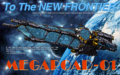
From the album: Untitled Album
-
Flashback 2012 Megaroad 01 Poster Recreation
Mercurial Morpheus replied to Mercurial Morpheus's topic in Fan Works
Hmm. same here. It's possible the fourm is scaling them down. Never uploaded something this big before. I'll look into it. -
Flashback 2012 Megaroad 01 Poster Recreation
Mercurial Morpheus replied to Mercurial Morpheus's topic in Fan Works
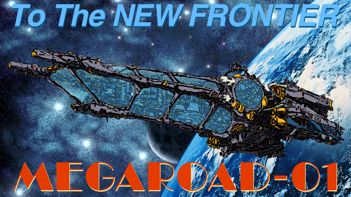
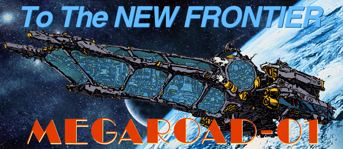
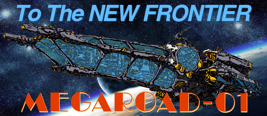
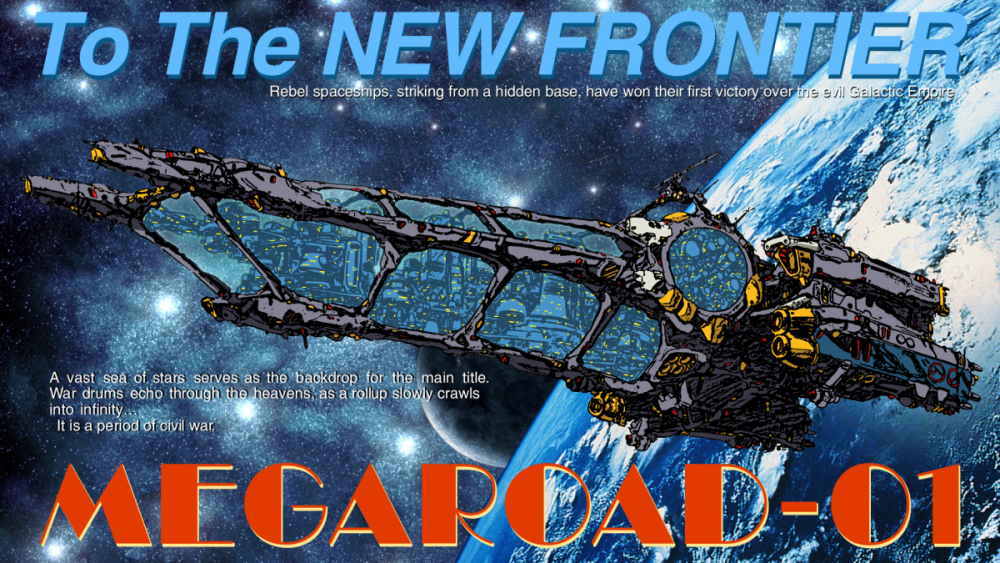
Thanks to Mr. March, I recreated it as a wallpaper. Here it is in 1920x1200 16:10 format (my native) and 1920x1080 16:9 format. I trust no one needs a 4:3? While the image he provided would allow for even bigger wallpapers, Piecing the starfield back together for the bigger size proved a bit of a challenge and the moon has been scaled up a bit. The images were oversized for the original project thankfully, which is way this is even possible. I don't really want to scale things up too much, and replacing them outright drastically alters the look. No one actually needs something bigger, right? I know how massive some screens are now. The bottom text is also placed under the Megaroad instead of through it on the original to balance the added space. This is actually pretty much the first wallpaper I've ever created. Still thinking of colorizing the city. I've made versions with and without the obvious Star Wars references. 16:10 16:9 Actual size zip file. The 16:10 is slightly edited while I was at it. Apparently, we can't upload 7zip files. Megaroad.zip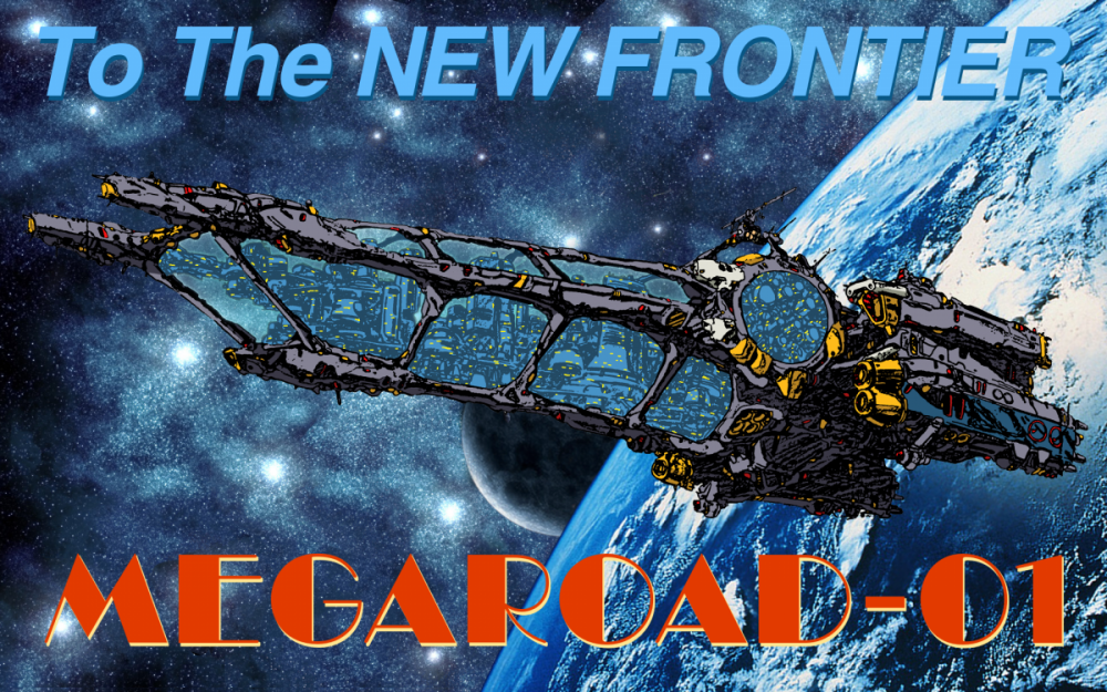


-
Flashback 2012 Megaroad 01 Poster Recreation
Mercurial Morpheus replied to Mercurial Morpheus's topic in Fan Works
What i did in the GIMP was different but just as simple. Basically I area selected the glass area (the lines are thick enough that this works well) and then erased with the eraser tools opacity lowered. No worries about erasing the city. Should have known it was more Star Wars. Thanks Reivaj! Final version with full text: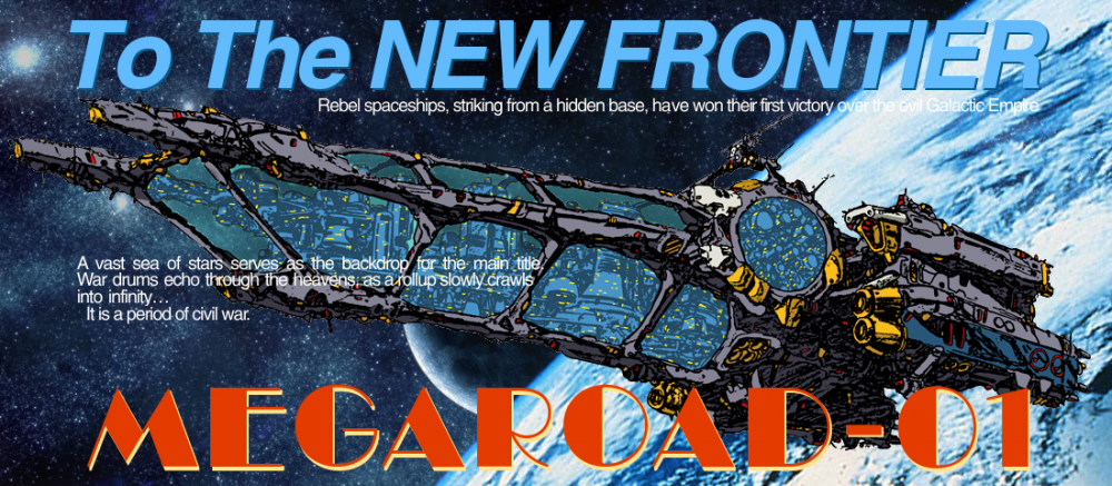
-
Flashback 2012 Megaroad 01 Poster Recreation
Mercurial Morpheus replied to Mercurial Morpheus's topic in Fan Works
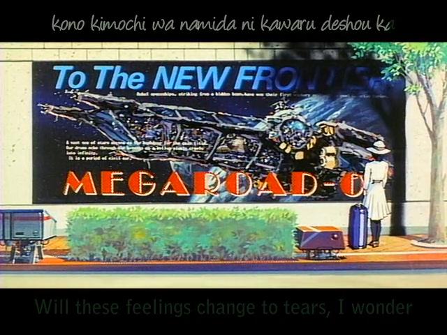
That turned out to be pretty simply to do, but i agree it really helps blend her in. Send it my way. I'll see if maybe I can make a wallpaper or something out of it. No promises though. ^_- I sort of debating whether to colorize the city to match the image too. Most of the rips out there are so blurred and oversaturated that it's hard to make out. The top one's easy. the bottom is harder. Something like: "I want one of stars -------- as ---- ----- ----- ------- ----- -------- Our drums (dreams?) echo through the ------ ------- as a ---------- -------- -------- into infinity It is a period of civil war. It's not uncommon for older animes to use such dialog for filler since they figure no one can read it anyway. I can recognize the Star Wars easily. Any guesses as to the rest? It's probably from a novel or song or something. -
Seeing as it's the end of 2012, I wanted a Megaroad cover on my Facebook. Going through what was on Google, I happened to find a nice lineart version of the ship and decided to use it to recreate the poster instead of using the low quality screencaps for the fun of it. The whole thing is comprised of web found images (the starfield and earth being three separate images). I tried to get it as close as possible without going crazy over minutia. Thought I'd share it here for anyone interested. I'm no master photo editor, but I've made a few sigs from time to time. The fonts are as close as I could find. The bottom white text is missing since I just can't make out what most of it says (outside of the last line, being another bit taken from the crawl of Star Wars). If anyone can clear that up, I'd be most appreciative. Here's one without the obvious Star Wars reference: .mkv_snapshot_26.17_[2012.12.31_01.55.53] V2.png] Here's one using the original Earth I started with. I replaced it with the current since it's closer to what is in the film. The original .mkv_snapshot_26.17_[2012.12.31_01.55.53].jpg]


-
M7 BD: The changing face of Mylene
Mercurial Morpheus replied to Renato's topic in Movies and TV Series
Reading this naturally forced me to pull my copy of Innocence out to look. This is a bit more than a retouch. The eyes are completely redone and the mouth is slightly different. Her ear also appears to be smaller and less visible, and her cleavage is gone. The effects are also completely redone vs the original and the Innocence version as a blur frame effect added. So this is effectively a third version, not a tweaked second. Personally, I like this one best, but the original is definitely the most distinct.
-
Never odd of them messing with a paint scheme. Reminds me to go over the fixes I'll need to apply when I get around to painting my Qubeley (like the correct purple, not pink funnels and possibly painting the grey footpads pink). Nothing the application of paint can't fix at least. The equally mind boggling Nu "Destroy Mode" on the other hand....
-
Star Trek Into Darkness, in theaters May 17, 2013
Mercurial Morpheus replied to UN Spacy's topic in Anime or Science Fiction
Looks like Gary Mitchell to me. Preferable to Khan, but not sure how I feel about the rest of it. -
Definitely not liking the retcon armor separation on the Nu. It's not the Unicorn dammit, and it doesn't need such an inaccurate gimmick. It's one thing to sharpen the edges and up the panel lining like he usually does as long it still looks right, but it's another to add a feature that doesn't even belong to the suit. The psychoframe does give off a glow at the end, but nothing like this. Kills some of my enthusiasm for it which had gone up when the finished product started to look a lot more CCA than the early prototypes, which were an over detailed and edged mess, suggested. Thankfully it looks like it hides well. Is it too much to ask for a nice kit that actually looks like what's in the show? Wouldn't bug me so much if the previous kit weren't so old and have so many naysayings or if Nu wasn't my favorite and I sorely need a good kit of her.