Anubis Posted June 10, 2004 Share Posted June 10, 2004 Damn, DA. #1 looks great. Link to comment Share on other sites More sharing options...
Cdr Fokker Posted June 10, 2004 Share Posted June 10, 2004 The M+ box is going to kick so much ass. ... I think that about sums it up. Link to comment Share on other sites More sharing options...
vibayo Posted June 10, 2004 Share Posted June 10, 2004 (edited) Well,it seems that my idea is not going to be continued(Anubis,the background i wanted to be removed,was the one on sharon pic,replacing it with black to match the color in the space below and right of the YF-19 and YF-21),so let's help this design. I think that the spine color should be changed to its original color and then darken it a little to match the dark style of the box(the city) and perhaps the characters with the ghost plane in black and white could be overlayed at the bottom of the city image.In the lineart,tou could scan batroid and gerwalk modes of each one anf put them in the corners and of course isamu and guld side to side with their planes The box the image that has to be overlayed into the bottom of the spine,putting the spine in its original color and the make it darker (the third one from left to right and perhaps changing its color to something darker) Guld (smaller and cut out of this image)and then put him in the right bottom part of the YF-21 image Isamu(smaller and cut out of this image) and then put him in the left bottom part of the YF-19 image And the schemes of batroid and gerwalk extracted from mechanics design works( a book that all of us have and if not,then i will scan some images from mine) Sorry for not making a mock up,but i don't have the skills and i'm out of home,so i don't have photoshop and i don't know why,but paint is not allowing me to open the jpg images(extrange thing) Edited June 10, 2004 by vibayo Link to comment Share on other sites More sharing options...
Anubis Posted June 10, 2004 Share Posted June 10, 2004 (edited) I can see adding a battroid or a pilot in the corner of each side to see how it looks. Adding too much may detract, but there's always room for experimentation. There does need to be some room for the MW logos. I have to bring the M+ Game book to work tomorrow to scan some lineart pics. The Game Book has the right lineart pics to try out. As for the big fighters, I like the detail that's in those pics, it even goes into wing sweep/morph areas, and everything. Realy nice, makes it look really...technical. Now, should we keep the text, or remove it so there's more room to add something? Taking it out would make it too simplish I think. There's room to add a small pilot and/or battroid to try out, including the pilots in the int. covers, so no need to extract anything. Also, I can scan a Ghost to go under the logo on top, think that's a good idea, or leave the top alone still? Edited June 10, 2004 by Anubis Link to comment Share on other sites More sharing options...
MrDisco Posted June 10, 2004 Share Posted June 10, 2004 (edited) the round 'eye' will make it seem like its a box set for 2001, 2010. i would also have to pass on the box if it goes greyscale. if we go with the blue lineart (which i think could work quite well if we pick the right shade of blue; the 1colour layer DA posted seems quite spiffy) how will this affect the silver or gold base layer that Paul was mentioning? also with the blue lineart it will match even more with the blue sky on the spine. i am not in favour of cuting/pasting pics. if we go with the lineart lets stick with that as a single image with the text. Edited June 10, 2004 by MrDisco Link to comment Share on other sites More sharing options...
Anubis Posted June 10, 2004 Share Posted June 10, 2004 the round 'eye' will make it seem like its a box set for 2001, 2010. i would also have to pass on the box if it goes greyscale.if we go with the blue lineart (which i think could work quite well if we pick the right shade of blue; the 1colour layer DA posted seems quite spiffy) how will this affect the silver or gold base layer that Paul was mentioning? also with the blue lineart it will match even more with the blue sky on the spine. i am not in favour of cuting/pasting pics. if we go with the lineart lets stick with that as a single image with the text. If we use the blue lineart there's no worry about the greyscale or it being an engraved box. That's what Paul was talking about. Just Black with the white lineart would have been an engraved panel. Using the blue it will be able to stay a full color box. Link to comment Share on other sites More sharing options...
Anubis Posted June 10, 2004 Share Posted June 10, 2004 (edited) Here's another Macross City to match the current spine size of the mock-ups. Unstretched. Edited June 10, 2004 by Anubis Link to comment Share on other sites More sharing options...
Anubis Posted June 10, 2004 Share Posted June 10, 2004 (edited) Lineartbox1 Edited June 10, 2004 by Anubis Link to comment Share on other sites More sharing options...
Anubis Posted June 10, 2004 Share Posted June 10, 2004 lineartbox2. Not bad with the little add-ons. Link to comment Share on other sites More sharing options...
MrDisco Posted June 10, 2004 Share Posted June 10, 2004 linearartbox+dessert Link to comment Share on other sites More sharing options...
Anubis Posted June 10, 2004 Share Posted June 10, 2004 (edited) lineartbox3. I still like the desert image on the spine the best as well. The Macross City one has potential as well, but it's not quite as lively. Edit: Also moved the"YF-21" title over to make it symmetrical. The bars should probably wrap all the way around until they meet the edge of the spine image. Edited June 10, 2004 by Anubis Link to comment Share on other sites More sharing options...
BoBe-Patt Posted June 10, 2004 Share Posted June 10, 2004 hmmm. I don't know, the spine art just dosn't match the rest for me. How about a picture of sharon apple with a black background? Either the female version of sharon or the robot box would be cool. Link to comment Share on other sites More sharing options...
Cdr Fokker Posted June 10, 2004 Share Posted June 10, 2004 hmmm. I don't know, the spine art just dosn't match the rest for me. How about a picture of sharon apple with a black background? Either the female version of sharon or the robot box would be cool. Yeah, a pic of Sharon would probably work well, with a black BG too. Otherwise, I think the desert is the way to go. Link to comment Share on other sites More sharing options...
Anubis Posted June 10, 2004 Share Posted June 10, 2004 (edited) Here's the updated box with the Sharon Spine. Version 4. The red doesn't really go well I think now, but maybe convert her red to blue to match the sides? That may look pretty sharp. Edited June 10, 2004 by Anubis Link to comment Share on other sites More sharing options...
Anubis Posted June 10, 2004 Share Posted June 10, 2004 (edited) Maybe something like this with Sharon, only blue? Edited June 10, 2004 by Anubis Link to comment Share on other sites More sharing options...
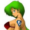
BoBe-Patt Posted June 10, 2004 Share Posted June 10, 2004 (edited) how about this? Just a quicky: Edited June 10, 2004 by BoBe-Patt Link to comment Share on other sites More sharing options...
BoBe-Patt Posted June 10, 2004 Share Posted June 10, 2004 and if I can, I'll try and find an image of the sharon apple robot box thing. I have an image in my head that would look great for the spine. Let me look around for it. Link to comment Share on other sites More sharing options...
Cdr Fokker Posted June 10, 2004 Share Posted June 10, 2004 Hell yeah. That should work very nicely. Not a real big fan of having the robot box/eye on the spine, but hey, guess I'll have to see what you have in mind to really agree or disagree. Link to comment Share on other sites More sharing options...
MrDisco Posted June 10, 2004 Share Posted June 10, 2004 lineartbox3 for me Link to comment Share on other sites More sharing options...
Anubis Posted June 11, 2004 Share Posted June 11, 2004 how about this? Just a quicky: Thanks. Here's a quickie box with a blue Sharon as a test piece. I think this could rock with a blue sharon on the spine. Link to comment Share on other sites More sharing options...
Mechamaniac Posted June 11, 2004 Author Share Posted June 11, 2004 Hey guys...got another update from Paul. He just wants us to know that the black design may not come out completely black, and would like it if someone can provide a scan of the lineart images at 600DPI along with the hexadecimal color code of the blue we want to use so he can mock it up on a case, and see if it will look good. His main concern is that the small text may not work out so well. If someone has the scan, PM me. Thanks!. Link to comment Share on other sites More sharing options...
Dangard Ace Posted June 11, 2004 Share Posted June 11, 2004 IIRC all lineart and scans are from Anubis. Color dodge color is #00018B Link to comment Share on other sites More sharing options...
Anubis Posted June 11, 2004 Share Posted June 11, 2004 Hey guys...got another update from Paul.He just wants us to know that the black design may not come out completely black, and would like it if someone can provide a scan of the lineart images at 600DPI along with the hexadecimal color code of the blue we want to use so he can mock it up on a case, and see if it will look good. His main concern is that the small text may not work out so well. If someone has the scan, PM me. Thanks!. I have to rescan the lineart tomorrow. I didn't expect to use it for the actual box, so when I checked it tonight I had only gotten it at 100dpi. I'll have new scans tomorrow. If the box ends up being a dark grey or something, I can live with that. Hopefully it works out. Quite decent of Paul to give that heads up and offer to check if it'll work. Link to comment Share on other sites More sharing options...
Anubis Posted June 11, 2004 Share Posted June 11, 2004 (edited) edit: double post Edited June 11, 2004 by Anubis Link to comment Share on other sites More sharing options...
fulcy Posted June 11, 2004 Share Posted June 11, 2004 how about this? Just a quicky: Thanks. Here's a quickie box with a blue Sharon as a test piece. I think this could rock with a blue sharon on the spine. Damn... I believe I was the first to push the desert image for the spine - that is the one image that I always think of when I think of M+, but that blue Sharon looks really really good! Link to comment Share on other sites More sharing options...
Anubis Posted June 11, 2004 Share Posted June 11, 2004 (edited) Yeah, even just adapting the source image into blue makes for a great spine. If anything similar to how Sharon looks in this wallpaper could be done in blue though that would be awesome. Edited June 11, 2004 by Anubis Link to comment Share on other sites More sharing options...
Anubis Posted June 11, 2004 Share Posted June 11, 2004 Update: New scans have been done, I will be adding them to the test section soon. Got the detailed 19/21 pics a lot better. I also got alternative fighter modes just in case, as well as battroid lineart, ghost lineart, and a couple other pics. First, I resscanned the logo. I think it looks a lot better this time. Link to comment Share on other sites More sharing options...
Anubis Posted June 11, 2004 Share Posted June 11, 2004 (edited) Here's a newer, better .jpg of the YF-19. The new original scanned .tif is 2471 x 3525@300dpi. Edited June 11, 2004 by Anubis Link to comment Share on other sites More sharing options...
Anubis Posted June 11, 2004 Share Posted June 11, 2004 (edited) The YF-21. I love the detail on these. Edited June 11, 2004 by Anubis Link to comment Share on other sites More sharing options...
Wabbit Posted June 11, 2004 Share Posted June 11, 2004 (edited) I've got my Mech #13 and Mikimoto #16 today! They are AWESOME!!! Edited June 12, 2004 by Wabbit Link to comment Share on other sites More sharing options...
Anubis Posted June 12, 2004 Share Posted June 12, 2004 If anyone wants to try something with the Sharon pic, PM me and I'll get you the actual source .tif somehow. Link to comment Share on other sites More sharing options...
BoBe-Patt Posted June 15, 2004 Share Posted June 15, 2004 Ok, here's the sharon apple in blue! Link to comment Share on other sites More sharing options...
BoBe-Patt Posted June 15, 2004 Share Posted June 15, 2004 can't seem to find that sharon picture I want. I'm looking for the robot box version of sharon apple. I have an idea, but witout this image, I can't make it happen. Link to comment Share on other sites More sharing options...
Mechamaniac Posted June 15, 2004 Author Share Posted June 15, 2004 Ok, here's the sharon apple in blue! Now that looks nice! Link to comment Share on other sites More sharing options...
Anubis Posted June 16, 2004 Share Posted June 16, 2004 Ok, here's the sharon apple in blue! Can you pull that off on the source .tif? I can send it you you if you like. Is this the kind of sharon computer pic you were looking for? Link to comment Share on other sites More sharing options...
Recommended Posts