the white drew carey
-
Posts
2928 -
Joined
-
Last visited
Content Type
Profiles
Forums
Events
Gallery
Everything posted by the white drew carey
-
Slowly but surely?
-

Gundam Show Thread - MSG thru GQuuuuuuX
the white drew carey replied to Black Valkyrie's topic in Anime or Science Fiction
Yeah, but what I'm looking for is an estimate of just the head itself. I'm really bad at judging these things... -
Gundam Show Thread - MSG thru GQuuuuuuX
the white drew carey replied to Black Valkyrie's topic in Anime or Science Fiction
Hey all- I know this isn't TV related, but I was hoping for some fan input: Best estimate - what do you think the height of the S-Gundam's head is, minus the V-fins and antennae? I'm working on a new drawing and can't find any specific data, but this info would really help with sizes and perspective. -
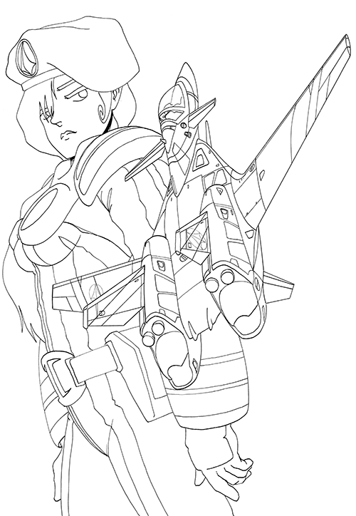
Hey all. It has definitely been a while. A rough year that started with me breaking a bone in my hand has just been a bit crappy. I haven't been drawing nearly as much as I want to, and have let myself (and others) down along with it. Any-hoo... I've been stewing on a project for a while and basically told myself to do it. Hopefully this will jump start the other things I want to (or should) be working on. This is going to be for my second EX-S Gundam / Alice in Wonderland composition. What you see here is the flatted layer which I will now use for coloring.

-
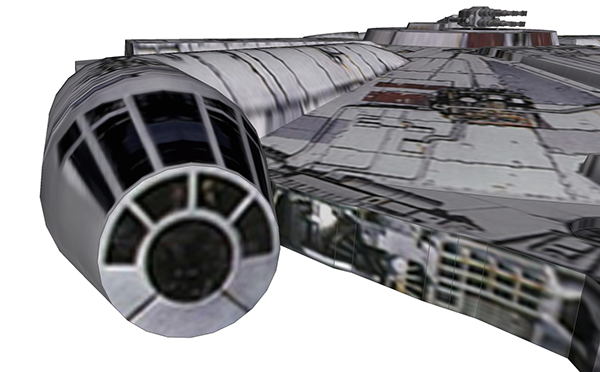
Hey all, I have an urgent request here. I'm looking for any hi-res images of the Falcon's cockpit from the outside, somewhat akin to the image below (anything similar would be cool). My daughter's b-day party tomorrow is SW-themed, and I wanted to take pictures of the kiddies with the stuffed Chewbacca toy (that she will be getting) and photoshop them in to the cockpit, then print them out as a special gift. However I am 1) short on time to look for images due to other preparations and such, and 2) the limited searching I've done has come up blank. If anyone has or knows where to get some good images, that'd be REALLY cool. If any 3D modellers here have done a good Falcon (better than the Google Sketchup one below that I found online) and would like to position their model and take a nice snapshot for me, that would be greatly appreciated. Cheers! twdc
-
Macross Δ (Delta) - announcement thread
the white drew carey replied to renegadeleader1's topic in Movies and TV Series
I don't know why, but for some reason I am getting a really big "VF vs. VF as a competitive sport" vibe from this image as well as the "Shoot (it) down." ... -
Uhhh... Before you continue with this request, have you seen the final piece?
-
Long time, no posting, everyone! Oh well. That previous one is now on the back-burner. I'm not entirely sold on the lay out or the Valks... In the mean-time, I've been beating around this one for a bit, and have gotten to the point where I think I'm going to start the digital coloring... As many of you know, I am obsessed with Millia and the VF-9. I think this may be the third or fourth drawing of the two I've done. Wowza.

-
Variable Glaug UN Spacy - High Quality Pics
the white drew carey replied to Chthonic's topic in Fan Works
My appreciation for the Variable Glaug just ticked up about 12x!!! -
macross: Skull Leader, Love Stories, and Remember Me
the white drew carey replied to Skull Leader's topic in Games
Hmmm... yeah. I see where you're coming from regarding the screen sizes. Didn't think of that. I e-mailed off what I have, just in case it does you any good. The game files would be awesome, cheers! -
macross: Skull Leader, Love Stories, and Remember Me
the white drew carey replied to Skull Leader's topic in Games
Yeah, that was me working on trying to get this translated and, yeah, I lost all but the 1st disk in a HDD crash. If anyone wants to share their copies, please PM me. I would be forever grateful. I was also toying with the idea of using Construct 2 to remake this game. Although I was just planning on using the original graphics as I am looking more for the gameplay and not an HD upgrade. Partially b/c I want to preserve the retro look of the game (not to knock your updated graphics, Skull Leader, but I think they lose some of the charm...). p.s.- I'm more than happy to share what translations we got done with this, although you may already be well-past that point. -
derp.

-
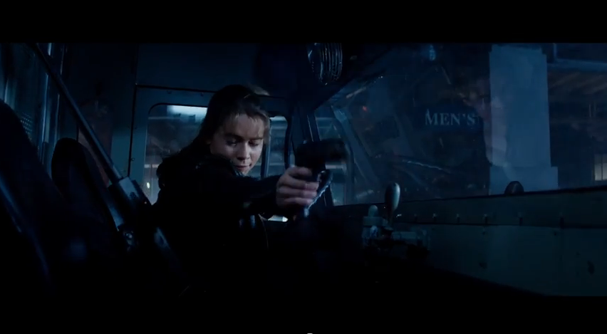
Sarah Conner, now trained from childhood by the ultimate killing machine to be a bad-ass, still flinches when shooting a gun? Few things in action movies frustrate me more that actors/actresses who are supposed to be firearms experts and/or soldiers, yet flinch every time they pull the trigger. The moment they are cast, is it so hard for them to take a couple hours or so out of their "busy" schedule a few times a week until filming is done to hit the firing range and train with a firearms expert, so that they don't look like a total noob when firing away? (Angelina Jolie has been in crappy actions films almost her entire career and continues to do flinch to this day. You'd think she'd be used to it.)
-
O/T Artwork
the white drew carey replied to the white drew carey's topic in Anime or Science Fiction
Hello all! Long time, no post! Anyhow, a quick one here... this is now (new revived after a summer break) twice-a-week comic, GAMERGEEKDADDY. I thought this one would be of interest as our secondary character (the first to talk) bears a striking similarity to someone we all know and (I hope) love. Link leads to the page itself, because I could use the hits. http://www.asplenia-studios.com/blog/2014/09/01/gamergeekdaddy-62/ -
Does she have her awful "Transylvanian" accent from Alexander? 'Cuz I'm always up for a laugh.
-
Ugh... no thank you. Yates' HP films were the worst of the bunch. Terrible pacing and awkward scene transitions...
-
AKIRA LIVE ACTION MOVIE = Life Support?
the white drew carey replied to Macross007's topic in Anime or Science Fiction
BOOOOO!!!! -
It was great!, I went with the wife and a coworker and we were just grinned the whole time. Spectacular!!!
-
Aircraft Super Thread Mk.VII
the white drew carey replied to David Hingtgen's topic in Anime or Science Fiction
Hey everyone! I've been really busy of late, but was able to take a day off and go to the Abingdon Air & Country show here in the UK two weeks ago. The link below leads to the "best" photos I took of the event (using a new telezoom lens, so... I was still getting a feel for it). Please forgive the overly simplistic descriptions, as they were written for an audience that is not nearly as knowledgeable as you guys! https://www.facebook.com/media/set/?set=a.10152044196036606.1073741832.713586605&type=1&l=7ede52af21 -
Aircraft Super Thread Mk.VII
the white drew carey replied to David Hingtgen's topic in Anime or Science Fiction
You see, that's the thing, though: I don't care if a place is ugly as long as it gets the job done. But I see the F-35 being a Jack of All Trades, Master of None. -
All Things Videogame Related: EXTREME VS!!
the white drew carey replied to Keith's topic in Anime or Science Fiction
BTW- Did anyone else notice that Titanfall's developers were so lazy that they skinned half of the combat suit, and then mirrored it for the other half? The picture I'm posting doesn't have the left hand, but it was onscreen and I can confirm that the right glove has a mirror image of the left glove with the letters NGER and then some strange symbol/character. *bonus points to the team for skinning the LEFT half of the body and then mirroring it to the right side.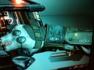
-
O/T Artwork
the white drew carey replied to the white drew carey's topic in Anime or Science Fiction
Challenge, my a$$. Your shading is top-notch and a shining example that I aspire to. -
Gakken's first point (which Danth just quoted above) is a big sticking point for me. Also, there are enough changes that affect the very nature of the book: cleverness often outweighs brute force. All of the points in the book where Bilbo uses this have been altered to the point where it doesn't mean anything. His well-crafted plan to free the dwarves from the wood elves after weeks of thought (and the fact the he compounds the effect of the plan by returning the keys to the jailer, providing a puzzler for the elves) is lost because Jackson wanted another useless chase scene featuring Legolas 'snowboarding' down hills on objects and dead orcs. And then Bilbo's cleverness in keeping Smaug interested long enough to not kill him by using riddles and hidden clues is gone (or altered beyond recognition) because we had to have a stupid Geonosis Droid Factory Part II action sequence with dwarves flying around in mining equipment. The more I think on it, the more I begin to hate the movie. I'm already waiting for the fan-edit when the third one is out where all of the useless crap Jackson put in is taken back out, leaving a nice, solid 2.5-3 hour movie which is actually, you know, about a hobbit.
-
Yeah. I mean, him and his team did an excellent job condensing LotR into three films, and only two changes they made ever bothered me (Arwen's increased role [which I can get past], and Faramir's change [which was awful]). Now imagine a film full of Faramir changes and made-up Arwen-type stuff, and you'll get the idea.
-
Just saw Desolation. Man, did that suck. I'm not going to spoiler tag this stuff below because if you've gotten this far in the thread, you've heard enough. Jackson was applauded for fitting LotR into three (very long) films. But I still don't get why the heck he felt the need to turn The Hobbit into a three (over-long) films. Even adding in the stuff from the appendices would only justify two. Instead we get a retread of a dwarf infatuated with an elf, characters who are different than they are in the book, and needless action scenes (I almost walked out when Thorin was running under Smaug with the wheelbarrow). Plus, there are tons of wild inconsistencies regarding the crap that Jackson added in, especially regarding the stuff in Laketown. Hey, these Laketown people are happy to see the dwarves, and provided us with weapons and supplies to assist us in our quest! Uh-oh, Kili is sick. Knock knock. 'Bard! You're the only one who can help!!! Not any of the other people who are actually happy to see us!' Bard spends hours in his house with sick Kili and the other two dwarves. HE IS AT HOME. Yet the moment he leaves, the guards are like 'Hey Bard, we've been looking for you!' Needless chase scene. 30 orcs attack Bard's house in Laketown. No one notices a bunch of clumsy orcs running along their rooftops. Tauriel and Legolas have a fight with them and Legolas continues the fight for a decent amount of time through Laketown, yet no one raises a cry and no guards show up. Ugh...