PsYcHoDyNaMiX
-
Posts
1296 -
Joined
-
Last visited
Content Type
Profiles
Forums
Events
Gallery
Everything posted by PsYcHoDyNaMiX
-
Where did you order from?
-
Paid for mine the 16th as well... and just got notice yesterday (the 3rd) that it was just shipped out. Maybe they're going by who placed their pre-orders first? I was on the late boat... a couple days (2/3?) after the first price because I missed the first run and ended up with 230 a pop.
-
Wow some good prices... even otacute has theirs as well but at a higher price $214 (US). I should have waited on other sites before paying for my NY order.
-
I know... I was just trolling, lol. I meant that small sequence from the movie where he went straight from fighter to battroid... I believe it was right after he drew up the dino bird in the sky.
-
Isamu didn't use the gerwalk mode during the test flight in the Macross Plus Movie Edition. I don't remember the exact timing position in the movie, but he went straight from the plane mode to the battroid mode. There was no gerwalk mode, lol.
-
HLJ has their pre-order up: http://www.hlj.com/product/YMTGK-19 Their base price is cheaper than NY. I placed an order with them too and selected the warehouse option to choose which shipping methods are most viable when the product becomes available in December.
-
Agreed. If I can find one with a cheaper price with shipping total I'll change my pre-order. With NY its about $400 with shipping.
-
I chose the pre-order pay notice option (up to 1 day prior). If NY can get their orders in prior to the 5% discount deadline they're making a decent amount per valk. Plus I'm pretty sure they have a retailer's discount of some sort.
-
http://www.nippon-ya...ed-edition.html NY has them up. ***EDIT*** Ahh... Murphy beat me to it, but yea... it's up and I ordered one as well.
-
Wow... kind of surprised. AE is for once the cheaper alternative than AmiAmi for the VF-19P. ***EDIT*** I think I'll wait for the Red exclusive (if there will ever be one) or for this one to go on sale. I'm already pretty happy with my VF-19S. I still need to get the VF-19Kai.
-
Already order stopped on HLJ (sale price 17000 yen): http://www.hlj.com/product/BAN977444 ***EDIT*** Don't know how as the page was just put up. I guess it could've been available since I had my page checker set at a random interval of 51 seconds.
-
Same as well
-
Nice... I have a middleman service trying to secure an order of one for me through other means, but they're having difficultly placing an order from his sources as well. I was going to order one from Otacute because the prices were better and I've ordered from them before.
-
Wow... Otacute opened up pre-orders for the YF-29 VF-1S scheme and the pre-order was closed as soon as the notification was sent. ***EDIT*** I'm guessing a few scalpers out there have buying bots for them... ***RE-EDIT*** I guess on the flip side that if Otacute was only able to secure like 10-20 orders that wouldn't be much considering how many people across the world would want one. Just to say... I was not able to place an order for one, lol.
-
NY has them up at 18500yen: http://www.nippon-yasan.com/lang-en/macross/2631-macross-f-dx-chogokin-vf-25g-messiah-valkyrie-michael-blanc-custom-renewal-version.html
-
NY has them up at 18500yen: http://www.nippon-yasan.com/lang-en/macross/2631-macross-f-dx-chogokin-vf-25g-messiah-valkyrie-michael-blanc-custom-renewal-version.html
-
The only improvement that can be made on the VF-27 are its hip/waist (as featured on the v2 VF-25 versions), the hands, and possibly the folding shoulder mechanism. I've been thinking about swapping my VF-29F's hip/waist with my VF-27 to see how it would hold. The only difference in height between the renewals and the VF-27 is just the hip/waist feature. That is primarily the reason why the VF-27 is so short when compared to a VF-25 in battroid mode.
-
I believe the entire HLJ site is bogged down. Could be due to the 'YF-29 VF-1S scheme' craze.
-
Is the red encircled part of the scan indicating that there's some sort of a rubber sleeve encasing the shoulder's joint? I can't read Japanese, but that's kind of what it looks like from the picture.
-
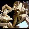
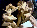
I didn't make this. I stumbled upon it while looking at some Gundam models. http://www.modelers-...id=10687&cid=40 I'm kind of surprised there isn't a dedicated thread for inspirational Macross models/customs...
-
Just cancelled my preorder with BBTS...
-
The reason for the height difference in that particular picture is because the ankles on the VF-27 are not extended as they should be and there is no swing bar in the hip section like all the VF-25 renewal versions. ***EDIT*** If Bandai just releases exclusive hip-part and hand supplement parts for the VF-27 it would be one of the best valks out there because that's all the VF-27 really needs.
-
I'm guessing a Ver 2 release with thicker legs! LOL... okay bad joke.
-
Nice! Got my order in.
-
I think all Bandai would have to do is just create/sell a supplement set for the VF-27 (crotch section, metal swing bar, new hands) and I'm pretty sure this would suffice, since the only mode that is off really is the Battroid mode.