the white drew carey
-
Posts
2928 -
Joined
-
Last visited
Content Type
Profiles
Forums
Events
Gallery
Everything posted by the white drew carey
-
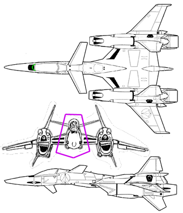
The nose still looks a bit wonky. Could you show us a front view? It seems like it is too squat and wide. This view from Macross Design Works shows it to be a bit taller and thinner Also, the canopy is cut short just like the VF-1. But you have it rounded.

-

Does this remind you of anything?
the white drew carey replied to Stemp Fester's topic in Anime or Science Fiction
Nope. Just a mech. -
The PlayStation 3 Thread 80GB Edition
the white drew carey replied to Gaijin's topic in Hall Of The Super Topics
So that the player doesn't forget about the demo when the game comes out? Six days seems like an interesting marketing strategy. Its not designed to showcase the game weeks or months before its release (DMC is already such an established franchise that you ain't gotta do that), but to "remind" players its coming out. There's also a possibility that the demo feeds straight into the retail version, although unlikely. I'm with Keith on this one- Six days doesn't seem crazy to me. -
Wow.
-
High Definition Media & Technology Thread
the white drew carey replied to JsARCLIGHT's topic in Hall Of The Super Topics
While I agree the war is not over, I'd have to disagree with your assessment of Best Buy's reasoning here- I've worked there once myself way back when and Best Buy is notorious for dumping stock when something doesn't pan out. Just cut their losses and run. That seems to be what they're doing here, IMO. I do agree, though, that they won't tell the consumer of the status of the HD war if the buyer is oblivious. -
High Definition Media & Technology Thread
the white drew carey replied to JsARCLIGHT's topic in Hall Of The Super Topics
I hate to say it Nied, but it seems you're being intentionally obtuse for the sake of making a smarmy statement. Dangard's theory is more plausible than most I've read in this thread. Why bash it with an inane comment like that? -
That actually looks better than the CGI-build!
-
Battlestar Galactica Discussion
the white drew carey replied to HoveringCheesecake's topic in Hall Of The Super Topics
I don't know if anyone else has the actual issue, but to me Helo and Sharon seem to be looking at two different people. Helo's eyes are aimed high, and could be looking at Six or Natalie (Normal-hair Six on the end), but Sharon seems to be looking at Rosyln. -
Battlestar Galactica Discussion
the white drew carey replied to HoveringCheesecake's topic in Hall Of The Super Topics
I wouldn't worry. It raises more questions and doesn't tell much, if anything, that you haven't seen from the S4 commercials. -
LIST YOUR FAV MUSIC VIDEOS OR AMV
the white drew carey replied to deadghost's topic in Anime or Science Fiction
Mighty Mighty Bosstones Don't Know How To Party video. Why? At 3:11 in you see them pull a kid in a black shirt and a plaid pant leg on his head onto the stage where he staggers around. That was me, seconds after a skinhead who was on stage kicked in me the jaw (I was in the crowd). The bassist dropped his bass and jumped into the crowd after the skinhead guy, but he got away. I got to hang out with the band afterwards once I was coherent. As it fades out you can see my friend Billy jump out on the left and wave to the camera. -
Lovers of the Valk Girl...
the white drew carey replied to miriya's topic in Anime or Science Fiction
Ditto. If you're a fan, go for it. But I have no clue what it is, so it's not really a valk-girl, just a chick in pseudo-mecha armor to me. -
Yes, but with much more hair... (who am I to criticize?)
-
True dat, but I think that there's more than enough room for different character designs in Macross. IIRC, a lot of people were irked by the M0 designs, but I thought they were all right. My least favorite behing MF is probably M+. It's also not totally the character designs themselves, although the super-long noses are a bit too much, but mistakes by the animators. I mean, look at the angle she is in this shot, and the animators simply couldn't draw it correctly so it looks really, really bad: Here is a prime example of that flat-face thing I was talking about. Considering the position of his torso, I'd say his neck would broken right now... Overall, tiny errors in the animation can really hurt the show. I hope they fix up some of this stuff...
-
Atonement!
-
I don't know... Even though it's a bit amatuerish, I'm liking the manga character designs more than the anime designs. They seema bit more fleshed out. I think the anime designs are probably the worst of the Macross projects. In many of the scenes the characters suffer from a phenomenon I like call "flat-face" where the animators can't seem to draw a face from the side without making it look the a cube with a nose on it (this is most evident when the eyes are drawn on the same precise lines). Its not enough to turn me off of the show, but I do think they're not very good designs.
-
Crap, you're out of Wii's!?!
-
My guess is that she's written to give this impression at the start. What's interesting, though, is her complete attitude change from when she arrives at Frontier from Galaxy vs. her stoicism when leaving during the attack. Makes me wonder.
-
He's definitely not as angsty as what you can usually find, but it is there- Sullen, misunderstood by his peers, has dreams and aspirations beyond his lot in in life. Like I said, though, I think it's hilarious how they completely de-mystify him right off the bat with the girl jokes.
-
Its never a true MW thread until vehement arguments raise their ugly heads!!! I thought it was cool. Princess was a little too angsty for me, but hopefully that will change. I found it infinitely more watchable than the first M7 episode. I'm still not fond of the character designs and some of the cel animation is kind of wonky. Plus those flying suits they wear seem kind of plainly designed. Oh well. I like how everyone keeps giving that guy crap for looking like a gal. When the little girl called him on it I almost spit out my beer by laughing so much. Good stuff. I'm happy.
-
I hate everyone's opinions... ...even my own.
-
Agreed, especially since one of the urban sections is "San Francisco", it only makes sense.
-
Probably because he's referring to Outlanders by Johji Manabe. I hope that's right. I'm pegging this one down to plagiarism. I'm guessing that the artist (and I use that term loosely) saw this design without having a clue what it was. That's how a black part becomes a windshield and other crap like that.
-
Battlestar Galactica Discussion
the white drew carey replied to HoveringCheesecake's topic in Hall Of The Super Topics
That's cute. -
Aircraft Vs Thread 4
the white drew carey replied to Apollo Leader's topic in Hall Of The Super Topics
That stinks. I would love to see you made into a series. OK, I'm a tard. -
Nah... he's said before that the second part will actually be transitional material between The Hobbit and LOTR. I cannot recall, however, whether or not he sid he will be using notes from Tolkien himself or pulling it out of his, now slim, Kiwi bottom.