

Mr March
-
Posts
9190 -
Joined
-
Last visited
Content Type
Profiles
Forums
Events
Gallery
Everything posted by Mr March
-
What does everyone think of Macross II?
Mr March replied to ShizumaRobo's topic in Movies and TV Series
Mediocre Macross. Not great, not bad, but nothing worth attention or revisiting, IMO. Well, except for profiles on the M3, of course. -
The fact that the 1/60 is smaller makes it more appealing to me. My 1/48 Yammies, as much as I love the two I own, were always just a bit too big. I also really like the more rounded legs on the 1/60 and it appears the sculpt features more articulation, especially in the arms.
-
Macross Frontier News Thread *Read 1st post*
Mr March replied to azrael's topic in Hall Of The Super Topics
I like the look of Mikhail's blue VF-25 and the sniper rifle is interesting. I'd love to hear the fiction regarding the weapon. -
Damn, beat me too it. I always love to tear this sci-fi cliche to pieces whenever I have the chance. The enormous energy expenditures to envelope a craft in an energy shield would only be worthwhile if the ship in question had no other pressing need for power from any other systems. Since most sci-fi ships use energy based weapons and other power hungry systems like gravity generators, force fields, FTL drives and the like, shields make almost no sense from a combat perspective. The power used to maintain a shield would be far better utilized for significantly increased speed and firepower. Especially in the case of Macross, which has one of the biggest energy cannons in all of sci-fi, it makes virtually no sense to use an omni-directional barrier in the vast majority of situations. The pin-point barrier system on the other hand, would be a far more efficient system and can be moved at a moments notice to more heavily shield the vessel from the most dangerous lines of fire.
-
Just to note, the New Macross Class vessels had many more than three pin point barriers. In Macross 7, the Battle 7 is shown with something like 11 active pin point barriers operating simultaneously. So this isn't exactly a new feature.
-
Macross Frontier News Thread *Read 1st post*
Mr March replied to azrael's topic in Hall Of The Super Topics
This issue has come up before and I hope my Macross 13 profile on the M3 helps steer fans in the right direction. -
Macross Frontier Episode 2 Talkback Thread *READ 1st Post*
Mr March replied to azrael's topic in Movies and TV Series
I don't mind. I actually find the topic quite interesting. There's so much said about Japanese among fandom but it's rare to read the real deal. A basic primer on why translations work the way they do and why names are translated in such a way would be a really valuable addition to a fan site. Nothing in depth, just much of what's been already stated in this thread would be good. Anyway, back on topic... -
Superficially, the Mini-series stillsuits looked like fabrics from vintage clothing outlets, they were poorly fitted for function and the masks never sat correctly. Into minutiae, the Mini-series stillsuits had no means of adjustment and there were no tubes at the neck. The Mini-series stillsuits appeared as ill-fitting jumpsuits and not prescision garments that needed to be properly worn to ensure efficient operation. The hood and mask could not be adjusted for open desert. There were no noticeable catch pockets. This is about what I can remember off the top of my head. Digressing, yeah, they looked like pants, in the cockney sense of the word
-
LOL Michael Bay does something right, for once
-
Macross Frontier News Thread *Read 1st post*
Mr March replied to azrael's topic in Hall Of The Super Topics
My thanks azrael. I knew of the flight suits, but didn't knwo they were both SMS hires. But nonetheless, it's clear they're onboard with their unique colors. This sounds fantastic. Exactly what I'd hoped for. And the ANN news article confirms it. The ultimate extended edition -
Idol Talk, baby
-
It is interesting reading the reactions. I've posted this topic on several other boards and it's been entertaining. Personally, what I've read into this article most is the argument of fan perspective. Or better to say, the lack thereof among fandom. It really is disheartening to endure the rabid fanboy ferocity after a while, but I suppose even the most level-headed of us is guilty of acting as such on occasion. Digressing, I think the article works brilliantly as a call to reason despite a few flaws. The overall message is to relax and moderate your fandom more; avoid acting as the disgusting "spitting nails" tyrant that gives geeks a bad name for arguing over minutiae. The face palm needs a vacation every now and then
-
Macross Frontier News Thread *Read 1st post*
Mr March replied to azrael's topic in Hall Of The Super Topics
Because that particular VF-25 variant is green, which is Luca's color (seen when Luca is in his Ex-Gear uniform). Alto is red, Mikhail/Michel/Michael is blue, Luca is green. -
Macross Frontier Episode 1 Talkback Thread *READ 1st Post*
Mr March replied to azrael's topic in Movies and TV Series
Gives one a new appreciation for the effort of translations. -
It's perfect. The size is just right.
-
Ah, very nice work you two.
-
Like saying Hark-ah-nen. I liked the Lynch version still suits as creative sci-fi wardrobe. They looked as if they were fitted in such a way to act as a wearable pump. Sadly, the suits were not as they were described in Herbert's book. The mini-series still suits looked like crap. Sure they were a little more accurate with the head piece, but the implementation was just awful.
-
In some cases I'd say yes, in other cases I'd say no. Commonly held beliefs in fandom can also sometimes be a very poor benchmark for what is official or not. AFAIK, the "Phoenix" designation is still unofficial. The VF-5000 Star Mirage seems to have been officially adopted in official Macross publications (and your mention of it in the Macross 7 Remastered Edition), but Kawamori was on record in past years stating "Star Mirage" was just a nickname. It can be difficult to reconcile these issues and the Macross Compendium typically errs on the side of caution in areas that are ambiguous.
-
Hmm, the color looks off. It should be silver.
-
Found this fantastic article and it's screaming out to be shared: http://www.cinematical.com/2008/04/08/the-...lax-dont-do-it/
-
Not bad. I like the look of the Macross 25. It's going to be quite menacing when we see it in action.
-
I don't mind the pace. Ideally I'd want all my Revoltechs now, now, now. But to be honest, I'm buying Revoltechs for several different series, like Patlabor and Evangelion, so I want early releases for several different product lines.
-
I'm sure no one really believes Uwe Boll will quit making films just because of a million angry film fans. The petition is just affirmation for the critics. The fact that this silly petition has already tallied over a hundred thousand signatures in just days is quite telling how much the films suck. Nothing more. If Boll wants to manufacture a media-spin victory out of this by using the press for attention to his films, more power to him. It certainly fits his MO. From my perspective the joke is on him and the reality is far more damning
-
I don't like the Weirding Modules from the Lynch version of Dune and don't particularly care for it as an adaptation either. But I agree that as diverging as the Sound Weapon concept was from the Prada Bindu of the original novel, it served a very similar function and was basically an identical plot placeholder. The emperor in the Lynch film was fearful of the power of the Atreides new found technology, but it was ultimately the growing threat Leto's house represented in the Landsraad that motivated him to conspire against the Atreides, just as in the book.
-
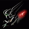
Evangelion 1.0: You Are (Not) Alone
Mr March replied to UN Spacy's topic in Anime or Science Fiction
Very nice wing design. The style very much compliments the motif of Unit 01. Even if it's just an unofficial custom, it sure looks nice.