MacrossJunkie
-
Posts
3245 -
Joined
-
Last visited
Content Type
Profiles
Forums
Events
Gallery
Everything posted by MacrossJunkie
-
All Things Videogame Related: EXTREME VS!!
MacrossJunkie replied to Keith's topic in Anime or Science Fiction
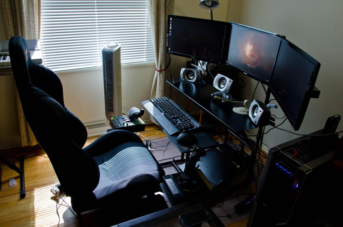
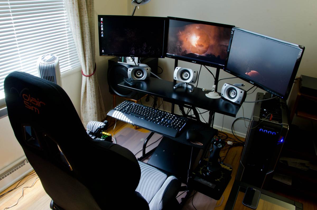
I've tried some, but I'm waiting until the keybinding is built into the game itself instead of having to mess with xml configs to really get into it more (which should be in the upcoming 1.0 version of the Arena Commander). It's still going through a lot of play and input balancing iterations as well. There is still much for them to put in and refine. I think they should have at least most of their promised features at launch, which at the current rate, I'm guessing is still about 2 years out. A lot of the past dev time spent has been on getting the ground work and backend stuff built. If you follow their "Around the Verse" show and posts, they mention a lot about how they were making the tools to that make generating content or automating certain tasks much faster so progress should accelerate as more of their tools are built out. They've already got a lot more they were/will be able to show this year than they were able to last year. As for investment into the game at this point in time, you really don't need to put much more than $45 into it if you want a ship, beta access, and an arena commander pass which is comparable to spending money on other computer games these days anyway. You could even do $35 ($30 base package + $5 arena commander pass) if you don't care about the beta access. The only thing anyone is missing out on if only just doing a pledge now is the alpha access. You can still do the arena commander with the pass as much as you'd like and includes several dogfighting modes as well as racing which was just added in the 0.9 release. I've been a big space sim fan since the days of WC1 and X-Wing, so I am highly anticipating when most of the core features including the persistent universe are in for people to test with. My cockpit is almost complete. I just need to get some rudder pedals and am awaiting the eventual consumer release of the oculus rift. I may get Elite: Dangerous as well when it is released to hold me over as it will be released a lot sooner than SC. I know, right? Stupid cliff hanger at the end of Freespace 2...

-
Based on the pictures, there doesn't seem to be any need for any parts-forming here, aside from maybe the head/bridge and the definition of parts-forming. I just don't see a way for it to get past the cannons without taking it off and then putting it back on. There's just one thing about the sample pics that I'm wondering. Is cruiser mode mis-transformed or are the main cannons simply not capable of sliding back to cover the blocks that the arms are connected to due to the SD proportions? It kind of looks like they could. Edit: Is it too late to tell them that the "01" and "02" on the ARMDs should be flipped? The ARMDs themselves are correct, but the numbering on them aren't.
-
That works too! The purple on the 30th Anniversary edition would be a perfect swap. Does anyone have Macross 30 and can make some screenshots of Ozma's 29 without super packs? I'm either not searching with the right words or there just doesn't seem to be any good clear shots out there for me to use as reference. The couple I've seen looks like there is a lighter gray on the leading edge of the wings (I'm starting to see a pattern with Bandai and them forgetting to paint leading edges), but with the super parts on, I can't see just how far out it extends, if at all. So they paint the LERX unnecessarily, but don't paint the leading edge of the wings with that same gray paint. Someone at Bandai is on too much drugs... or has been off their medication for too long. I'm not sure which.
-
On the 30th anniversary edition? Yeah, I would too if I had one. That and the clear purple wing light inserts would all be green. The green looked sooo much better on that. The gold stripes were also better than the bright yellow. I would repaint those as well. On a side note, I've modified my post a few posts up with more pics illustrating how to get at the fold crystals.
-
Master Made SD-style SDF-1 "Makuros" Add On Pack!
MacrossJunkie replied to evilcat005's topic in Toys
So a monster and the other two are likely Max and Milia 1J's. -
Regrets? I regret not buying the 1/60 Regult when it was available. I also regret buying the v.1 VF-25G, Armoured S, and RVF-25.
-
Arcadia 1/60 Perfect Transformation VF-0D for 2015
MacrossJunkie replied to Dark_Ghost's topic in Toys
Unfortunately, due to the fact that the toy is PT, they probably had to stick the fans so far up because the hip bar would be connected to a block of plastic/die cast taking up the space just behind the fan. The SV-51's isn't much better (a little bit better, but not by much). -
There are little pegs that plug into the top half. It could just be those that were making it difficult. There shouldn't be any glue stopping you from taking it apart. Edit 1: Sorry, I will need to make a correction to one of the pics. (I did mention I was tired right?) Edit 2: Okay, I've updated the 2nd pic. There should be a total of 5 screws to remove to separate the fuselage. A separate 6th screw for the windscreen.
-
Sorry, I'm tired. The first and second pic is exactly what you need to unscrew to get the LERX's off. Hopefully this pic helps to illustrate how the LERX is connected to the fuselage. The top and bottom half sandwiches the round metal bar. Unscrewing the screws shown above will let you separate the two halves. As for what I used to tint with, I used this: http://www.amazon.com/gp/product/B00AVKJYQ0/ref=oh_aui_detailpage_o08_s00?ie=UTF8&psc=1 It's acrylic and mixes well enough with Future and acrylic paint thinner. It squeezes out of the bottle sort of like a paste so I have to thin it down. Edit: Found this while googling around for clear purple paint: GAIA COLOR LACQUER 047 Seems to be readily available on ebay and I found it on Amazon as well. It might be worth a try since the stuff I'm using now is not as crystal clear as I would like. It has a sort of cloudiness to it.
-
I just replied to mickyg on how to disassemble, so I'll just copy and paste to here as well. To disassemble to get at the canopy and such, do the following shown in the pics I just took using a small precision screwdriver (second pic will need to be done at awkward angles): There is one screw left that lets you remove the front windscreen, but it doesn't prevent you from separating the top and bottom half of the fuselage. The end result will allow you to do this: The front windscreen is screwed in via the hole right in front of Ozma there and is the one accessed within the landing gear bay in the first pic accessible once the top half of the fuselage has been separated from the bottom half. You can see that the peg goes right through the black piece and then through the green part as well. For the fold crystals, it's pretty obvious. There are two screws under the chest piece. Unscrew those and pull the pieces off. You'll see the tabs underneath where the fold crystals are plugged in. Use the precision screwdriver or something else with a small enough tip to slowly push in on the tabs, alternating between the tabs, until the crystal pops out. Using what I learned when doing my Isamu 29: On re-tinting the canopy, err on being too light. What looks like the colour being too light and faded ends up being just right once it's put back on. Adjust a little bit at a time from there if it needs to be darker. Related to the above, clean off the coloring from the outside of the canopy and apply the tinting to the underside. That lets you easily clean off the tint and redo if you mess up without having to worry about wiping off the black canopy frame. It also protects the tinting from accidental nicks and scratches. Edit: 2nd pic updated. Edit 2 - Electric boogaloo: Added pics for removing the fold crystals
-
Arcadia 1/60 Perfect Transformation VF-0D for 2015
MacrossJunkie replied to Dark_Ghost's topic in Toys
Agreed. And yes, they were free floating and the bars were so thin that even if it were made of die cast for the toy, they would still be very susceptible to breakage. It just wouldn't be practical to duplicate on a toy.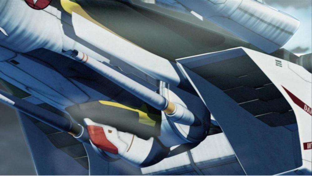

-
Okay, so I need some opinions here. I retinted the canopy, but I can't decide if this purple is just about right or if it should be darker. Also, do you guys think I should leave the fold crystals blue or recolor them purple as well?
-
Master Made SD-style SDF-1 "Makuros" Add On Pack!
MacrossJunkie replied to evilcat005's topic in Toys
It would be nice if they included some little SD fighters in the pack. -
Heh, Looks like the rail cannons got put on backwards on one side. They're all facing the same way. I hope the shoulder plates can be loosened enough for people to correct it on their own should that happen to theirs. The other two samples look correct though.
-
Sometimes I resort to using a vacuum. The inner of the lightbox fabric seems to just constantly release little white particles. Personally, I don't think any of the add-on parts look good with the Prophecy. At least not with the orange, blue, and white paint scheme.
-
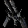
I am really tempted to buy one. It looks so good and it transforms too! I have to say it's amazingly detailed, comparable to the Yamato SDF-1 even. I could swear they used the Yamato 1/2000 or 1/3000 as reference. The shoulder rail cannons, for example, seem to be based off of Yamato's interpretation which looks different than the line art.
-
I really wish Arcadia would include waterslide decals instead of stickers or at least along with stickers. Even with trimming the stickers as much as I can manage, you can still see how it's higher than the surface, which never looks quite as good as if it were just printed on or going with decals. Agreed about the Yamarcadia valks having really shallow panel lines. Some of the panel lines on the 19 are so shallow, I can't tell if they are really there or if I'm just seeing things or I know they're supposed to be there but are completely invisible, like certain portions of the lines on the shoulder pauldrons. The Bandai VF-25's also have some shallow lines as well, particularly the back of the leg areas, but nowhere near as bad. I think one thing Bandai really needs to improve on are the exceedingly pathetic excuses for intake fans they do on all of the valks. To call them half assed would be a very generous description. I don't even know why they bother to make the intake covers removable if they aren't even going to put any effort at all in making the fans look anywhere close to decent. They put so much detail even into areas that would rarely be seen at all, and then they hire an 8 yr old to make a mold of the intake fans.
-
QFT. Black backgrounds are a pain to deal with. I only continue using them because I feel it provides better contrast in my photos. I am too. The lightbox I use seems to produce its own swarm of tiny white dust particles.
-
1/48+fp's, 1/60+fp's, 1/72, 1/2k, 1/3k,1/100 and now 1/144
MacrossJunkie replied to VF-18S Hornet's topic in Toys
More shots of fighter mode with the pod deployed. Does anyone else feel like getting the covers open is a literal pain? A lot of them are hard to open up and they end up digging into the space under the fingernails while getting them opened. -
Well crap. Missed it again...
-
1/48+fp's, 1/60+fp's, 1/72, 1/2k, 1/3k,1/100 and now 1/144
MacrossJunkie replied to VF-18S Hornet's topic in Toys
Lighting and angles seem to affect it drastically. That said, the lighter color could have been more pronounced. So although it's there and I can see it in person and in some of the photos, in others it's really hard to see so I took your feedback and made it more visible by respraying with less thinner so it shows up in the photos better. -
1/48+fp's, 1/60+fp's, 1/72, 1/2k, 1/3k,1/100 and now 1/144
MacrossJunkie replied to VF-18S Hornet's topic in Toys
I did. Look closer. It's harder to see in some shots due to the lightning. -
Every panel a different shade.
-
1/48+fp's, 1/60+fp's, 1/72, 1/2k, 1/3k,1/100 and now 1/144
MacrossJunkie replied to VF-18S Hornet's topic in Toys
Here are the rest of the pics I took of my YF-30. Finding the right mixture of paints for the subtle colors differences to paint the patterns on the wings and other areas was a pain. -
1/48+fp's, 1/60+fp's, 1/72, 1/2k, 1/3k,1/100 and now 1/144
MacrossJunkie replied to VF-18S Hornet's topic in Toys
Thanks, guys! Actually I did most of the work (masking and painting the pattern, oil wash, weathering, and clear coating) in a sort of GERWALK deployment so most of the surfaces would be exposed. I took the head and weapon pod off and did those separately. After that, I took it to battroid mode to finish off the parts that were still hidden. I should hopefully have time to photograph the other modes after I get home from work.