Agent ONE Posted May 28, 2004 Share Posted May 28, 2004 That image of Dana is hardly porn and they didn't stray away from the original that much. Most of the complaints here are merely nitpicks or putting the art in question under the microscope so that they could complain about RT produced material (except Js, he's just anal about his weapons and guns). I didn't say it was porn, I just said it was lame. I don't think its a nitpick either. It may be slightly different, but its par for the course with HG, they always have to mess with it so they can pretend they created something. Quote Link to comment Share on other sites More sharing options...
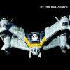
BoBe-Patt Posted May 28, 2004 Share Posted May 28, 2004 I'm just wondering why they made Dana's hair green instead of blondie. After max's blue hair mixed in with Miriya's green makes yellow or blondie in this case. hehe. I guess Miriya's gene's is more dominant. Quote Link to comment Share on other sites More sharing options...
Ali Sama Posted May 28, 2004 Author Share Posted May 28, 2004 I'm just wondering why they made Dana's hair green instead of blondie. After max's blue hair mixed in with Miriya's green makes yellow or blondie in this case. hehe. I guess Miriya's gene's is more dominant. they did not. it is blond. check the site. her real color however. is green. though she is a blond in the sereis and in the original pinup. Quote Link to comment Share on other sites More sharing options...
Ali Sama Posted May 28, 2004 Author Share Posted May 28, 2004 I can really appreciate how much they screwed up the armor in order to make it "sexy". Considering I've always been a fan of the Southern Cross armor, I'm kind of ticked. But hey, It's HG. And what's wrong with that is...? Vostok 7 Thats like putting boobs on a VF... Just lame. These are soldiers we are talking about, not porn chicks. not real life. Exactly... Think about it this way. We don't have female soldiers in Iraq running around in shiny skintight kevlar outfits, do we. No they wear combat fatigues that are designed for combat, not to be sexy. no. but. she is apilot. not a grunt. Quote Link to comment Share on other sites More sharing options...
EXO Posted May 28, 2004 Share Posted May 28, 2004 (edited) I didn't say it was porn, I just said it was lame. I don't think its a nitpick either. It may be slightly different, but its par for the course with HG, they always have to mess with it so they can pretend they created something. I'm not gonna defend HG, but in the case of the artists that do the comic book, it's a case of damned if you do and damned if you don't. If they were to use the line art they would be crucified for being unoriginal Mikimoto (or whoever designed the SC characters) wanna-bes but if they were to put their own spin on it then then they're "messing" with it. My preference would be if they stuck with the lineart, but in this particular case I'd say that there was certain improvements on a character who was bland to begin with. Edited May 28, 2004 by >EXO< Quote Link to comment Share on other sites More sharing options...
bob joe mac Posted May 28, 2004 Share Posted May 28, 2004 WOW that is on kick-ass redone Dana. I mean I do not like RT but this is by far the best thing (if not only) totally cool thing to come out of the RT franchise. Quote Link to comment Share on other sites More sharing options...
the white drew carey Posted May 28, 2004 Share Posted May 28, 2004 I'm not gonna defend HG, but in the case of the artists that do the comic book, it's a case of damned if you do and damned if you don't. If they were to use the line art they would be crucified for being unoriginal Mikimoto (or whoever designed the SC characters) wanna-bes but if they were to put their own spin on it then then they're "messing" with it. My preference would be if they stuck with the lineart, but in this particular case I'd say that there was certain improvements on a character who was bland to begin with. For shame >EXO<, for shame! When I draw Macross stuff I try to emulate the original designs, but in my own style. I don't make Hikaru's flightsuit skintight so you can see his junk in all of it's glory, or resize the shoulder pads of the DYRL flightsuits. The "downsizing" of the armor in that picture, from it's original design* to what it is now is simply a means to show off her figure. They didn't just draw it another way, they purposely altered it to fit the idea of "We want to show Dana in her body armor, but we want it to be sexy." To argue differently would be folly. I'm not even crying out "they messed with it" simply because it's HG. I'm just calling it like it is. *I like the original design because it portrays an homage to medievel suits of armor. Also, the armor as originallly designed is more robust and does not compliment a svelt figure- an aspect I found very realistic. Quote Link to comment Share on other sites More sharing options...
JsARCLIGHT Posted May 28, 2004 Share Posted May 28, 2004 Your line work is sub-ziggy and your characters are off model in every frame... but I deem it.... rackworthy. Wurst Yune Everrrrrrrr! Quote Link to comment Share on other sites More sharing options...
EXO Posted May 28, 2004 Share Posted May 28, 2004 For shame >EXO<, for shame!When I draw Macross stuff I try to emulate the original designs, but in my own style. I don't make Hikaru's flightsuit skintight so you can see his junk in all of it's glory, or resize the shoulder pads of the DYRL flightsuits. The "downsizing" of the armor in that picture, from it's original design* to what it is now is simply a means to show off her figure. They didn't just draw it another way, they purposely altered it to fit the idea of "We want to show Dana in her body armor, but we want it to be sexy." To argue differently would be folly. I'm not even crying out "they messed with it" simply because it's HG. I'm just calling it like it is. *I like the original design because it portrays an homage to medievel suits of armor. Also, the armor as originallly designed is more robust and does not compliment a svelt figure- an aspect I found very realistic. Folly to who? Interpretations have always been acceptable even if you look at the books themselves. It just goes with what type of Dana they are trying to get across. If you look at the linearts there are always ways to change the design, they even gave Millia's valkyrie with a slight figures to show of some sort of sexiness or allure. Like it or not they have the licence to the SC property and this goes more along the line of what BGC2040 did to the property that was the original BGC. I for one prefer the original designs, but I'll call it what it is, a nitpick. Post what you will of what you think Dana in her armor look like, Drew, there's always going to be someone that will be disappointed with your work. Just because they're getting paid for it and we're not, it doesn't mean they don't tread the same line of wrong and right, it just means there more prone to public scrutiny. Quote Link to comment Share on other sites More sharing options...
UN Spacy Posted May 28, 2004 Share Posted May 28, 2004 WHOA! I've never really liked Southern Cross....personally I always thought the mecha and storyline were the worst of the Robotech trilogy (and dat ain't saying much). But that pic makes me wanna see it in a whole new light (maybe it's because Dana looks SO FRIGGIN HOT). Quote Link to comment Share on other sites More sharing options...
imode Posted May 28, 2004 Share Posted May 28, 2004 It's nice. I dig it. Umm... looks a lot better if you don't think of it as Dana Sterling but just as another character. Though, if they were going to go so far as to change her hair color, I would have preferred it if they got rid of the 80's hair style as well. And I say, make it sexah! It's anime! Quote Link to comment Share on other sites More sharing options...
Ali Sama Posted May 28, 2004 Author Share Posted May 28, 2004 It's nice. I dig it. Umm... looks a lot better if you don't think of it as Dana Sterling but just as another character. Though, if they were going to go so far as to change her hair color, I would have preferred it if they got rid of the 80's hair style as well. And I say, make it sexah! It's anime! she is blond ont he site. I mde her hair green. Quote Link to comment Share on other sites More sharing options...
Ladic Posted May 28, 2004 Share Posted May 28, 2004 She looks nice with green hair lol. that is cool as hell. Quote Link to comment Share on other sites More sharing options...
bsu legato Posted May 28, 2004 Share Posted May 28, 2004 I mde her hair green. Nice of you to mention that. Shouldn't that have gone in your first post? Quote Link to comment Share on other sites More sharing options...
Ali Sama Posted May 28, 2004 Author Share Posted May 28, 2004 I mde her hair green. Nice of you to mention that. Shouldn't that have gone in your first post? it said with some changes..... Quote Link to comment Share on other sites More sharing options...
Ladic Posted May 28, 2004 Share Posted May 28, 2004 Quote Link to comment Share on other sites More sharing options...
Blaine23 Posted May 28, 2004 Share Posted May 28, 2004 Heh... good one Ali Sama. Shows you how often most folks around here look at RT.com It's still a good picture, but I dig the green hair better. Quote Link to comment Share on other sites More sharing options...
Mislovrit Posted May 28, 2004 Share Posted May 28, 2004 Also, the armor as originallly designed is more robust and does not compliment a svelt figure- an aspect I found very realistic. Imho the bottm half of the armor type Dana squadron is wearing looks like armored diapers. Quote Link to comment Share on other sites More sharing options...
imode Posted May 28, 2004 Share Posted May 28, 2004 It's nice. I dig it. Umm... looks a lot better if you don't think of it as Dana Sterling but just as another character. Though, if they were going to go so far as to change her hair color, I would have preferred it if they got rid of the 80's hair style as well. And I say, make it sexah! It's anime! she is blond ont he site. I mde her hair green. Tricky! Quote Link to comment Share on other sites More sharing options...
Vostok 7 Posted May 29, 2004 Share Posted May 29, 2004 Haha Ali, you the MAN! Vostok 7 Quote Link to comment Share on other sites More sharing options...
the white drew carey Posted May 29, 2004 Share Posted May 29, 2004 Folly to who? Folly to whomever tries to argue that this picture was done for reasons other than eliciting responses like this: (maybe it's because Dana looks SO FRIGGIN HOT). True, artwork based on a subject is open to interpretation. I was just voicing my disappointment that HG had to service the lowest common denominator. Anyone remember the Lebatars?HG has a history of trying to make these characters "sexy". Quote Link to comment Share on other sites More sharing options...
Radd Posted May 29, 2004 Share Posted May 29, 2004 Folly to who? Folly to whomever tries to argue that this picture was done for reasons other than eliciting responses like this: (maybe it's because Dana looks SO FRIGGIN HOT). True, artwork based on a subject is open to interpretation. I was just voicing my disappointment that HG had to service the lowest common denominator. Anyone remember the Lebatars?HG has a history of trying to make these characters "sexy". I wouldn't rule out the possibilitiy that their artists are simply drawing the characters how they would like them to look. It happens. Quote Link to comment Share on other sites More sharing options...
Radd Posted May 29, 2004 Share Posted May 29, 2004 I should clarify my reasoning. Most artists I've met draw women as sexy as possible, often along the American comicbook idea of how a woman should look. Corporate executives rarely need to force the artists to do this. Those that do are often in the minority. Artists that try to avoid that look when drawing women often can't walk 5 feet without some idjit telling them they need to draw larger breasts and tighter clothes. Quote Link to comment Share on other sites More sharing options...
Ali Sama Posted May 29, 2004 Author Share Posted May 29, 2004 I should clarify my reasoning. Most artists I've met draw women as sexy as possible, often along the American comicbook idea of how a woman should look. Corporate executives rarely need to force the artists to do this. Those that do are often in the minority. Artists that try to avoid that look when drawing women often can't walk 5 feet without some idjit telling them they need to draw larger breasts and tighter clothes. comics is sensasional. bigger then life. Unless your doing a story about a normal every day person which is not as uncommon as you think. Quote Link to comment Share on other sites More sharing options...
Wabbit Posted May 29, 2004 Share Posted May 29, 2004 You know, I strongly disliked the SC series with regards to the Robotech edit. Dana got on my nerves everytime I saw her on screen.. anyhow......with this edit, I actually like the SC armor, and her character design is far better. Blasphemy or not, I think HG improved on a character... Agreed. It is blasphemy! Kidding. It's a nice design. Quote Link to comment Share on other sites More sharing options...
Radd Posted May 29, 2004 Share Posted May 29, 2004 I should clarify my reasoning. Most artists I've met draw women as sexy as possible, often along the American comicbook idea of how a woman should look. Corporate executives rarely need to force the artists to do this. Those that do are often in the minority. Artists that try to avoid that look when drawing women often can't walk 5 feet without some idjit telling them they need to draw larger breasts and tighter clothes. comics is sensasional. bigger then life. Unless your doing a story about a normal every day person which is not as uncommon as you think. I speak from personal and professional experience. Most up and coming professional artists, at least at the beginning of their education and careers, want to be comic book or anime artists. Few of them grow out of this even upon leaving school and entering the so-called 'real world'. Of course, while most of those that do grow out of being McFarlane or Akira Toriyama copycats are more successful in general, there's still a disproportionate number of professional artists in America that still draw all their women like you see in the comics. Quote Link to comment Share on other sites More sharing options...
CoryHolmes Posted May 29, 2004 Share Posted May 29, 2004 Instead of nitpicking on the smallest details about how this picture sucks and the artist should rot in hell (not my personal opinion, but it does appear to be the prevealing attiude here...) why don't we look at some of the positives in this pic? I for one love the little pits and dings in the armour. Makes it look used and just-polished from the front-lines look, something that's always been missing in the animation. Something else I enjoy are the markings, decals, and insignia. Gives it a more real-world feel, especially that arrow on the arm shield, showing which direction attaches to the gauntlet. Very cool. As for the restylings... I like them. All of Yune's characters have some muscle and build to them, instead of them all looking like androgynous stick figures who's gender is only descernable through the VA. Same thing here, Dana actually looks like a believable tank-driver that went through push-up bootcamp. And same goes with the armour itself. I don't mind the restyling, regarding it as a modernization of a 20 year-old design. And maybe it's just the RT geek in me (heaven forbid, I know ) but the new armour design looks somewhat reminiscent of the CVR-3 seen in Mospeada/New Generation. A nice little bit of continuity there, I say. All in all, I enjoy this pic greatly. I wanna see the rest of the characters, and can't wait to get my grubby little eyes on the New Gen designs. Rook Bartley in CVR-3F... droolage... Quote Link to comment Share on other sites More sharing options...
Ladic Posted May 29, 2004 Share Posted May 29, 2004 I would like a pic with the helmet on, that would be so cool. Quote Link to comment Share on other sites More sharing options...
Radd Posted May 29, 2004 Share Posted May 29, 2004 I would like a pic with the helmet on, that would be so cool. Agreed. Quote Link to comment Share on other sites More sharing options...
Ali Sama Posted May 29, 2004 Author Share Posted May 29, 2004 (edited) I should clarify my reasoning. Most artists I've met draw women as sexy as possible, often along the American comicbook idea of how a woman should look. Corporate executives rarely need to force the artists to do this. Those that do are often in the minority. Artists that try to avoid that look when drawing women often can't walk 5 feet without some idjit telling them they need to draw larger breasts and tighter clothes. comics is sensasional. bigger then life. Unless your doing a story about a normal every day person which is not as uncommon as you think. I speak from personal and professional experience. Most up and coming professional artists, at least at the beginning of their education and careers, want to be comic book or anime artists. Few of them grow out of this even upon leaving school and entering the so-called 'real world'. Of course, while most of those that do grow out of being McFarlane or Akira Toriyama copycats are more successful in general, there's still a disproportionate number of professional artists in America that still draw all their women like you see in the comics. yep. though they tend to want more anatomically correct women. i mean. the only reson you need tha tmuch sex appeal for a normal perosn is if your style sucks lol/. it usualy tends to change on the studio you work in. Avalon studios, where i work at usualy tends towards realistic art. Edited May 29, 2004 by Ali Sama Quote Link to comment Share on other sites More sharing options...
gnollman Posted May 29, 2004 Share Posted May 29, 2004 What Cory said. I look at it as Yune's "take" on Dana.... I'm willing to let it pass. Looks great to me. Quote Link to comment Share on other sites More sharing options...
Radd Posted May 29, 2004 Share Posted May 29, 2004 I should clarify my reasoning. Most artists I've met draw women as sexy as possible, often along the American comicbook idea of how a woman should look. Corporate executives rarely need to force the artists to do this. Those that do are often in the minority. Artists that try to avoid that look when drawing women often can't walk 5 feet without some idjit telling them they need to draw larger breasts and tighter clothes. comics is sensasional. bigger then life. Unless your doing a story about a normal every day person which is not as uncommon as you think. I speak from personal and professional experience. Most up and coming professional artists, at least at the beginning of their education and careers, want to be comic book or anime artists. Few of them grow out of this even upon leaving school and entering the so-called 'real world'. Of course, while most of those that do grow out of being McFarlane or Akira Toriyama copycats are more successful in general, there's still a disproportionate number of professional artists in America that still draw all their women like you see in the comics. yep. though they tend to want more anatomically correct women. i mean. the only reson you need tha tmuch sex appeal for a normal perosn is if your style sucks lol/. Depends on where you work. Some people want more anatomically correct characters, many don't. In the entertainment industries, in animation, comic books, anime distribution, and whatnot, anatomically correct isn't what sells. Sure, they want to see that you can draw correctly, if you have the basics of drawing down, then with a little effort you can train yourself into any style. However, I simply stating that the majority of those in the fields of animation and illustration like to draw stereotypical comic book/anime anatomy when it comes to women. Lots of people think that our corporate overlords strictly control every aspect of production of everything we see and hear. Sure, they stick their noses in too much, moreso in some entertainment industries and less so in others, but the multitude of people creating what we see and hear have more leeway than most seem to believe. Quote Link to comment Share on other sites More sharing options...
Ali Sama Posted May 29, 2004 Author Share Posted May 29, 2004 I should clarify my reasoning. Most artists I've met draw women as sexy as possible, often along the American comicbook idea of how a woman should look. Corporate executives rarely need to force the artists to do this. Those that do are often in the minority. Artists that try to avoid that look when drawing women often can't walk 5 feet without some idjit telling them they need to draw larger breasts and tighter clothes. comics is sensasional. bigger then life. Unless your doing a story about a normal every day person which is not as uncommon as you think. I speak from personal and professional experience. Most up and coming professional artists, at least at the beginning of their education and careers, want to be comic book or anime artists. Few of them grow out of this even upon leaving school and entering the so-called 'real world'. Of course, while most of those that do grow out of being McFarlane or Akira Toriyama copycats are more successful in general, there's still a disproportionate number of professional artists in America that still draw all their women like you see in the comics. yep. though they tend to want more anatomically correct women. i mean. the only reson you need tha tmuch sex appeal for a normal perosn is if your style sucks lol/. Depends on where you work. Some people want more anatomically correct characters, many don't. In the entertainment industries, in animation, comic books, anime distribution, and whatnot, anatomically correct isn't what sells. Sure, they want to see that you can draw correctly, if you have the basics of drawing down, then with a little effort you can train yourself into any style. However, I simply stating that the majority of those in the fields of animation and illustration like to draw stereotypical comic book/anime anatomy when it comes to women. Lots of people think that our corporate overlords strictly control every aspect of production of everything we see and hear. Sure, they stick their noses in too much, moreso in some entertainment industries and less so in others, but the multitude of people creating what we see and hear have more leeway than most seem to believe. yep. witchblade was nothing like how mike turner drew it originally. He created the entire look and feeel. even though witchblade was suppsoed to be a dark knight type sereis. Quote Link to comment Share on other sites More sharing options...
Radd Posted May 29, 2004 Share Posted May 29, 2004 Again, I'm not saying that it never happens, I'm just saying people have gotten so cynical that most people think all anime/comics/whatever is done entirely for the money, and that there's a man in a suit in every art studio in the world beating on a large drum while another man in a suit whips the chained up artists bellowing, "Less clothes, more bust! Less clothes, more bust!" Quote Link to comment Share on other sites More sharing options...
Ali Sama Posted May 29, 2004 Author Share Posted May 29, 2004 Again, I'm not saying that it never happens, I'm just saying people have gotten so cynical that most people think all anime/comics/whatever is done entirely for the money, and that there's a man in a suit in every art studio in the world beating on a large drum while another man in a suit whips the chained up artists bellowing, "Less clothes, more bust! Less clothes, more bust!" I agree with you. I work in comics cause I love it. so does my boss and other people I know. Quote Link to comment Share on other sites More sharing options...
Recommended Posts
Join the conversation
You can post now and register later. If you have an account, sign in now to post with your account.