tekering
-
Posts
4169 -
Joined
-
Last visited
Content Type
Profiles
Forums
Events
Gallery
Everything posted by tekering
-
What, this cover? Obviously, they couldn't be bothered to have someone check their Japanese text before they went to print.
-
I think a picture is worth a thousand words, that's what I think.
-

The Unlicensed Third Party Transformers Thread
tekering replied to slaginpit's topic in Anime or Science Fiction
The intakes on the shoulders are a deal-breaker for me. Why can't they rotate forward to be perpendicular, like the Masterpiece seekers can? It seems silly for MakeToys to try so hard for additional cartoon accuracy, but fail to do what HasTak has done for over a decade... -
The Transformers Thread (licensed) Next
tekering replied to mikeszekely's topic in Anime or Science Fiction
He's much more prominent in The Headmasters. -
Your most recent Macross or toy purchase! General thread.
tekering replied to Gakken85's topic in Hall Of The Super Topics
Something like this, perhaps?
-
The Unlicensed Third Party Transformers Thread
tekering replied to slaginpit's topic in Anime or Science Fiction
Wow, that's desperate. FansProject has decided to resurrect their Steel Core mold from six years ago, stick a new head on it, and pretend it's Grimlock? And to think they used to be an important part of the third-party market... Oh, how the mighty have fallen. -
The Official Moscato Hobby Models Thread
tekering replied to captain america's topic in Anime or Science Fiction
Looks like nice, clean work... from what I can see. If you have a light source in front of your subject -- as opposed to above it -- the figure wouldn't be so obscured by shadows. -
Not a problem in space. Love it, Shizuka!
-
The Official Moscato Hobby Models Thread
tekering replied to captain america's topic in Anime or Science Fiction
-
The Transformers Thread (licensed) Next
tekering replied to mikeszekely's topic in Anime or Science Fiction
Something like this? Oh, they definitely are... and mostly just endless variations on a single design, as opposed to the myriad design concepts Transformers represent. Thanks for writing!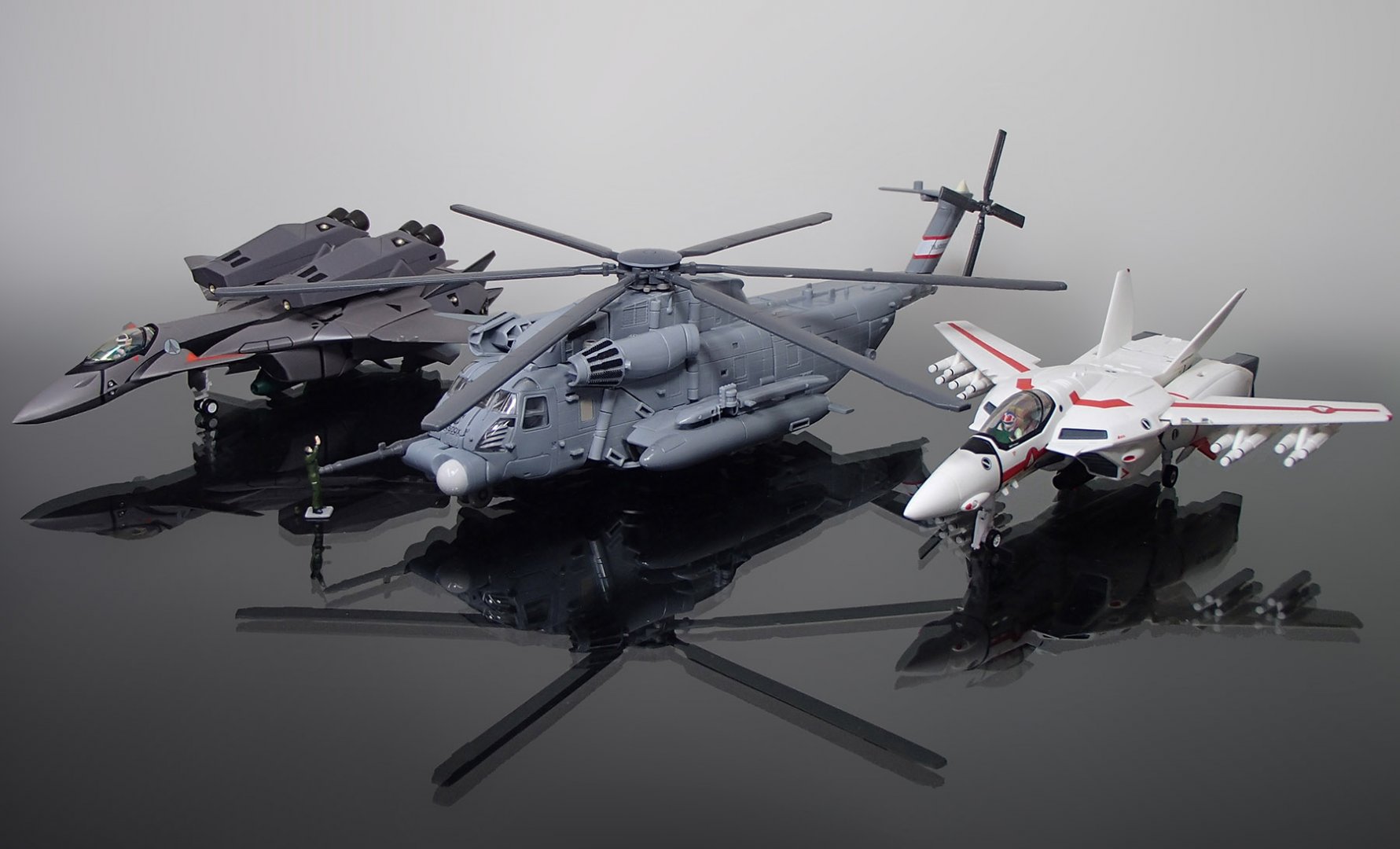
- 17914 replies
-
- 1
-

-
- transformers
- toys
- (and 5 more)
-
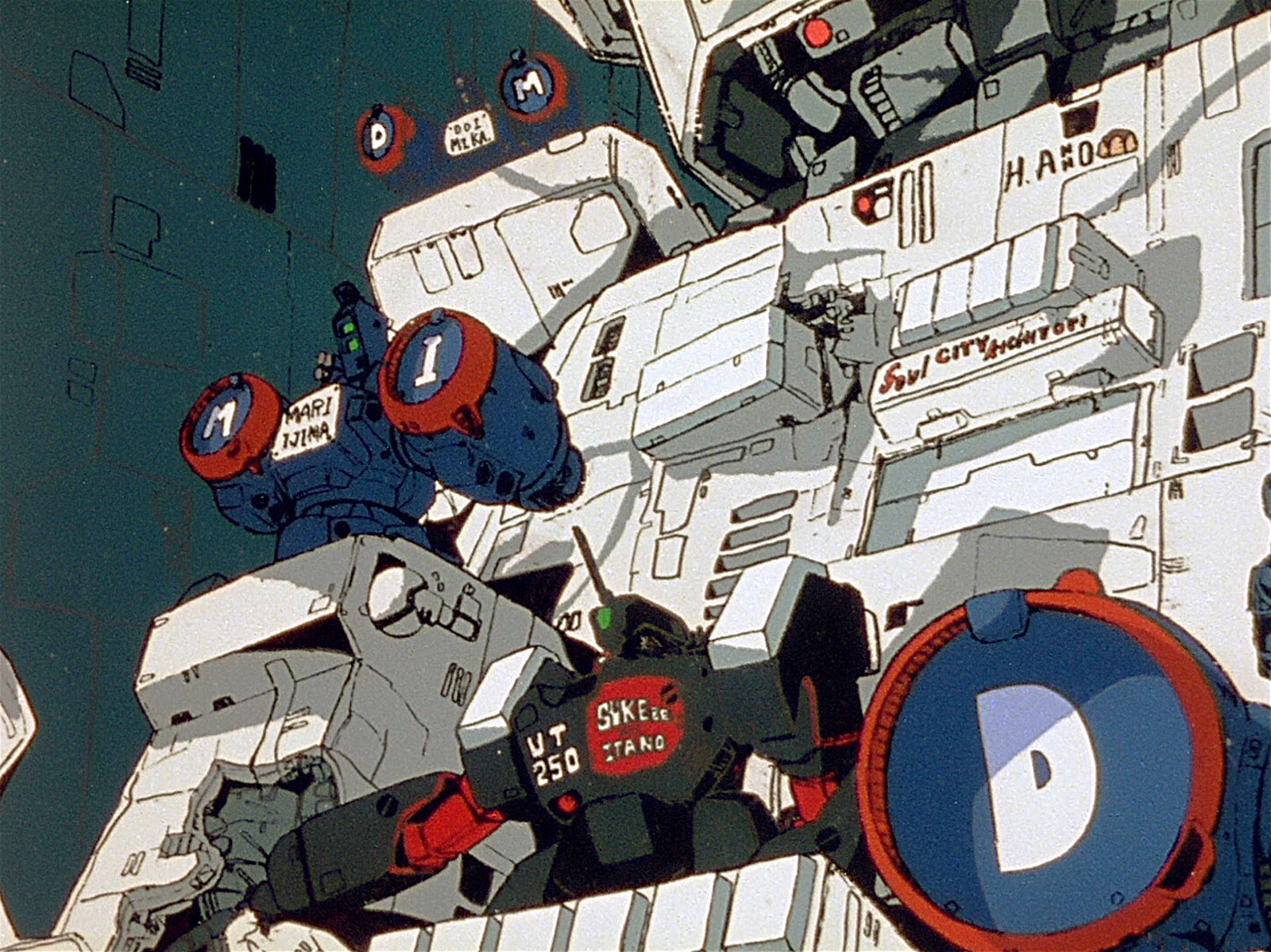
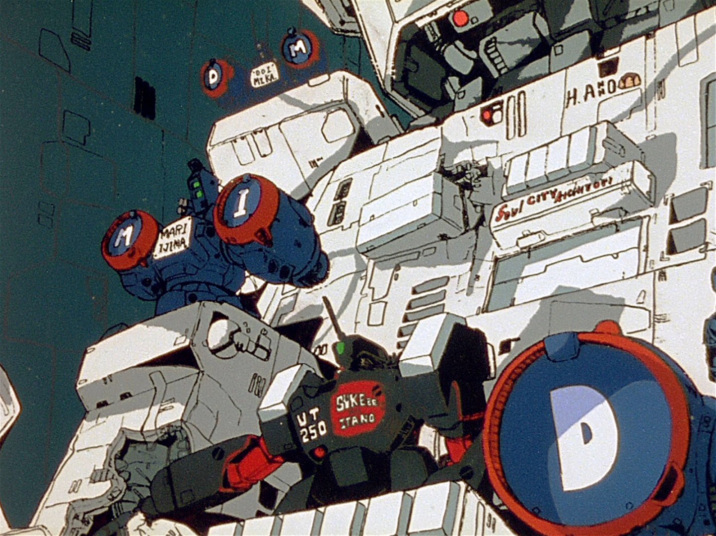
What, the one labeled "Itano the Pervert?" I doubt that's canon, any more than those Phalanx Destroids are.
-
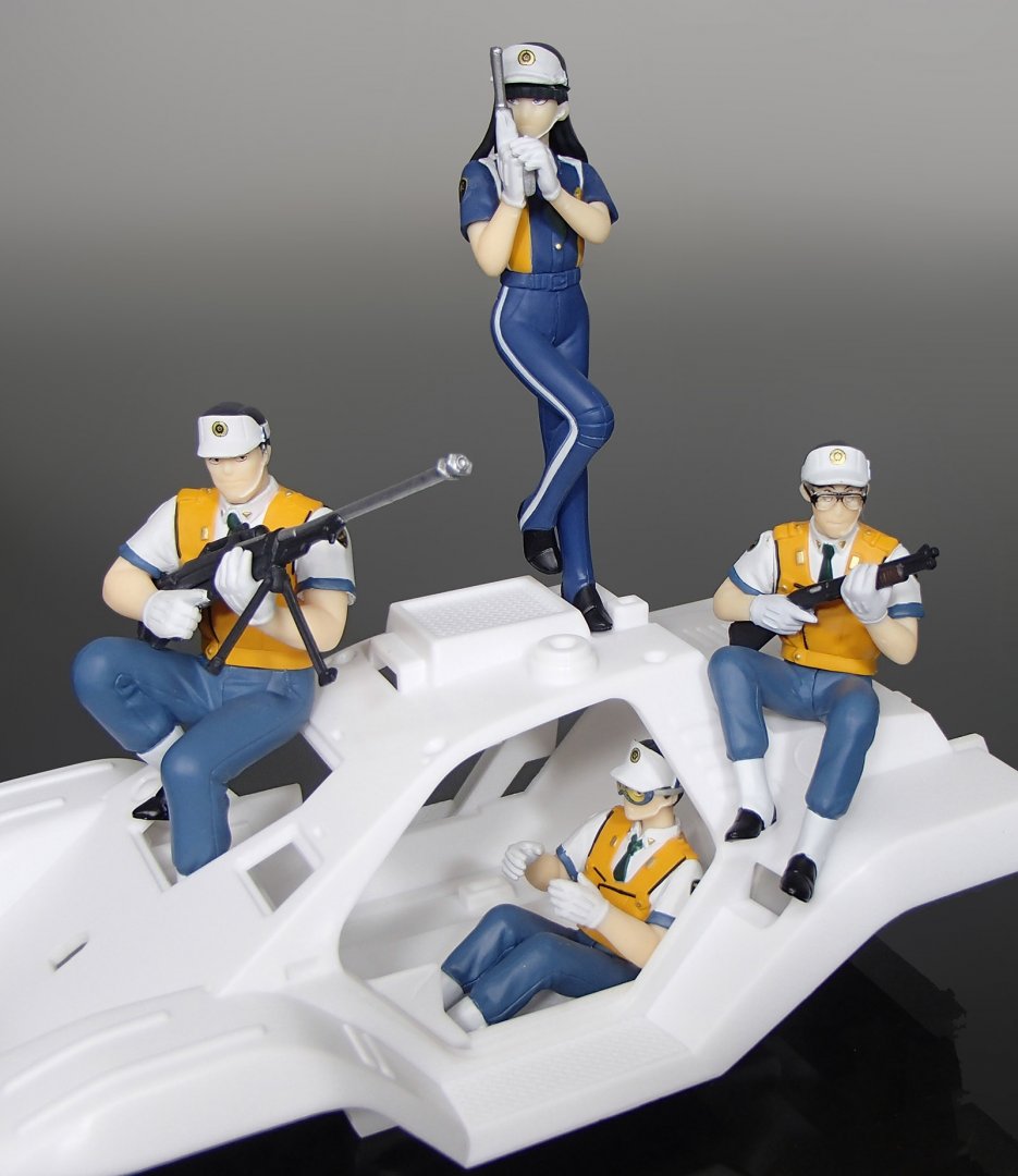
Actually, most of it's just repurposed accessories from other toy lines... DST, McFarlane, NECA, Hasbro... There's all sorts of useful stuff out there.
-
I'll take one of each!
-
The Unlicensed Third Party Transformers Thread
tekering replied to slaginpit's topic in Anime or Science Fiction
Despite the obsolete scale, ol' MP-1 is still my favorite. The ideal blend of cartoon and toy aesthetics, this is the toy that started it all for me. If it weren't for this guy, I wouldn't have spent the last fifteen years collecting Transformers...! -
The Unlicensed Third Party Transformers Thread
tekering replied to slaginpit's topic in Anime or Science Fiction
I had no interest in upgrading my MP-10 until I saw those new Transform Element pics. They just took TakaraTomy to school, yo! -
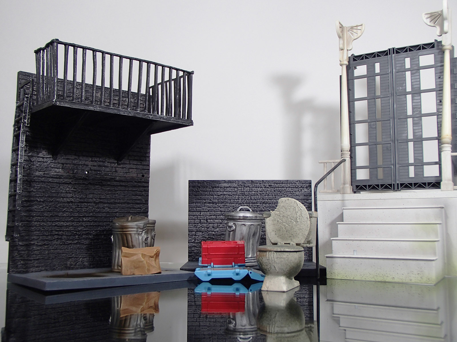
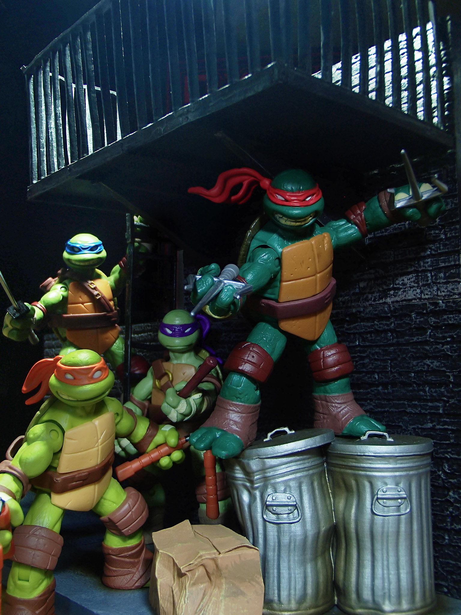
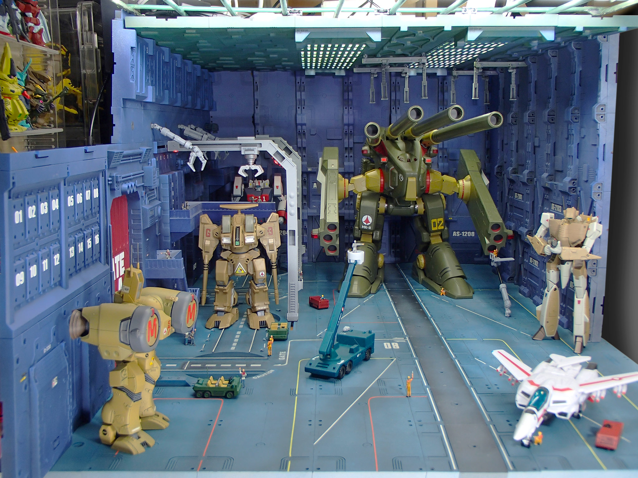
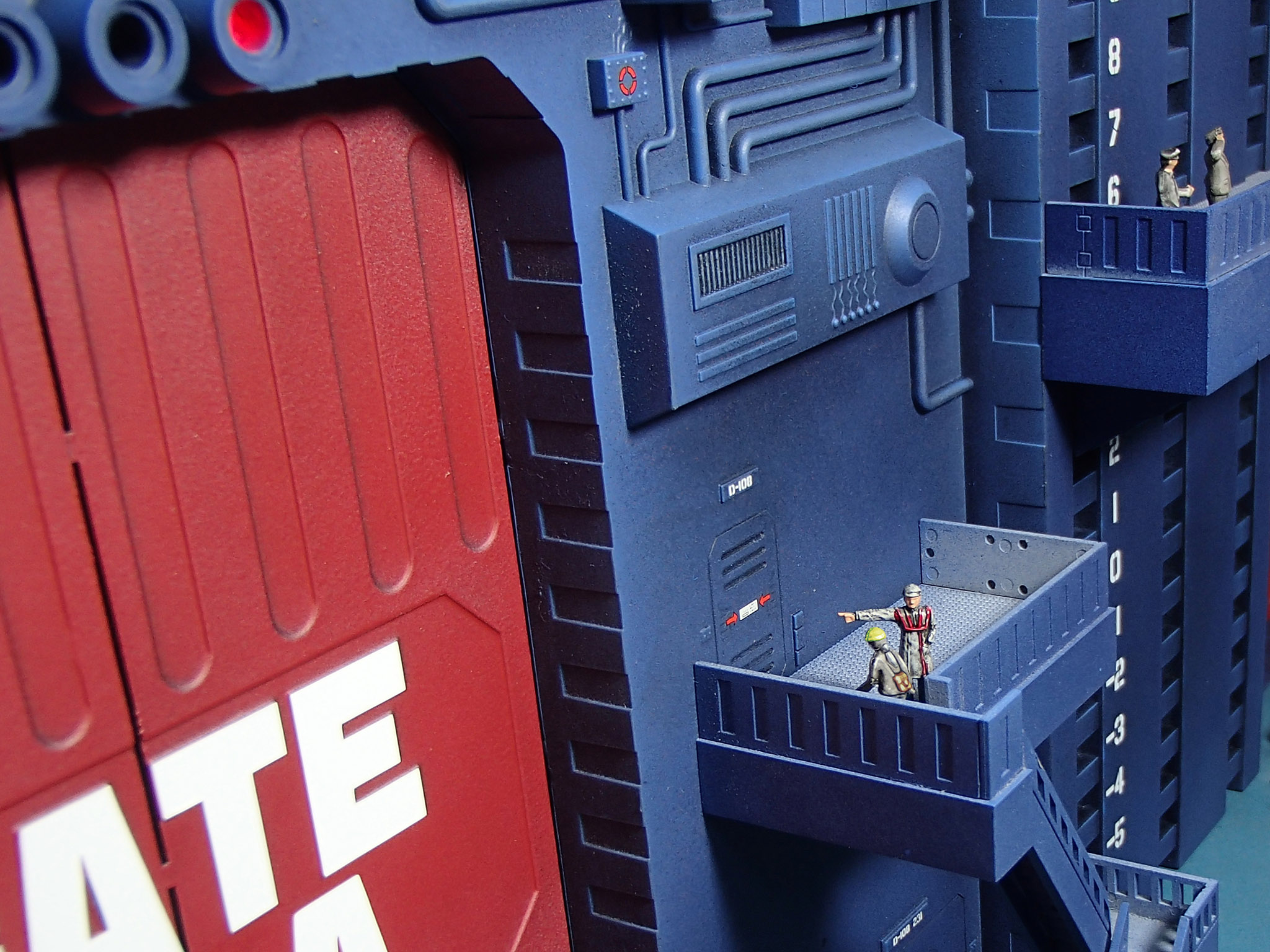
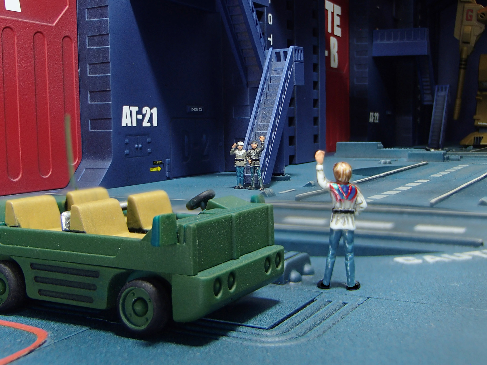
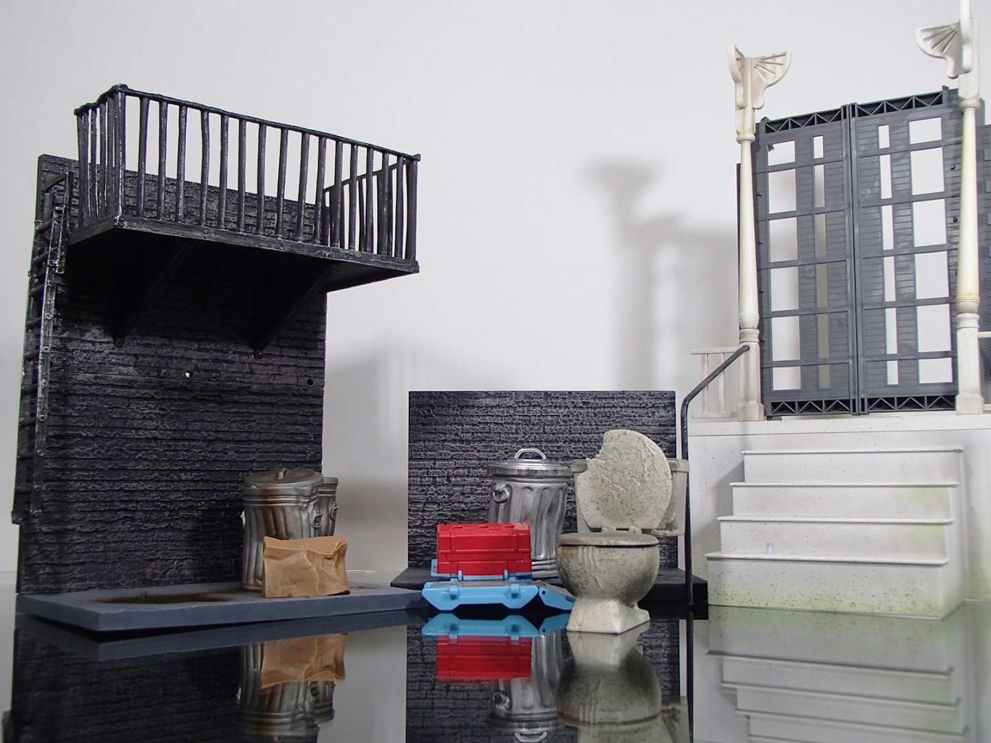
No, the city will remain 1:150 (except for a little forced-perspective here and there), but I intend to reduce much of it to rubble. In the meantime, I'm working on a 1:12 scale city alley diorama...

-
Your most recent Macross or toy purchase! General thread.
tekering replied to Gakken85's topic in Hall Of The Super Topics
Doesn't seem to have worked... But hey, at least you gave it a shot. -
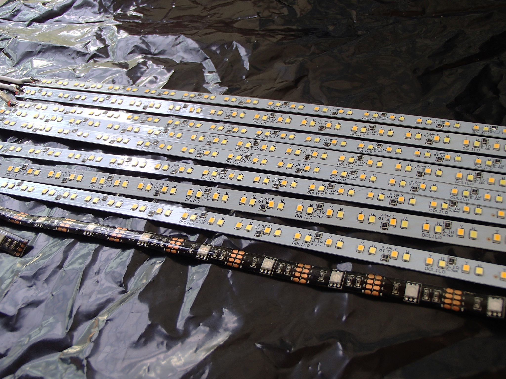
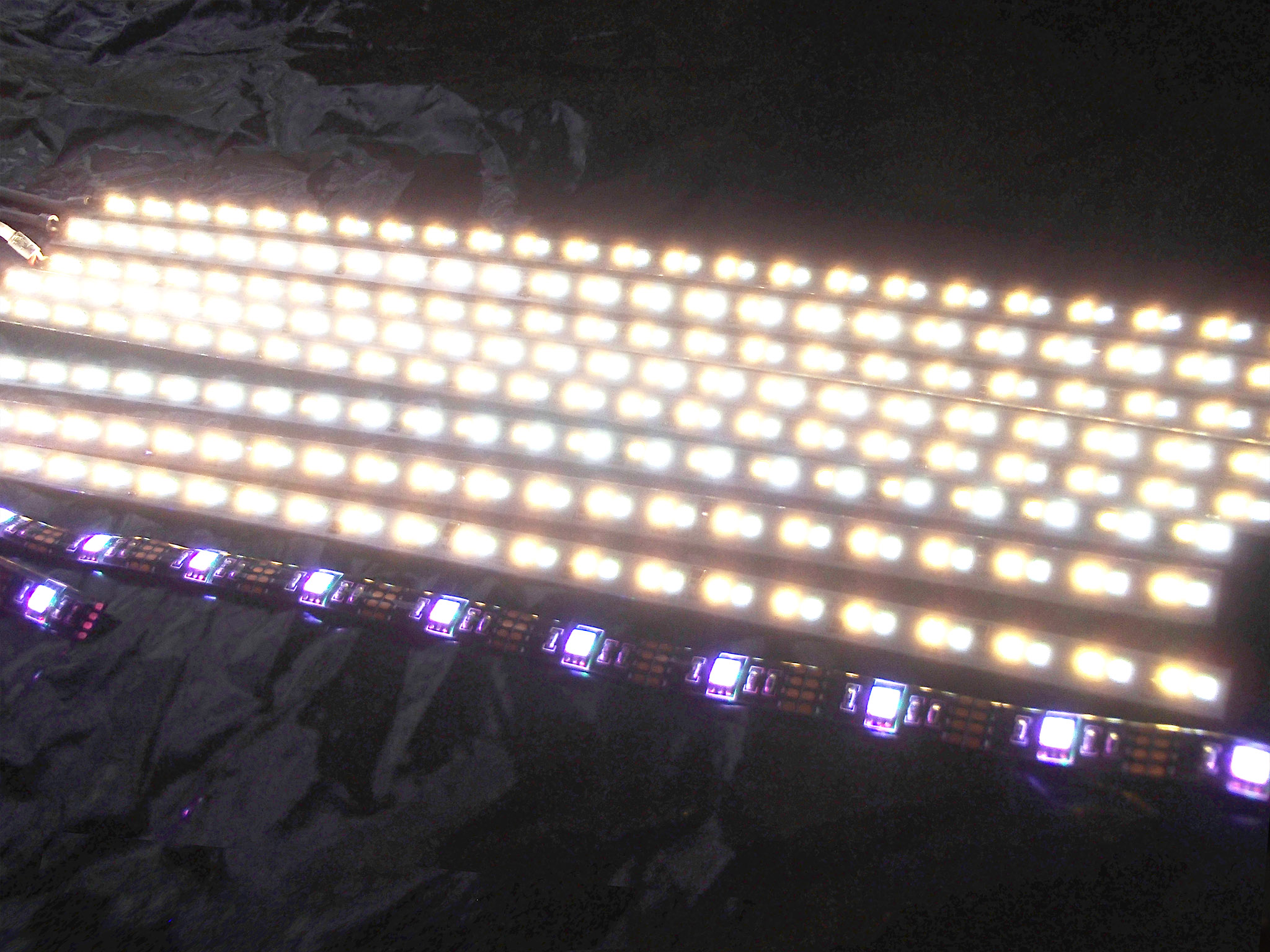
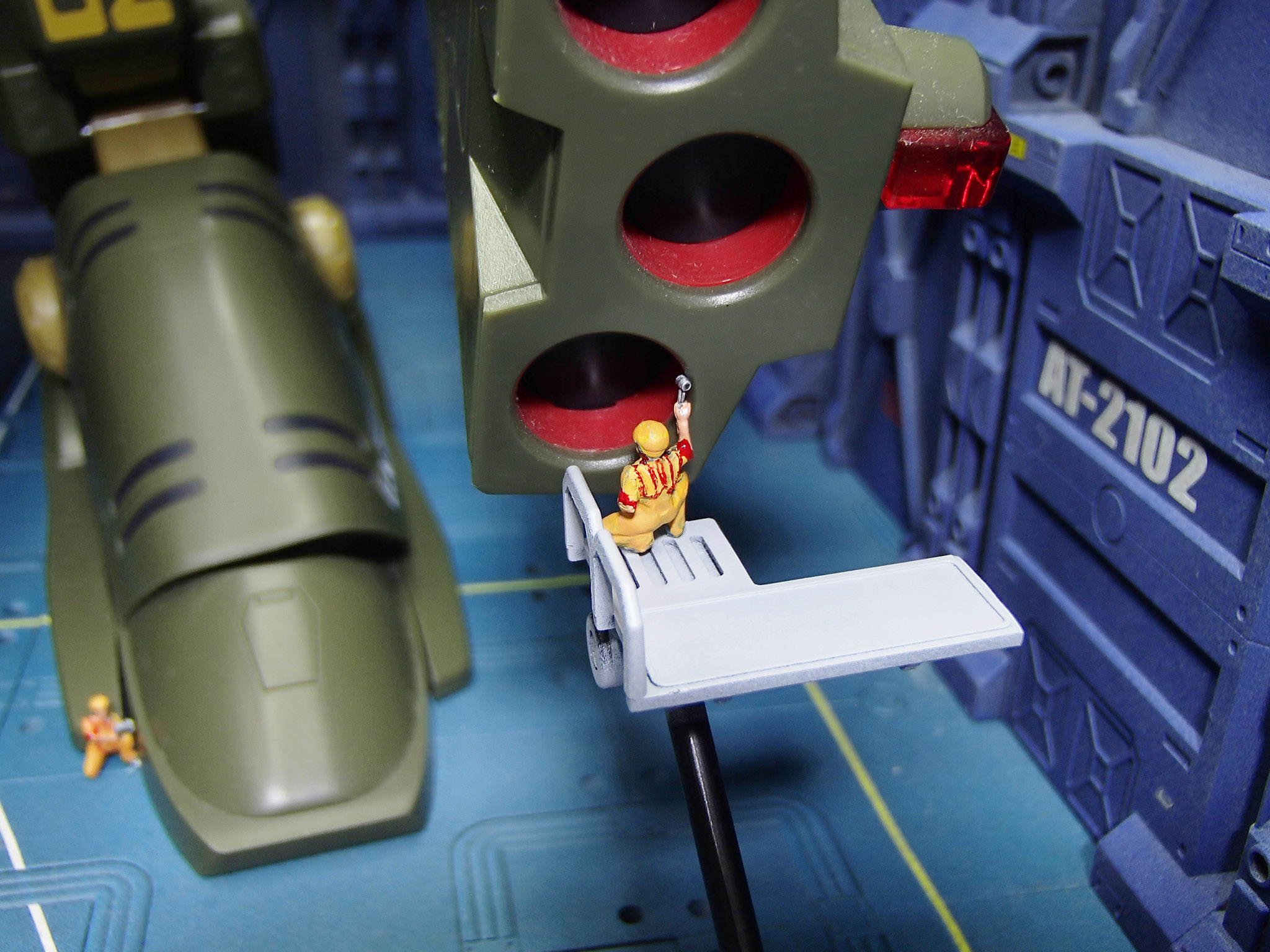
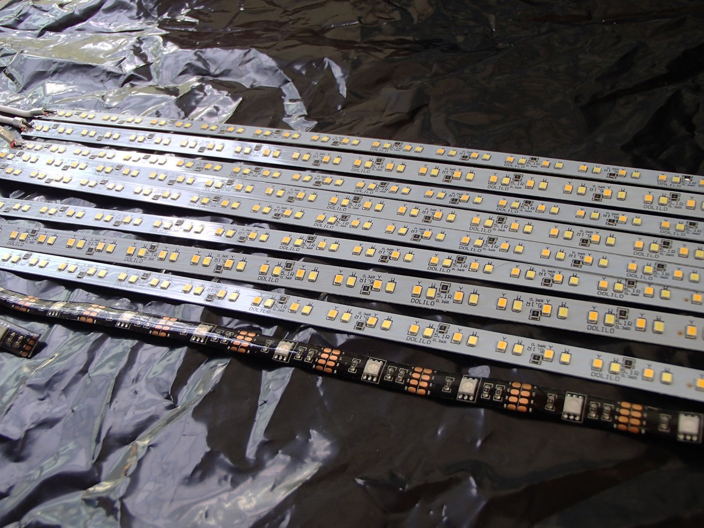
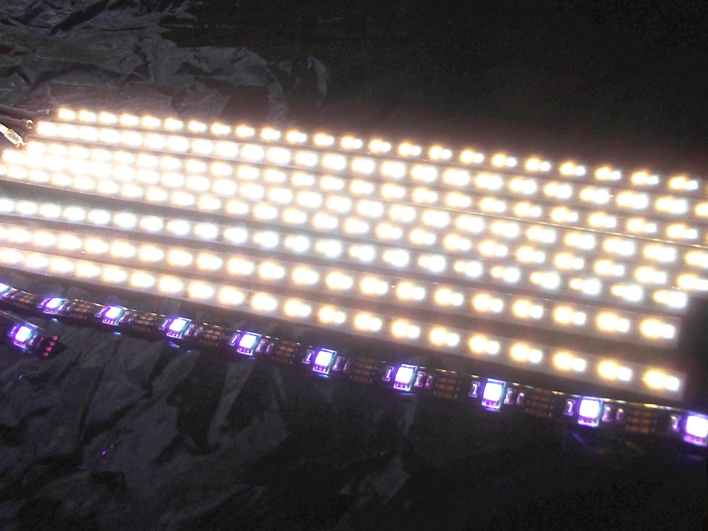
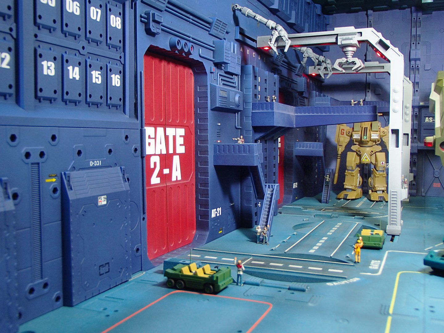
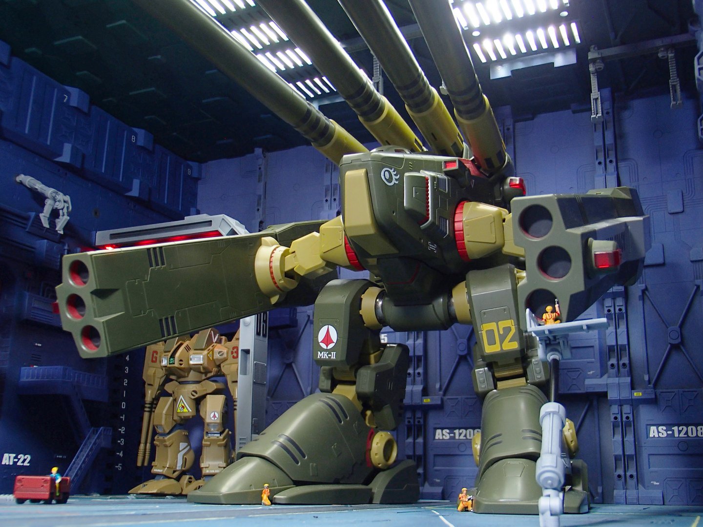
Looks good to me, amptor. Nah, I just bought a bunch of USB-powered LED strips... ...and then plugged them into a USB power supply. The overhead grating the lights shine through in the ceiling are repurposed panels from The Ubiquitous diorama sets.

-
Oh, Hollywood won't do anything nearly that good.
-
Much appreciated, gentlemen. I'm afraid my alter ego will have to suffice, for the time being...
-
The Unlicensed Third Party Transformers Thread
tekering replied to slaginpit's topic in Anime or Science Fiction
Looks like somebody screwed up scanning that Sunbow model sheet. The midsection should look like this:
-
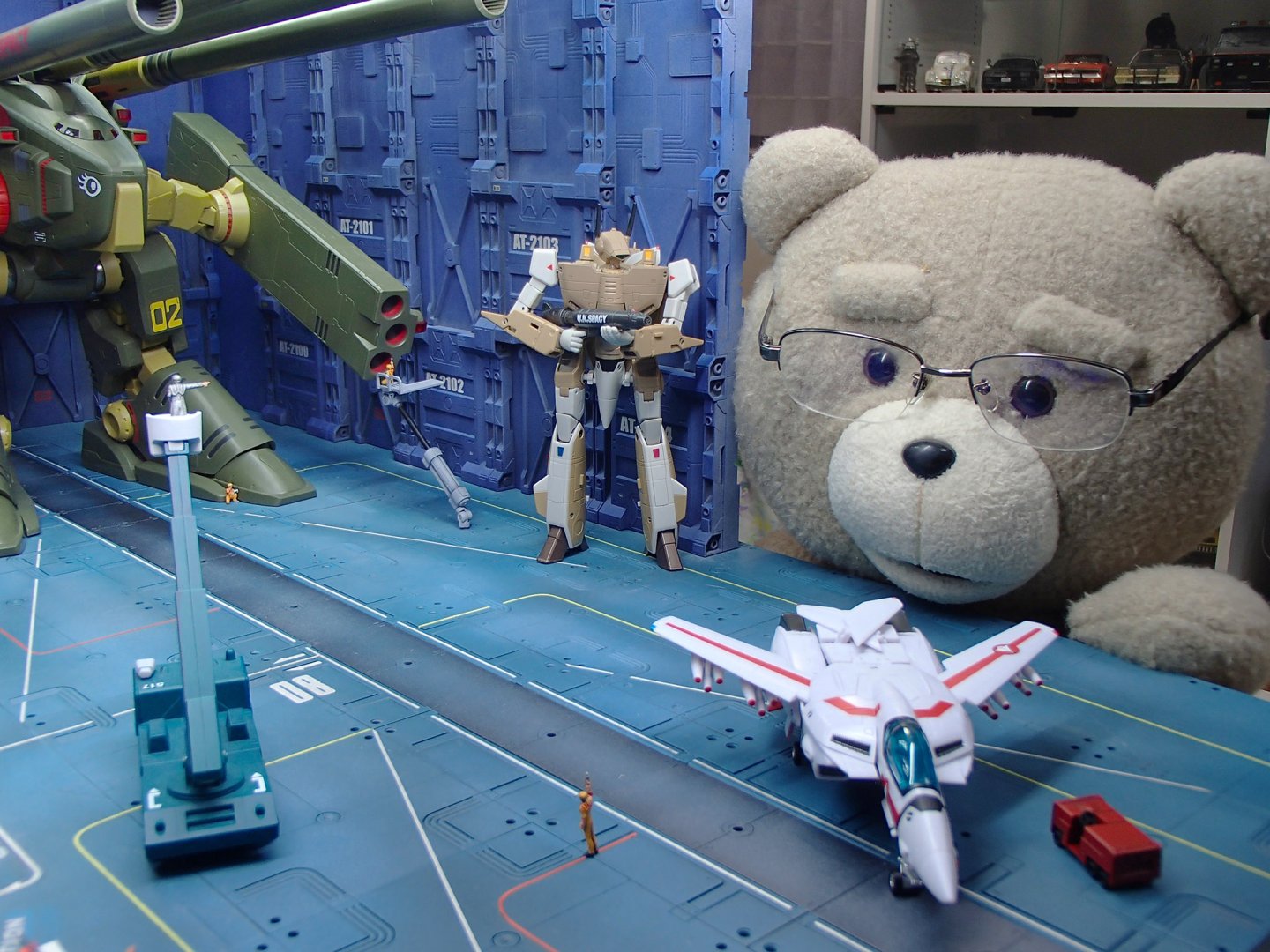
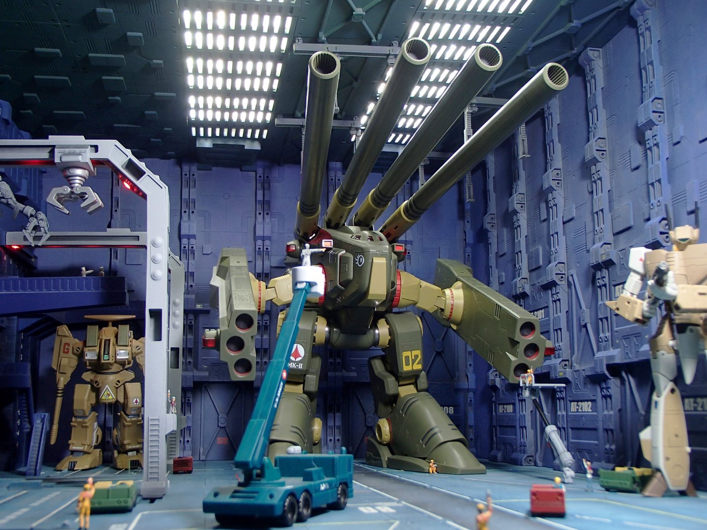
Ignore it, it's meaningless. Thanks, guys. Here's the rest of the shoot:


-
MOSPEADA INBIT KIT REVIVAL IV: EAGER?
tekering replied to captain america's topic in Anime or Science Fiction
Interesting. If you had access to a resin kit like that, why did you go to the trouble of sculpting your own from scratch? Were you unsatisfied with the accuracy of the Japanese kit? Did you enjoy producing your own Invid models enough to make it worth the time and effort? Were you hoping to make more money by providing a superior alternative for foreign collectors such as ourselves? When I think of how many classic anime designs have never been accurately-reproduced as models or figures -- like the frequently requested Southern Cross mecha -- I hate to think of you wasting your considerable talents on something that had already been produced (albeit, without the space booster). I suppose somebody could've recasted the parts, and stuck them into the box the original parts came in... although given how little the kit seems to be worth on the secondary market nowadays, I doubt it would've been worth it. -
So, you're going to the trouble of bringing your toys into the workplace (despite the lack of adequate light), just to take pictures with the crappy camera? Are they paying you to photograph your toys, or are you just neglecting your duties? Geez, I wish I had your job! No, it's all the redundant cross-posting that offends me. And your work ethic.