Chronocidal
-
Posts
10759 -
Joined
-
Last visited
Content Type
Profiles
Forums
Events
Gallery
Everything posted by Chronocidal
-
I wouldn't expect that prototype to look anything like the final product, it looks barely half finished. Looks like a quick paint-up using 3D printed components, and possibly chunks of previous valks. Those arms really are tiny though.. like, skinny little stick arms. The only thing giving them any bulk is the chunk of wing attached to them. The final version will probably be very different, and include the hardpoints and features that everyone has come to expect. As far as the missing pod goes though, I'm actually expecting something a little different than the helicopter one on the YF-30. Watching the trailer, and the silhouette from the battroid at the end, it looked more like the pod flipped around, extended, and possibly split into two over-the-shoulder cannons, which is a huge improvement over the stadium light mount. Aside from that though, as much as I like the VF-31 overall, I wish they would just ditch the stupid pod system. I don't know if it's just lazy, or what, but the implementation as of now looks like ass. It really looks like they just jammed that pod in there without a second thought to even trying to blend it into the design. I took a look at the teaser poster from a couple months back, and it looked nothing like that, completely smooth like the YF-30.. maybe it was just early concept art?
-
The fact that they're doing the VF-1J makes me think it's probably a market test to see if they can make it profitable. Same way they approached the Hi-Metals, if I recall. I wouldn't be surprised if every add-on pack or alternate paint scheme is a web-shop item (which really isn't a huge issue anymore, considering they're easier to buy than the standard releases ). I don't even want to think about the price of something like this though. Bandai seems to have become fully aware of how deep the pockets of the Macross fanbase are, and decided to dive in headfirst. While Arcadia can't really take any huge risks, Bandai doesn't share that particular restraint, and I'm curious to see how high-end they'll be willing to go. As far as the design itself is concerned.. I don't know why they couldn't just go 1/32 and be sensible, but it's not that huge a difference. I do get the feeling that this is how big the VF-1 will need to be before the anime-accurate leg transfer panels will actually be feasible to implement. It's going to take some massively strong joints to make it reasonably poseable though.
-
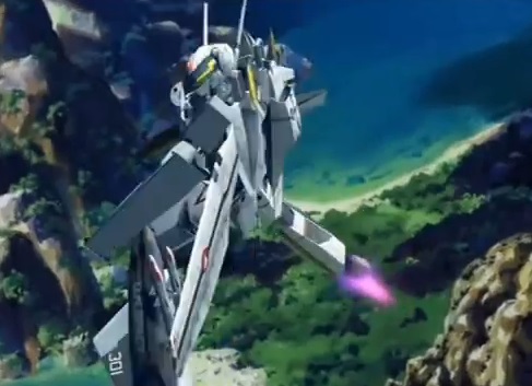
So I take it this is just an evolution of the entire Jamming Birds concept then? Hmmm....not sure if I'm excited or skeptical. On the other hand, it probably means that that red-haired Zentraedi-looking girl is likely one of the pilots for this group, with a backseat backup singer. So we might get some female pilots after all, possibly on both sides of the whole conflict. As far as the design is concerned... it looks really unfinished at best. It's got engraved details for the front gear, but nothing there yet, and no sign of rear landing gear at all. Also, the implementation of that pod thing is terrible in fighter. It's not even as streamlined as the YF-30's, and it's like they made no attempt to blend in where it attaches. It honestly looks like they used the backplate from a YF-29, but left the shield off, so you have that weird jagged attachment point at the back. I mean, I like the overall design, but this is clearly far from finished.
-
I'm perfectly ok with a 25 style torso really (except I've never liked how unstable the head mechanism is on all the recent valks). The YF-30's torso was kind of just a mess of folds, and if that's what it took to get the missile pod to fold away nicely, I'm all for it.
-
They've even got glaugs and battlepods making appearances in there, I wonder if they'll be marketing the new Hi-metals under the Delta logo?
-
Or an added character who joins the group mid-way through the series. Also, I (fortunately) miscounted. It looks like the Draken squad is in classic Diamond Force colors, one with yellow/gold stripes, the rest with white/silver.. fortunate because there's actually 6 of them. Looks like 5 on the VF-31 side though, and I expect those will all be unique. This is going to be a serious struggle for people who like elaborate displays. Oh, small note.. People were debating whether the wings on the VF-31 were forward swept or drooped.. looks like a combination of both, judging by the lighting in those clips. They look like they fold in half at the mid-point.
-
Loving the aircraft, but I'm getting really curious what sort of story this is going to be... It literally looks like something out of Ace Combat Zero, what with the themed squadrons facing off. Also, while I'm glad to see more female pilots (finally), I'm worried that we've basically got a singing aerobatics demonstration team showdown in the making. I mean, it might be good? But we all remember what happened last time we got a singing pilot... On a more wallet stabbing note, I love how they're building the mold milking into the show from the beginning. That's already TEN distinct paint schemes that we'll probably be seeing hitting the shelves.
-

STAR WARS Merchandise Episode - 2
Chronocidal replied to Black Valkyrie's topic in Anime or Science Fiction
I don't think there's any design there to ruin, it looks like an 80s cell phone with fins and a cockpit attached. Doesn't look even slightly like a fighter, if anything, I'd assume it's some extrapolation of the "let's put the cockpit on one side" design philosophy used in freighters like the Falcon and Outrider. -
Given what the poster showed, I think the tails are much more incorporated into the wing structure this time, it looked like the tail roots stretched nearly the entire chord of the wing, so there's going to be no stupid spinny-pin-hinge tails this time. At best, they'll probably fold flat. Now, if they can just get those hand covers to look a little more streamlined in fighter mode. The YF-30 ones weren't terrible, but they didn't blend in very well at all when the hands were inside. Also, I'll be interested to see a new take on the gadget copter launcher, hopefully this one actually has the option of folding away.
-
One of my co-workers and his wife both love unique names, and he offhandedly suggested Revan as a half joke, but she actually liked it, even after telling her where it came from. On the other hand, Ewing actually is a name... I know if I ever met someone named that, I'd have a very hard time pronouncing it correctly.
-
Put in an order for one at HLJ, but may not keep it depending on how the holidays go. I mostly just want a spare to customize.
-
STAR WARS Merchandise Episode - 2
Chronocidal replied to Black Valkyrie's topic in Anime or Science Fiction
Ohhh, they actually have one of the collapsing cloth ones? I've got the foil folding version, but that one's plastic gets so hot in the sun I can't even touch it. Also, I've seen a reverse angle one looking at the backs of their heads going into hyperspace for the back window. -
I've always just assumed that you could shape shields in whatever shape you needed, so the surface the air interacts with would just be a big smooth aerodynamic bubble. And as far as design lineage goes, they did show a bit of that in the later designs from the prequels, especially where the shuttles are concerned. Get into the Clone Wars, and you've got the "original" Y-Wing, which I thought was a fun take on why the ones in ANH looked so bare. For VTOL functions though... all Star Wars tech just runs on upsidaisium. All ships are actually just lighter than air, and carry around ballast tanks that they fill with heavily compressed atmosphere to become heavy. Pay no attention to Luke's ship sinking, he forgot to blow his ballast so the ship would float.
-
STAR WARS Merchandise Episode - 2
Chronocidal replied to Black Valkyrie's topic in Anime or Science Fiction
If the scales are correct, it'll be half the size of the Fine Molds 1/72 one, so about 8 inches long, and 7 inches wide, I think. -
Laws of physics might be able to be broken, sure, but that doesn't change the fact that the design still looks horribly lopsided and unbalanced to me. If you ignore the physics, yeah, it's just aesthetics, and I just think the change to the wings is the ugliest thing ever done to an X-wing. I can't come up with any reason whatsoever that that would have some sort of benefit for the design, even in-universe, and it just feels like it was done for the sole purpose of changing things to make them look different. Like.. I would love it if it was the original concept. I've loved that design forever. This thing just isn't that design. But anyway, back to actually discussing things more people care about. Bottom line, more kits and toys for people who actually like the design, since you won't get any competition from me.
-
Bleh. Long story short, I'm stupidly picky about these kinds of designs, and I hate changing things just for the sake of making them "new," without thinking about what effects those changes would have. The JJ-prise was scaled up after the design was already done, and they didn't bother to adjust the structural cues on the exterior to match it. I don't mind the design aesthetically that much, it just bugs me that the design is basically an unfinished job now, that has no real coherence between interior and exterior details. On the X-wing, I can't stand the new wings (if you can even call those toothpicks in the front "wings"). The asymmetry drives me nuts, both in an aesthetic sense, and from thinking the ship would roll like a lopsided kickball from the uneven mass distribution. Why couldn't they just keep all four wings the same shape? And to top that off, because of how they tweaked the way the wings merge, they're only attached to the engines by half of their thickness, so they look like a huge structural weakpoint. Apologies for bringing this up in general, but yeah. Maybe I'll get one of the new kits eventually to mod into the original ANH concept art style, but those wings make me cringe in more ways than I even want to list.
-
Yeah, I was jumping the gun with the colors because it looked like another random change from the Yamato version. I still like the original version better, because it matched the tails, but apparently that was never the right color to begin with, and Hasegawa's painting guide was wrong from the start.
-
Actually, looks like the new color might be right after all. I think the old versions went by the Hasegawa marking guide, but the new ventral fins actually look like they might be the correct color, at least for Episode 1.

-
Eh, I view the new X-wing like I do the new Enterprise: changed to look different without anyone actually thinking much about the changes, or whether they would make sense, even in-universe. That's just my personal impression though, and not really anything worth getting into here. Between the quality of the Revell kits, and the lack of the Bandai ones though, that just makes it easier for me to stick with the originals I already have to build.
-
Whether the movie is good or not, the merchandise will usually be entertaining in one way or another. And either way, once you get the hype-train rolling, you know that even if the new movie is terrible, all the nostalgia for the old movies will result in tons of merchandise from them as well. I'm really not feeling any of the new ship designs, but I'm loving the new model kits of the original ships.
-
So, dunno if this will be any kind of actual truth in speculation, but I find this rather amusing. Or on the wacky side of things.. And no, I haven't actually watched this trailer yet, so it's very likely that none of my wild guessing is even remotely true. But really, I know they declared the EU to be a separate universe, but I can't help feel they're still milking it for plot points. As far as the Trek Wars go though.. I always thought the 2009 Trek reboot was the best Star Wars movie since the original trilogy. The change to pulse phaser turrets in the opening kind of cemented that in my mind from the start.
-
Amount of tampo is one thing... but wrong tampo is something else entirely, and they still have not fixed the colors on the ventral fins.
-
Evolution Toy - VF-2SS Valkyrie I 《MACROSS II ~LOVERS AGAIN~
Chronocidal replied to joppewo's topic in Toys
Some of those joints are the weirdest things I've ever seen.. what's up with the wrist.. cuff.. flippy parts? Literally the only time I've seen a construction like that on a valk was when I used a cylindrical plate to mount the hands on a Lego valk I made, just because they had built-in pivot points. The molding and construction looks clean at least, but I don't know how that thing will ever stay together. The mounting tabs for the legs in fighter mode are incredibly tiny. Also, as far as construction goes, the reason the belly looks so empty is because they didn't make the intakes under the chest plate deep enough. That entire assembly should be thick enough to completely envelop the swing bars for the legs. Sad that it looks like while everything else is such a mess, this might be the first actual example of movable intake covers. -
STAR WARS Merchandise Episode - 2
Chronocidal replied to Black Valkyrie's topic in Anime or Science Fiction
Looks like most of them are still available through Amazon, but yeah, Disney made a mess of the licensing. There's been a lengthy discussion about it over the past few pages. -
Didn't someone figure out that you can actually shove the gunpod handle into one of the slots on the belly? I don't know how well it would fit though.. I know someone had considered making new wings or belly plates with attached hardpoints though. I just don't remember if they were completed.