
MacrossJunkie
-
Posts
3154 -
Joined
-
Last visited
Content Type
Profiles
Forums
Events
Gallery
Everything posted by MacrossJunkie
-
That's plain awful. I moan about the shipping costs being up to $60, but I'm thankful I don't have to deal with customs and duties on top of that. Rising fuel costs and high inflation really sucks.
-
I would love if they actually improved the mold a bit too. The super and green one was basically a v1.5 with an improved hip/crotch, using the renewal VF-25 mechanism. But it still lacked the detail and refinement that the renewals had like panel lines and such, which they tried to compensate for by way overdoing the tampo printing, plastering random markings and stuff everywhere.
-
It kind of looks like it will. The dark shapes behind the clear pieces look like they could be LEDs. Even if they aren't lights, I hope they leave it easy to disassemble to allow for modding. Is it me or do the side panels on the leg in that pic look removable? Like... say... for a city?
-
I think the only one that came close to that color was the FP version of the Yamato 1/72 YF-21?
-
I just edited my post. Check the first link.
-
They're from many years ago, so I doubt it. However, you have better options now as you can go to ebay or other places and get some 1/60 waterslide decals for the VF-1 and they should work just fine. Something like this: https://www.ebay.com/itm/392912244406?mkcid=16&mkevt=1&mkrid=711-127632-2357-0&ssspo=JBPAMr0eQYi&sssrc=2047675&ssuid=&widget_ver=artemis&media=COPY Avoid this though. https://www.ebay.com/itm/132263930355?mkcid=16&mkevt=1&mkrid=711-127632-2357-0&ssspo=eQq8BKGURZ2&sssrc=2047675&ssuid=&widget_ver=artemis&media=COPY The No Step actually say "NO STLP"
-
Yeah, I hated those stickers from Yamato back in the day. They continued using those double or triple layer sandwich monstrosities until the VF-11 or VF-1 v2. I forget exactly. The corners on the top layer would also start peeling. Even the later ones were still kind of thick, but still not nearly as bad. I had used stickers meant for the VF-1 from @takatoys back then for most of the markings. They weren't waterslides, but they were a huge improvement over what came with the YF-21. Trimmed properly, they looked pretty decent.
-
Even if painted, they'd still look cheap. The VF-25 and YF-29 fans in the primary intakes were especially egregious. At least the DX VF-1 fans have sharper, more defined details. In my opinion, Yamato/Arcadia generally did better in that area. That and painting the landing gear. It's funny that Bandai and can cover their valks in tampo to the point of overkill (see VF-27 super, DX VF-1, YF-19, YF-21 prototype), but can't be bothered with painting basic things like the intakes and landing gear.
-
The profile from that shot looks slimmer than I thought they'd be able to manage. That gives some hope that some revisions may be made, but only a glimmer of it.
-
At this point, I don't care if the cannons are a little too long or a little too short. If this doesn't become vaporware, we're finally getting a detailed large scale transforming (I assume?) TV SDF-1. That fact in itself seems like a miracle considering how no one wants to make any cap ships from Macross despite the plethora of cool designs.
-
I might be in the minority on this, but I feel like aside from the strange blocky heel, the Bandai YF-19 was pretty good proportionally in all modes. Like the VB-6 Konig Monster, it was reworked to be able to be used as a proportionally consistent CG model and I feel that both the VB-6 in Frontier and the VF-19 Advance (more or less the same as the YF-19 aside from the canopy and heel) did a good job translating the original line art forms to a 3D model. Meanwhile, Arcadia was going for the anime look succeeded there as well. I don't feel that level of effort in this Bandai YF-21 though. Like comparing the half assed effort in the VF-25 v1 to the renewal versions.
-
Makuro no sora oooo tsuranuiteeee... 😁
-
The fuselage feels too short as well. Even if we ignore the issues with fighter mode, saying it's for the sake of battroid mode, I'm still not very keen on the stubby bay doors and the weird cheap looking double jointed skinny upper arms. That said, I'll still get one if it gets released, but I was hoping that they used the time since the first time it was shown a few years ago to make improvements. Unfortunately, that doesn't appear to be the case.
-
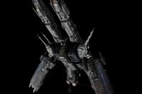
Oh my. This looks really nice. There's a lot of surface detail on it. I'm scared to know what the price will be for a 2ft long SDF-1.
-
That's pretty cool. I didn't know prototypes like that existed. Do you mean when they were initially called "breast fighters"?
-
I believe Chronocidal is talking about the LERX extending past the canards when they shouldn't be, according to the line art.
-
They're missing their chance to do the Ba variant again... At least this time, any QC issues could be chalked up as a feature as they all get shot down within minutes by the 303's. 😛
-
So, I wonder, is the fourth time going to be the charm or just more of the same QC issues? They can't possibly have ignored glaring issues for the 4th time in a row. Right guys? ...right? *grabs tank of copium and starts inhaling*
-
Who wants to bet that they haven't done a thing to fix the warped/bent sniper rifle? Anyway, I see the fact that they're showing the 25G and RVF-25 with supers as a good sign towards getting the armored 25F rather than the super 25F being a one off release.
-
Bogue pilots this.
-
To me, it looks more like Messer's color scheme. Maybe Arad decided to steal the color scheme since Messer wasn't using it anymore 😁
-
1/48+fp's, 1/60+fp's, 1/72, 1/2k, 1/3k,1/100 and now 1/144
MacrossJunkie replied to VF-18S Hornet's topic in Toys
Same. I can't say it's one of my favorite designs, but I wouldn't mind a high quality version. It would probably require some ingenuity at least on the level of Sentinel's Legioss to get it to look right. -
1/48+fp's, 1/60+fp's, 1/72, 1/2k, 1/3k,1/100 and now 1/144
MacrossJunkie replied to VF-18S Hornet's topic in Toys
Thanks for the summaries, guys! Oddly enough, it seems that mine is still pretty tight and can be put into awkward positions on one foot. I'm a little tempted to get another one now that I think about it. The one I have was one of my starting weathering attempts and I'd like to see how much better I could do now. -
Might be an unpopular opinion, but I find the SV-262 is at least way better looking than the 303 in all modes. I personally think the SV-303 is pretty ugly with its multicolored neon tron lines and odd looking battroid. The design might grow on me, but currently I'm not a fan. If they try to make a toy out of that, I fear those neon lines are not going to translate well in toy form (not that they translate well in any other form of media either). But yeah... I fear the 262 has probably not only fallen to the bottom of their to-do list, but impacted and broke through the bottom and fell into the abyss, taking the Arad and Chuck supers with it among other things.
-
1/48+fp's, 1/60+fp's, 1/72, 1/2k, 1/3k,1/100 and now 1/144
MacrossJunkie replied to VF-18S Hornet's topic in Toys
Is there something different/improved about the Arcadia version that makes the Yamato one merely a stand in? I haven't been paying much attention to the Tomahawk release, so I'm genuinely curious.
