
Mommar
-
Posts
13796 -
Joined
-
Last visited
Content Type
Profiles
Forums
Events
Gallery
Posts posted by Mommar
-
-
I can't help but remember the days that we argu... discussed that whether the DX 25 was "done right as it has to be chubby for this size to be transformable" or "half assed effort".

I guess the people who called it a "half-assed effort" turned out to be vindicated.
-
I'm interested in some of the other ordinance you mentioned from the Master File Book and the new gun pod. Not so much the initial set... well, unless there was some way to attach the MPBMS to one of the new VF-25's.
-
What did you use to plug the screw holes? The surface looks immaculate.
-
The D head is so much better than the S missing that mongo forehead.
The better to headbutt with.
-
I completely disagree. Game of Thrones, which is probably 98% faithful to the books is how a TV adaptation should be.
For myself, if I'm watching a book-to-TV, or book-to-movie adaptation I want it to be as faithful to the source material as possible.
Honestly, if they had changed the title of The Walking Dead TV series to "Extremely Loosely Inspired by The Walking Dead", I probably would have enjoyed season one a lot more. At least then I wouldn't have had any false expectations.
Graham
When the show was first being discussed they were very clear they weren't going to completely adhere to the Comic Book story because they didn't want to retread old ground and because they wanted to give the readers something different to look forward to and be surprised by. You can argue they've done a bad job at this so far but it was never a secret they were going to deviate.
-
Not just purple, but with new weapon as well!
Does that fit in it's leg too?
-
Does anybody know if Yamato was at, and was showing off some of this stuff, at the recent All Japan Plamodel Hobby Show this past weekend?
-
So how much longer till this comes out? I want it... I NEED IT!!!
They say "Late November" and Yamato stuff usually ships the last Friday of the Month so it's a safe bet somewhere around the 25th of November.
-
It looks like they got it better in the photo on the left:

Hard to tell if it's the angle of the photo though. One is up higher than the other. There isn't a big difference there. The color on the left looks a lot better IMO.
-
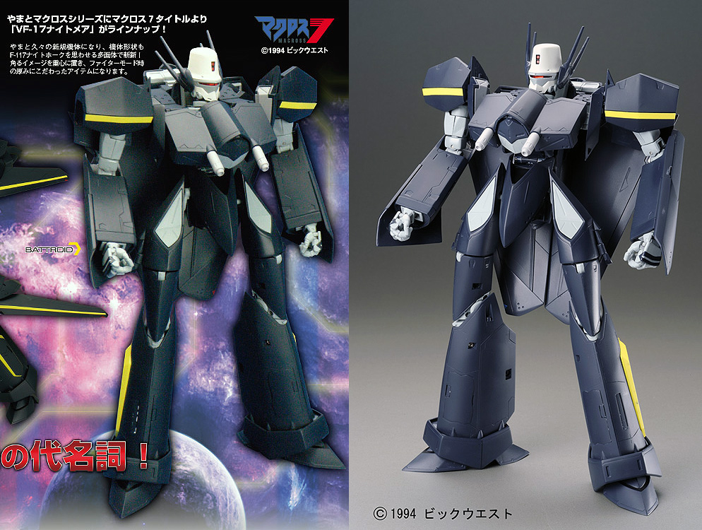
Just wondering, but I just looked at the lineart (*ducks in cover*). It seems that this battroid mold would look GREAT if they could just push the chest piece down a bit. Seems to be a bit to parrallel to the ground, where as it should really be pointing further downwards. Maybe the yamato showcasters talked with Hasbro, and are presenting mistransformed shots?
Dunno, but I think it would look a LOT better with that adjustment
I had already pointed out earlier that on the CAD drawing from head on we saw several months ago that the chest piece was lower. I'm wondering if this prototype can't pull that off right now because it was planned to be lower from what I can tell.
-
Well, I pre-ordered. Luckily I'm paranoid about funds and largely save everything I earn so I've got quite a bank account going. I feel bad for some of the others who aren't so fortunate.
-
Any insight as to how/if there will be a cockpit mechanism for battroid, or if it has ratchet or ball jointed ankles?
Hovering over a pre - order with these two things in mind

I'm willing to bet this thing has ball joints.
-
I went back and checked out the old CAD photo of Battroid Mode from head-on. I know things can change between the CAD and implementation but all of the proportions look exactly the same. The only thing different is that, while the very bottom of the chin is covered, it appears the chest piece on the CAD sits lower then in these photos. I'm wondering if this prototype isn't quite sitting correct. It doesn't appear to be in fighter mode either. But I'm willing to bet that chest piece isn't set quite where it should be, which should make a least a small difference.
-
I'm hoping for the end of this week so it'll have a week to reach my house by my birthday.
-
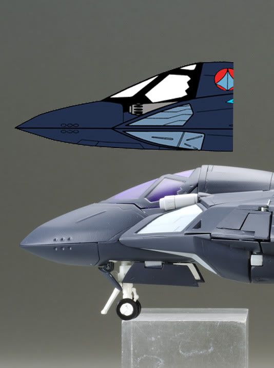
I think the nose is too "bulbous" and probably is the new gullet and that simply noone looked at the exact angle comparison like anime52k8 posted. Probably too late to change by this point, I imagine. The rest of fighter, I'm more than happy with and expect it to be a bit tighter in production.
It's already been pointed out that the lineart anime52k8 posted is not official and isn't accurate.
hey they should totally make the one variant from VF-X2
am i right
Totally right, I think it's a brilliant idea and they should do it.
-
check !!!
 and
and  hole for the gun!!
In the anime I'm not fond of that Gerwalk at all. Based on the two Gerwalk Stances (arms up and down) I almost prefer that mode to the other two on this toy though. I expected this to be the first toy I would keep primarily in Fighter or Battroid because I don't like it's Gerwalk configuration but I'm not getting that feeling with these prototype pics.
Based on all the other angles, the fighter mode looks great.
It's just that side profile shot that really gives me pause.
Maybe if the nose was extended a little bit (like anime52k8 said), it would help. But then, we'd have the issue of the codpiece in battroid looking a bit too long.
Compromises between the three modes. Always a tricky thing to manage.
I really think that side-profile shot is suffering from the fact it's a resin kit that doesn't hold together well. You can see huge gaps in the shoulder area. The nose is obviously dislodged and drooping in multiple spots. It also appears the legs are not attached at the back and are hanging away from the backpack as well. I think it will look a lot tighter (obviously still a little chunky) in fighter mode with the final toy.
-
I know, but I want it to look like this:
a nose closer to the profile art and everything else the same would look so much better in my eyes.
Based on that prototype pic you can also tell that it's really isn't holding together that well either. Look at all of those seems and the whole front of it looks like it's dropping. Tighten up those joints and I bet that will make it look more slim.
-
Green Zaku's at least have "that military look", do to being multiple shades of camo green. The M7 VF-11C just looks "unfinished". Sure it may have the most screen time, but doesn't make it the most-wanted. We see a lot more red Vajra's than Ozma's valk, but what's more desired? It's more of a "time spent being awesome" than "total time spent on-screen" thing. The VF-11C spends most of its time being blown-up in stock footage. As do red vajras. Ozma really isn't seen that much, but when he is--he's being awesome.
I love my two bright white VF-11C's. It has very clean lines. I never got a B because I'm not a huge fan of the color scheme. I would get a VFX-2 Jolly Rogers Scheme as well as a Max and Milia if they made them though.
-
I'm with Dobber. That 11C at almost $200 killed its chances.
-
Me too, as she's got no less than 2 of them--the M3 and M7 versions. It's got 10x the "presence" of some of the releases Yamato's done.
I'd prefer if they made an M3 version and had a Max variant as well. Though that's because I'm more partial to blue than red.
-
Agreed I can't wait to get my hands on this. It has been over ten years in the waiting to get my hands on a new VF-19S.
Then you deserve this a hell of a lot more than I do. I never liked (and still don't) Macross 7 and just recently, because of the Master File book, was able to appreciate this design. It's pretty much just convenient for me this is coming now. The real celebration is for all of you guys.
-
I'm with Eugimon, I'd rather have Protect Armor.
-
I still wish the head lasers were grey though.
I don't know what sort of a grey you were picturing but I think you're right that the bright white is the weakest link on the fighter. That blue is gorgeous and the yellow is matched really well with it. Better than I thought it would be. But the white makes the head look a little too cheap-toy-like.
-
Am I wrong or they mention something about a remote possibility of a VF-17T and VF-11改?

Yes, it appears they say there's a remote possibility of a 17 Trainer and what looks like a retrofitted or reworked 11?
DX VF-25 version 2
in Hall Of The Super Topics
Posted
Does that mean this thing is officially released and I can eagerly await my shipment from Amiami?