Californium
-
Posts
347 -
Joined
-
Last visited
Content Type
Profiles
Forums
Events
Gallery
Everything posted by Californium
-
Totally Off Topic - But FREAKIN ME OUT
Californium replied to Mechamaniac's topic in Anime or Science Fiction
-
Totally Off Topic - But FREAKIN ME OUT
Californium replied to Mechamaniac's topic in Anime or Science Fiction
Have you checked the items for secret messages? Maybe microfilm? It wouldn't be the first time an NSA courier got the wrong address. -
Oh don't be silly. of course I'm getting him. I had to have been one of the first people to preorder him. He should arrive within a week or so. --I can hardly wait.--
-
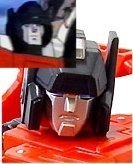
To anyone who has the MP Prime, does the neck look fragile? (As mentioned in the Tformers.com review...)
-
Lambor is Sideswipe. But Sideswipe is not Lambor. It's a zen thing. My question, why did they give Sideswipe fat lips and a protruding block chin? It makes him look like a completely different TF. <_< Oh well.
-
Yeah, should have just made up some new characters if they wanted more female pilots. Mixed bag really. Some improvements over the original. Some crap. Didn't outright suck. One thing i'll mention: I like they way they introduce the Viper MkII as the older cousin of the Raptor. Sort of implies that the Viper MkI would be the classic design from the original show, now relegated story-wise to having fought in the first Cylon war. And yeah, it's nice that the new cylon fighter is one big flying cylon. My only really huge complaint would be that the original BG music was relegated to the military band at the retirement ceremony. That music was kickass and dropping it was a really pathetic idea.
-
... ...
-
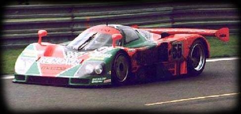
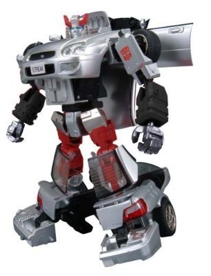
Some better color planning to go with the high quality engineering would be a better idea, and more in keeping with the intent of this toy line. Self-applied paint, while not terribly difficult, would always need to be touched-up on a transforming toy like this one. In any case, it still looks like a very nice machine, and I might end up getting one. Here's one of the paint schemes I would've considered...

-
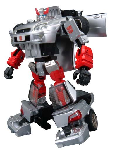
Better head sculpt this time around. Not sure I like the use of red they decided on, but I guess the choices were limited given the lack of black on the car mode. I don't like having the redundant autobot emblem on the license plate. I'd rather have a randon license number there. Or, if they insist on the emblem, make the plate so it can flip over, numbers on one side, autobot face on the other. Overall though, looks great.
-
...
-
Great movie. The IG deserves an SOC style treatment. complete with an extra head so you can have him with or without the dent. All diecast. And parts to convert him to alien attack mode. about 25cm high. Yeah.... that would be cool. edit: And a magnetic "S" sign you can stick on his chest so he can be superman.
-
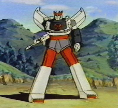
wheeljack...?

-
Stooopid toy "blacklist" soccer mom poopoo!
Californium replied to 91WhiskeyM6's topic in Anime or Science Fiction
Indeed. No more action-pose wolf blitzer action figures by mcfarlane. -
good to know. thanks motley.
-
Question for those who might know... Is diecast content the ONLY difference between the hasbro and takara Alternators? Are there any other differences or quality concerns with the US release?
-
Those would be extra lame if done in 1/24th scale.
-
Wheeljack, anyone?

-
Navy tests new "Fold" technique
Californium replied to the white drew carey's topic in Anime or Science Fiction
Great pic though. When will the US government stop wasting taxpayer money on cotton wads and admit that the sound barrier can't be broken? -
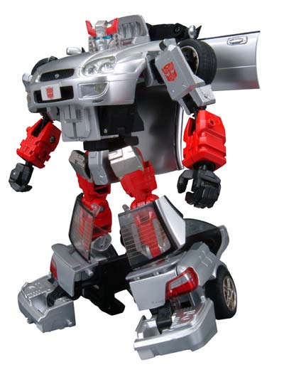
I wasn't a fan of Alternator Smokescreen's head sculpt (that blasted chin-strap thing) or his less-than-old-school paint colors. This Hound has niether of those problems. The head sculpt especially is an excellent re-interpretation of a classic character. This will be my first alternator. I can't wait When does he come out?!
-
THE NEW GALACTICA VIPER!*SPOILER*
Californium replied to Sarensaas's topic in Anime or Science Fiction
Indeed! -
Only four hours? Frell the scifi channel.
-
THE NEW GALACTICA VIPER!*SPOILER*
Californium replied to Sarensaas's topic in Anime or Science Fiction
I'd forgotten how awesome the original could look. If I had to pick one, the new version would lose out. -
THE NEW GALACTICA VIPER!*SPOILER*
Californium replied to Sarensaas's topic in Anime or Science Fiction
Looks more like a radial radiator grill than intake blades to me. That's among the most convincing CG spaceships i've seen yet. (Speaking of the quality of the render, and not any alleged "realism.") I like it. Nice design. Though I agree the markings should look more unusual. Like replacing the shield on the nose with that stars-in-a-circle emblem that represents the Galactica. (The one you see on all their uniforms in the old series.) And then replacing part of the tail number with a small arrow, the color of which would represent the squadron. (Blue squadron, Gold squadron, Plaid squadron...) And yeah... get rid of that blasted rescue arrow. ... I wish they had kept the old helmets. May have looked silly to some, but it did wonders to convey the "displaced ancients" theme that ran through the show; something that I always thought was rather important to the nature of BG. -
I like the MP prime head. Could maybe be better, but I don't think they were going for a straight port from the original cartoon. Little details all over the toy seem to suggest they were trying to update the design a bit. Works for me. BTW ComicKaze, I much like your take on the 13th Doctor.
-
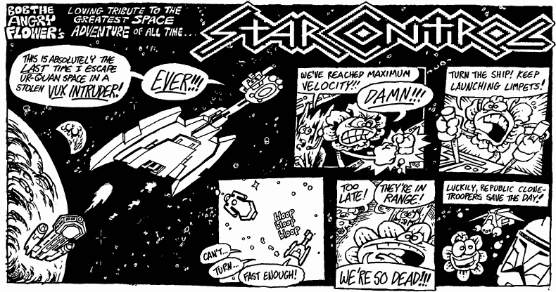
SC2 is great. Maybe the greatest computer game ever. I recently downloaded it from a Russian site and played it again for the first time in many years. I've never played the 3do version. I fully intend to nab the Ur-Quan Masters port sometime in the near future though. (It's wonderful so many people still care... ) Timewarp is good so far if you like melee. Too many extra ships though. A ittle buggy at times. Remains to be seen if they can make a plot game that doesn't fall flat like SC3. Are you running Windows on your computer? Windows should have a "MS-DOS for Games" shortcut that would let you play SC1 in DOS. (that's how I played the original SC2) I'm sure you could find the PC version of SC1 for download somewhere. (you've probably seen this pic, but it seems appropriate to the topic...)