Bobby
-
Posts
541 -
Joined
-
Last visited
Content Type
Profiles
Forums
Events
Gallery
Everything posted by Bobby
-
Thanks everyone for the feedback! I clipped all the songs to :59 seconds each and made them stream. I really want the viewer to enjoy the soundtrack at a good quality (at least a minute of it) when browsing through the images on the site. Hope it's not hanging up too bad. Is it true that Bandai has plans to make a 1/100 VF-2SS?
-
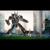
Thanks to permission by MWmember Cody Chan, his rare and astounding VF-2SS battroid model has now been added to the model gallery! He does brilliant work...THANKS CODY! P.S. If you have any VF-2SS w/out armor you would like to see featured, please contact me.
-
Thanks to permission by w.cheng, p.belic, jarrod, fly4victory, vicviper, m3, and others, vf-2ss.com is now online. The purpose of this site is simply for vf-2ss fans to experience and enjoy this remarkable valkyrie and soundtrack composed for Macross II. If you have any vf-2ss related art/models/cg that you'd like to contribute to the site please let me know. This (and vf2ss.com) is sort of a never ending project for an ongoing admiration/adoration of this extraordinary valkyrie, while longing for the day when a fully transformable vf-2ss w/out SAP will be produced as a kit/toy.