

guyxxed
-
Posts
335 -
Joined
-
Last visited
1 Follower

Recent Profile Visitors
3759 profile views


guyxxed's Achievements
")
Sharon Apple Concert Attendee (4/15)
80
Reputation
-
I just ordered through Amazon Japan. I'm sure better prices exist out there, but this was low cost enough that the ease won out.
-
This is awesome, thank you very much for making this available!
-
My copy of the Valkyrie and Destroid Encyclopeida arrived yesterday. As speculated above, it's mostly just a reprint of the line art with not a lot of technical details or new information, but it appears to be quite comprehensive, with a lot of stuff from games, M2, and Macross the Ride in additon to the series and movie mechs. Most of it is art I've seen before, but there is some new stuff (to me, at least) in here, like this spread on the Delta Workroid. Am looking forward to a detailed perusal this weekend!


-
Sorry for the silence, been a busy month with a lot of travel and home projects eating up my time. Popping by to share a bit of irony/coincidence/Murphy's Law, as yesterday I received my copy of the new Valkyrie and Destroid Encyclopedia, which turns out to not just be a very nice repository of well detailed line art, but also has a two page spread on the Delta Workroid! This would have been helpful about a month ago! 😄 Oh well. also happens to have a very clean version of the YF-24 art in there as well. Good book for us folks looking for references, but timing could have been better. 😉


-
As a capstone to the workroid project, here's a quick family photo of all our Cheyenne chassis together. Maybe a little cleanup left on the Delta version, but overall I'm pretty happy with how they turned out. One side note for the modelers out there, the workroids are listed with an official height of 7.5m, which feels about right when I put them next to people and look at the Delta screenshots, but the Cheyenne is listed as 9.87m (presumably to the top of the missile packs), but that's probably about a meter too tall unless they also made it stand up taller than the usual bent leg crouch they're shown it. Not a big deal, but an adjustment I had to make putting them all together like this.

-
This is nothing new, but I recently pulled out "Reborn" from Aikawa Nanase and was once again struck by how consistently good her stuff is. The lead track, "Yumemiru..", which is a remix of her first single "Yumemiru Shoujou Ja Irarenai" does a great job of hitting all the fun notes of the original while bringing something new to it. It's all unapologetic 80s/90s JRock, but if you like that kind of thing (I definitely do!), it's awesome! Anime soundtracks from that era all sounded like this (at least the ones I watched did) and I always get a Bubblegum Crisis flashback listening to her stuff, but wouldn't mind a Macross set to this kind of music someday, even if it's now a past era.
-
That looks great! I'm just an amateur fumbling around and doing YouTube tutorials when I get stuck, but if there are things I can help with, I'm willing to try. Just keep your expectations low. 😉
-
Sweet! Now just have to figure out how to make them transform! 😉
-
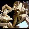
Bleah. Sorry for the long silence, work has been a monster lately. Not entirely done yet, but managed to pull the arms together and figured I needed to do a test pose in the game environment rather than just a model screenshot this time around. I've still got some work to do to get the movement constraints right (those slider pistons on the arms are very weird, and watching the anime in half speed, I'm half convinced the animators gave up on them as well and just manually set their positions in every frame 😉), and there are a few details still to go, but overall I think it's a good representation. Now to make it dance! 😄


-
Just a quick drive by to prove I'm not dead (yet). Snow delayed my next flight, so I had no excuses but to sit down and start on the arms. Look and proportion seem okay to me, but still a lot to figure out on the articulation (those piston things are going to be a pain since they don't follow the movements of the rest of the arm) and the fork attachment yet to go.

-
Last update before the weekend (and maybe for a little bit since I'm traveling for work the next two weeks, but we'll see, airports can be good places to work). Enlarged the wheels and added the higher articulator for the rear wheel, refined the textures a bit and started adding grunge, and beginning to add all the pretty little greebles (handholds and such). Yes, still avoiding the arms, but I'm getting there. 😉 Good weekend, all!


-
Backpack. Also put some transparency on the cockpit windows, which looks nice (but now means I have to make an interior of some kind 😉). Debated over making the rear vents a cut in feature or just textured on, looks okay here but will have to see how they hold up in a rendered environment. I guess it's time to start the arms. 😔


-
Basic form of the cockpit and the chest alterations are largely done now. Have to knit together the seams and do the backpack next, along with all the grips and lifting eyes. The designers of this thing used lfiting eyes like glitter and peppered them all over the place. It's probaly got about 50 of them scattered over its surface. Guess it can make sense if you think of it as a modular unit with different arm attachments and such that need to be lifting into and out of place as needed, but just funny how many they used when the Cheyenne and Frontier workroid have zero. Suppose that'sthe difference between the Delta workroid getting a close up moment whereas the others were never anything but background. And, yes, I'm avoiding doing the arms, is it obvious? Some heavy lifting there (pun slightly intended) and I can't kitbash them from anything so I'll have to build them from scratch. Oh well, at least I know what I'll be doing next week. 😉


-
Delta version underway. Have I mentioned lately just how much I love the ArtDink (Macross 30 and Macross Delta Scramble creators) modeling crew? They really went out of their way to make modifying these models really easy. For example, the Delta workroid is missing the 'calf muscles' that the Frontier workroid and Cheyenne both have, but instead of having to create the new skinnier leg, they had already made it that way and just slapped the calf bulges on overtop, so all I had to do was delete them and make the texture for the newly exposed surfaces. I'm half convinced that ArtDink had access to the filming CG (or, at least, some of the lower LOD versions) since the animators seem to have taken a lot of the same design steps as the game models did. Either way, it makes working on stuff like this a lot more fun because there's a clear path to get where I want to go with it and not a lot of tedium to get there. I will need to create a new chest, as the Delta workroid has a slightly different shape that isn't just an extension of the Cheyenne chest, but it's pretty minor, and interestingly the wheels on the Delta version appear to be bigger and differently attached than the others. There are a different set of gizmos on the back (kinda looks like air conditioning units), and obviously the arms will be all new, but I think it's already coming together pretty well with the leg up the game modelers gave me. More to come soon.


-
I'm on board with that, and like I said above, I'm not bothered by the awkwardness of workroids or desroids, they're cool additions to the universe, my engineering nerd mind just has to pull at the threads is all. It's part of the fun! Thanks for all the input and discussion, nerd stuff is also part of the fun! 😉 One last one, stripes and colors cleaned up, warning lights in plce, and in a more dynamic pose. Now, on to the Delta version!

