Mechmaster
-
Posts
277 -
Joined
-
Last visited
Content Type
Profiles
Forums
Events
Gallery
Everything posted by Mechmaster
-
Macross World Map Project.
Mechmaster replied to Metal_Massacre_79's topic in Conventions and Local Gatherings
Another Brit for you. Lat: 51° 58' 18" Lon: 00° 00' 45" Boston, England -
Yeah, that looks about right to me.
-
I just started working on my own Regult model again, I did have some pretty good line drawings for reference but a search of both my PCs suggests that I have lost them somehow. I'm pretty sure I originally found them somewhere on Macrossworld but I can't remember where.
-
Aren't all movies like that these days? I watched Waterloo on the telly yesterday, from 1970, and it occured to me that if it was made these days the climax would probably have been a light saber duel between Napoleon and Wellington with lots of kung fu and Matrix style wire-work. Movies now are all flashy effects and no one cares about historical accuracy or being true to the source.
-
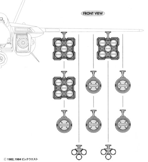
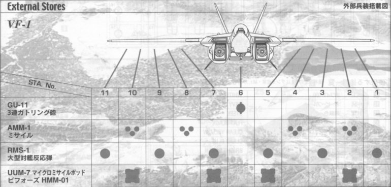
It seems to show that the AMM-1 is only ever used on the hardpoints with the notches, the RMS-1 on the hardpoints without the notches and the UUM-7 can be mounted on either. Hope this sheds more light on the matter...
-
According to the Hasegawa weapons set the different hardpoints used depend on the weapons load-out...
-
Feel free to make any changes/additions you wish Brian, I never seem to have time to take my models as far as I would like and having seen your texture work it can only be an improvement on the basic texturing I had done. I had hoped to make this model transformable some day, or at least produce a storm attacker mode version from it, but again I never found time.
-
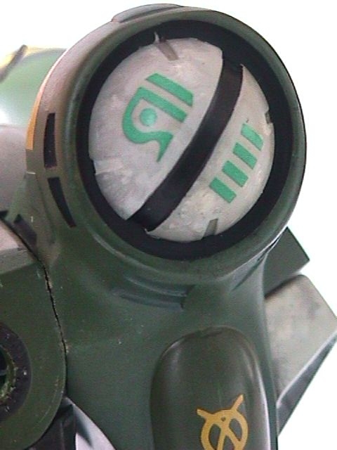
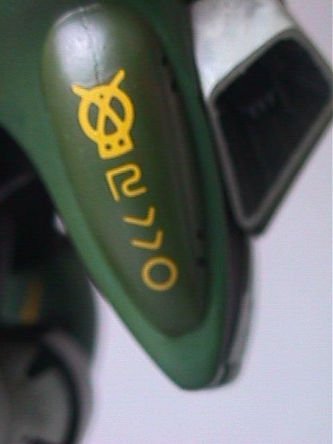
And the markings on the backpack launcher...

-
The markings on the side of the backpack... (oops, lost the focus a bit there)
-
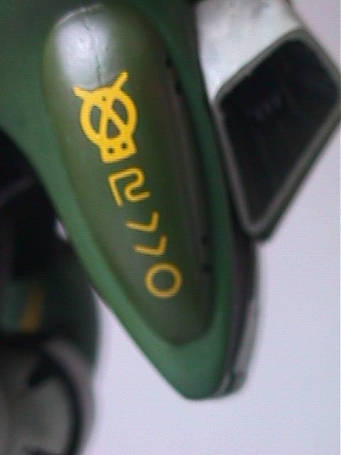
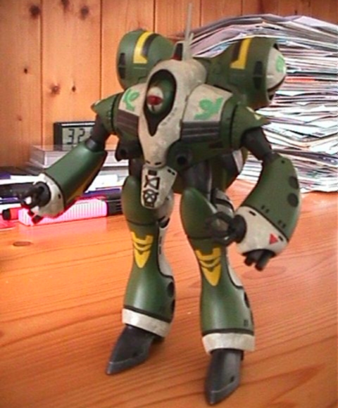
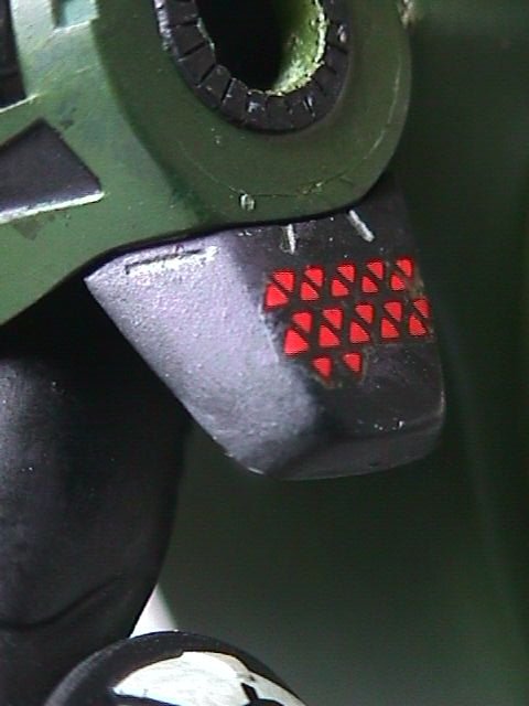
The side skirt armour, it is a bit boxy. I think the markings are possibly "kill" markings as the number of triangles is different on each side...
-
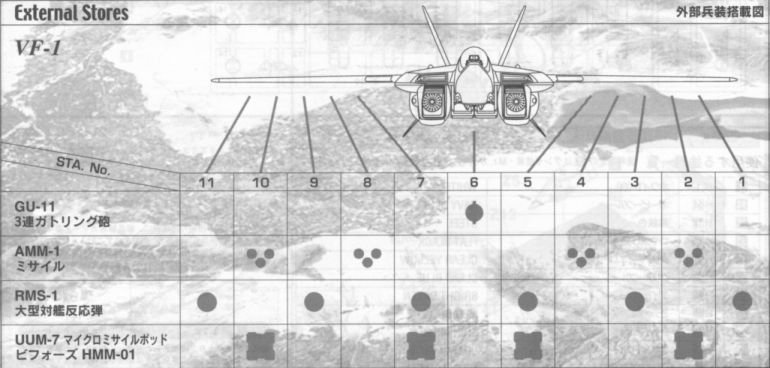
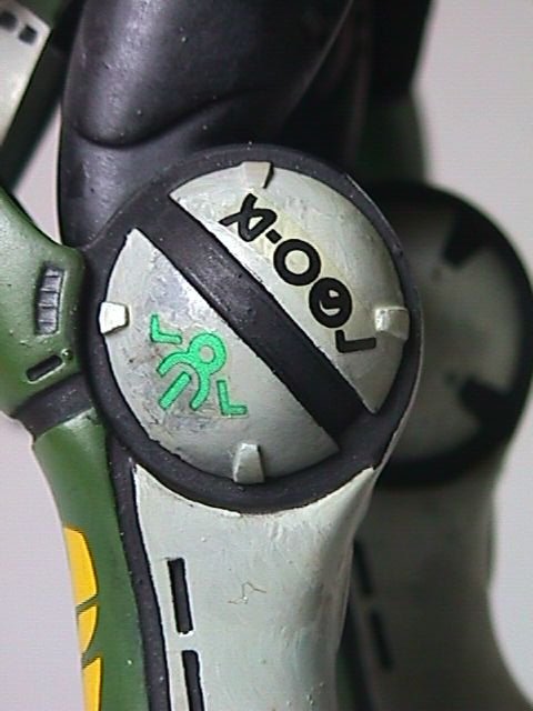
Looks much better now, I think Mechaninac may have a point about the head looking too small, I assume he is referring to the central, camera unit rather than the main hood, maybe expand that just a bit. As requested, here are the markings on the knee-launcher...
-
Kinda difficult to make it out with the black colour scheme but it looks good as far as I can see. I'm guessing that that is just a temporary texture as it has no detail, I think if you could add a dark texture that didn't swallow quite so much light it would look really cool. As for visibility from the cockpit I don't think thats an issue with spacecraft, given the immensity of space and the fact that the lights (suns) are so far apart pilots would rely mainly on sensors anyway, I generally design spacecraft with armoured cabins with no direct vision ports. I have to disagree with Zentrandude, I like the large single thrust unit.
-
Dogs aren't as good at catching flies and with spiders you get twice as many legs for your money. And inspite of arachnid necrosis spiders still worry me less than, say a drunk in a volvo or a desperate junkie with a straight razor.
-
Seems like a lot of fuss over a few spiders, I've never had a problem with arachinids, flies and stuff are annoying and unhygenic but spiders are kind of cute and as far as I'm aware no kind of spider regularly preys on human beings. If you're looking for a really unpleasant and dangerous animal try homo sapiens, thats the only creature that really scares me.
-
On the subject of the script, recreating a section of the anime in CG would certainly be a lot easier since most of us who have replied to this thread so far have admitted to having little or no experience as animators, having a ready made action sequence to follow would be useful as we learn. However if someone comes up with a clearly visualized original script that isn't going to tax our abillities too greatly then theres no reason why we shouldn't be a bit more ambitious. Perhaps we could start out doing a few short (20 to 30 second) anims based on the original show just to help us find our feet. Dok... Pushing the poster to completion is a sound idea, from what has been posted in the other thread recently I think most of us have models sufficiently "finished" for that purpose. I suggest we bully everyone into finalising basic models and textures to the point where we can have a go at the poster and then they can sort out other stuff in their own time. When I worked in the theatre one of the prime rules of set building/dressing was "if you can't see it from the audience, don't build it, don't paint it, don't worry about it" and while I confess to breaking this rule as often as anyone else when building CG models I think everyone is at the stage where they can produce a decent shot of their models for the poster. Sorting out transformation sequences and landing gear retraction isn't really relevant in the context of a still image such as this.
-
Theres a two page article about it in the June issue of Hobby Japan so I guess its still ongoing, the detail looks great and theres a fully jointed Chirico figure too.
-
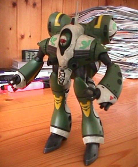
I think its just the central parts, the "head" and crotch guard that are a bit too wide, otherwise the proportions look pretty good, heres a shot of the Imai kit which kind of shows what I mean.
-
I have no skills as an animator but I'll be happy to donate any of my models to the cause. Afraid I only have half a battlepod though, I never got round to building the legs and so refitted it to use as a wrecked battle casualty. On the overall look I would say do the best we can with what we already have and see what that gives us, once we actually have an animation we can then work on refining it. I think that one of the things that has slowed down the poster project is that people are worrying too much about minor details that won't even show in the finished image ("should the bolts on the undercarriage be imperial or metric?" sort of thing) Get it scripted, storyboarded and produce the basic animation, if it really sux we can all change our usernames and pretend we had nothing to do with it, if it has promise we can work on bringing it up to industry standard quality.
-
This version is definitely an improvement on the original, but I like the twin pod version as well, maybe you could retain it as some form of specialist variant.
-
I didn't actually vote as I think you need a fourth category "combine the best bits of both designs" I agree with Greyryder, the twin cockpit of the original is cool but the rest of the ship lets it down. Try merging the twin cockpit and Stinger into the new design, replacing the current cockpit and twin Stingers.
-
They could always have him in a 3 sided fight with Alien and Predator, or how about Godzilla?
-
Looks simply gorgeous Dat. Are you able to switch off shadow casting on your fill lighting? The multiple shadows are a bit distracting, especially where they fall across the model itself, having only the main lightsource cast shadows would be better.
-
You answered "yes" to 58 of 200 questions, making you 71.0% otaku pure (29.0% otaku corrupt).
-
I've got about a dozen of these, I'm not sure if particular figures were in a particular kit or just added randomly but certainly not every kit had one, I got a Hikaru, a Misa and a Roy. And the Gerwalks came in brown boxes.
-
I remember those, the Adepta Sororitas figures, they only made two or three, I bought them (and yes I painted their armour pink) They didn't abandon the idea though, it simply evolved into the Sisters of Battle. But Warhammer 40K and Hello Kitty, what an inspired combination, I wish I had thought of it first.