

the white drew carey
-
Posts
2922 -
Joined
-
Last visited
Content Type
Profiles
Forums
Events
Gallery
Posts posted by the white drew carey
-
-
I like you, Drew, but I have to ask: did you even watch the movie, or are you just trying to get in on the gang-bang? I myself go back and forth on some of the plot issues and character development, but the cinematography and direction? Really? You lost me, you completely lost me.
Not directed at Drew:
There is a lot of Alien fan-boy hate going on in this thread, which is glaringly obvious when you consider some of the absolute shite movies a good number of the members here love. But hey, to each their own--right?
Totally watched it and, even with lowered expectations, was still totally let down by almost every aspect. I was being silly with the cinematography, but I am dead serious about the direction. The pacing of this film is so off, and the timeframe of events happening, especially at the end, is so rushed and ludicrous.
I think the reason some people (myself included) disliked it so much is that expectations were high for Scott to return to form. Instead, we get a generic and convoluted movie that tries to be a lot loftier than it really is. Scott really screwed the pooch on this one. I think he has finally and completely lost his touch.
-
Now THAT brings up bad memories!
-
Eugimon- I wish I could've have seen this movie with your pure, innocent, naive eyes...
-
Seriously... no one has posted this yet?
Spoilers below... don't watch if you haven't... oh, who cares. It won't ruin the movie if you watch it.
-
My wife and I just watched this film, and boy did it suck.
It was awful.
Awful.
Awful.
There are so many things that are glaringly wrong with this film, from story, plot, character development, acting, cinematography, direction... ugh.
Methinks that Ridley Scott meant to distance this film from Alien because, in the one time he actually did something right, he decided that purposefully connecting the two would probably infect the original with Prometheus' crappiness.
Did I mention this movie was really awful?
-
Just to let you in on part of what I do, since I'm not really much of a digital painter, is I usually flat (is that the correct term?) my line art using Bpelt's Multifill and Flatten (http://www.bpelt.com/psplugins/download.html]) filters, and then manipulate my colors and shading from there. I find it extremely fast helpful in laying down my base colors.
Anyone else use a similar filter or technique?
-
Thanks guys! I'll try both!
-
@the white drew carey
Love the linework. I'm personally not a fan of airbrushy shading, but that's the great thing about working digital, you can try different things. When you haven't settled on a style or technique you can throw everything at the wall and see what sticks.
Yeah, I'm not too sure about it either. But I simply don't have the digital painting skills that you guys have. Maybe I use the wrong tool set or something... but I don't know how you do it!
I see room for some nifty design work in that final part with the car. Maybe instead of fading the last word balloon out with a gradient, have the balloon itself fade out before the text in more of a breaking up into little pieces effect. Not sure how to better describe what I mean, maybe after I finish my work for the day I'll try and doodle one up. Anyways, have the word balloon fade out that way, and as the text overlaps the black have it turn white and also kinda wither out into the blackness, with illegible words barely visible trailing off in the space behind the car.
These words make sense in my head, just sat down with coffee tho.
I totally see what you are getting at. I'll see if I can incorporate that in... or something similar. Now that you've put that thought into my head, I've come up with something different in mind that may likely play along with the theme of the story as a whole. Hmmm...
(Oops, posted too quickly)
However, a lot of the comic will be a mix between complete linework, and shading. The shaded parts may actually be very minimal. We only see them in the first coupla pages because it is supposed to be dark in the bedroom, you know.
Still toying with it.
p.s.- if you have any tips or pointers to digital painting tutorials, I'd love to check them out. Maybe I can get better at it?
-
BTW- Here are the first two pages of one (of many) of my little side projects I am slowly working on. I'm drawing this comic all on letter-size paper. Not too sure about the shading yet, or if I will go in a different direction...
Page 1:

Page 2:

-
If I feel thick-skinned enough, I might even post some of my stuff here. Though I'd be seriously outclassed by you guys here.
Hey, I started it for us to post our stuff. Don't hesitate!
-
Hey 505th, I don't know if I've asked before, but what size are those marker drawings you've been posting?
anime52k8- I can tell you like your ladies skinny...

Keep up the good work, both of you!
-
Happy birthday Macross! Bwak bwak!!!
-
The movie's not out yet, but the critics love it.
Yeah, apparently this is supposed to be pretty darn good.
I still think JGL looks like Gigolo Joe, though.
-
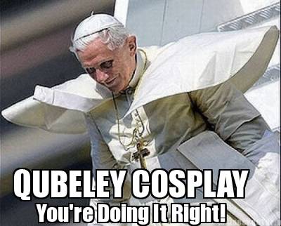
This isn't really artwork, but I saw a meme using this image (something about Pope Dracula or whatever), and immediately thought of a newer, geekier caption for it. So I went to http://www.memecreator.org (which is kind of a pain in the ass) and put this together.
-
A new GAMERGEEKDADDY with Macross references:
http://www.asplenia-studios.com/blog/2012/09/04/gamergeekdaddy-13/
-
Yeah, it didn't grab me either. Maybe because it looked like it has two souls: over-the-top actions scenes stitched together with barely passable fights scenes performed by an aging Arnold.
-
The Syrian government is saying it was an aircraft malfunction during a training mission.

-
I sure hope the voice-acting they have in that are just placeholders because, man, are they crap.
It sounds like a terrible video game.
-
OK, cool. If its an initial design, I can see where you can really run with it. And, yeah, getting figures right IS such a hassle.
-
Not bad! I love how well you color!!! If you don't mind a bit of constructive criticism:
-The characters' bodies look kind of wonky. I don't know if it is the legs being too short, or the torsos being too long. Either way, a lot of them look kinda like midgets.
-That mecha looks generic. I like the general design, but what you've got right now looks like a throw-away design from Southern Cross.
Anyhow, keep up the good work, and I can't wait to see this series you're working on!
-
Damn you, France!
The movie doesn't come out until the 25th here!

-
-
The newest strip of my webcomic, GAMERGEEKDADDY.
I don't know, is this off-topic or not?

(edited to include the actual strip instead of a link but, if you're cool, you'll go check out the red text in my sig... you could win something!)
-
So... I'm thinking of moving up to a DSLR. I've been stuck in the point and shoot doldrums for years and years and want to get something a bit better out of my photos.
Does anyone have an opinion on the Sony SLT-a37?
I know it is a beginner model, but the missus is being a bit strict on how much I can spend. Plus, I have four lenses from my dad's old Minolta A-700 SLR (the film kind, yo) that will fit, so I'm already up in that category.
Guillermo Del Toro’s ‘Pacific Rim'
in Anime or Science Fiction
Posted
I'm looking forward to it. del Toro has yet to disappoint me. I just can't stop saying the word 'Job' in my head after reading the title.