TenScaryMonkeys
-
Posts
13 -
Joined
-
Last visited
Content Type
Profiles
Forums
Events
Gallery
Everything posted by TenScaryMonkeys
-
Thanks for the kind words, guys. The head's actually simple and clean on purpose. Too much detail on the noggin would've sort of melted it into the body. I wanted it to catch your eye as a focal point, hence the lack of extra paneling (plus, most of the clutter I planned would have been on the faceplate, which is tragically hidden by the shoulder). I was afraid more linework would've distracted from the eyeslit, which is supposed to grab your attention. Whether or not it works is an entirely different matter. You are exactly right about the missing wing. Good catch. Tried a number of different ways to get the second wing in there, but it kept throwing off the flow of the piece (I'm OCD like that). The end result was a big ol' "screw it", and the second wing was omitted. We'll just pretend that due to some quirk of perspective, it's hidden behind the first wing. Don't tell anyone.
-
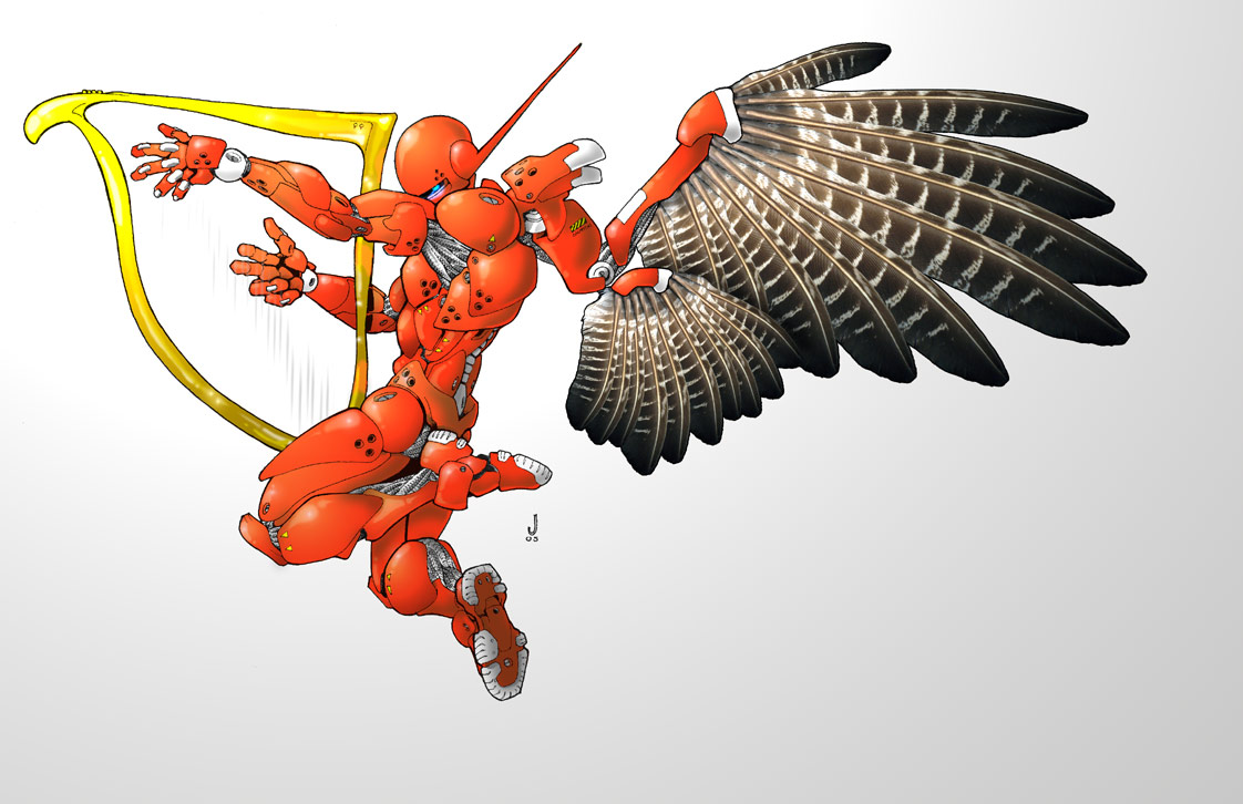
Aloha, folks. It's not Macross, but I'm proud of it, so I figured I'd share. The idea of a harp-playing robot was the impetus here, not the angelic angle, but it only seemed appropriate that a robotic harpist should also get some wings. My original plan for white and grey armour seemed a tad cliche, so we went with red instead. The wings, though, were my best little bit of inspiration. I was gonna draw the feathers individually, until it turned out that I was too goddam lazy to do so. Instead, I scanned a hawk feather I found outside, replicated the bejeezus out of it, and slapped 'em in there. I love the color of the feathers, and never would have thought to go that route had I done them manually. Oh, Nature, in all of her beauty.... Comments, criticisms, and recipes for summertime treats are welcome. Enjoy.

-
Something silly I thought of... Everyone who dislikes the concept of Imperfect Transformation seems to REALLY dislike it, and view it as a cop-out. Everyone else says that they understand the concession, based on Yamato's business needs and the marketplace climate. Nobody is EXCITED or HAPPY that the toy requires parts-swapping. Shouldn't Yamato's first concern be to make toys that excite potential buyers? I hate to sound negative (in reality, I really enjoy a lot of this company's product, and, if I had a kid, he/she wouldn't be going to college thanks to Yamato), but I can't rationalize spending the cash on a toy I'm not excited about. If the idea is to eventually release a bigger, better version (ala the 1/48), why not go straight for the big guns, and skip the toys that no one seems absolutely thrilled to purchase? Why spend the money to develop a toy that isn't going to whip Macross fans into an absolute buying frenzy?
-
I'm a child of the 80s, dammit, and we like our Transformers to transform. I dunno... Right now, I'm very, very averse to the idea of a transforming toy that needs to be taken apart then put back together. Transforming toys, for me, have always been about the transformation. If I want to build a robot out of plane parts, I'll go buy a Lego set. Both modes may look prettier, but I'm perfectly willing to sacrifice a small degree of appearance for a really innovative "perfect" transformation (longish groincone, slightly thin arms, hands a bit on the tiny side, whatever). It almost would've been easier for Yamato to make this a boxed set. One 1/100 plane, and one 1/100 super-articulated valkyrie with the proportions changed to account for anime magic. Then again, inasmuch as I have yet to actually SEE the toy, maybe my tune will change, and I'll consider this the best idea ever in a few months.
-
SilentRage - Nice work, I especially like the highly unconventional head. The feet have that really cool Zeta Quadruple Super Duper Gundam feel, a design I've always loved. Thanks for the kind words, everyone. Yeah, there is a degree of Anime Magic in the transformation (I think you'll get that with pretty much any line drawing) but the transformation is, for the most part, mechanically sound. The crux of the whole thing is in the torso area, which has to partially collapse, then swing back to get the hips / gas tanks into position. the shins fold back against the thighs, and the bed swings down over that. With the legs positioned as they are, they also provide a platform to tilt the bed for emptying.
-
... And a quick sketch of the truck from whence he came. I had to sketch it fast, since I saw the truck coming home from work, and had forgotten alot of it by the time I got home. Thanks for taking the time to peek at this nonsense.
-
So, this here drawing isn't Macross (probably better suited for a Transformers forum), but he was, at least, inspired by Macross designs. I've never really liked that most mecha designs cover up all the good stuff (i.e., the robotics inside a robot) with chunky armour, and find that Macross mechs seem more... plausible, mechanically speaking. You can see what's going on with the transformation, and sometimes get pleasant little peeks at the internal workings of the thing. That aesthetic in mind, I designed myself a happy little truck-fellow. That said, take a look and enjoy. Incidentally, if anyone would like to take a crack at coloring him, let me know.
-
Quick, tiny little scan just to show how nicely one can control the Pigma Micron .005. Notice how the inked portions didn't bleed out into the other panel lines at all?
-
Pigma Micron .005. Without a doubt, the best pen for high-contrast, incredibly well controlled lines. I've been using this pen for years (thought of it while I was inking a drawing with one), and have yet to find an acceptable substitute. Pick it up at any art or craft store; they run $2-3 per pen. I'd suggest picking up a couple, as the tip is so fine, you may damage it when pulling it through the lines (it'll fray a bit if it hits any imperfection in the plastic, but one pen should get you through a few toys before you need to retire it). I've recently started doing selective panel-lining; that is, coloring in only the more important surface details to give the toy a less cluttered look. Worked beautifully on my Roy 1/48.
-
All this excitement over the never-before-seen GBP armour, and STILL no pictures of the much-rumoured YF-19 revamp. Where ARE you, YF-19? Don't you love me anymore? You don't call, you don't write... I weep for the world. The 1/48 1J just looks astoundingly good, and I'm not even a big fan of FAST packs. The head seems to fit a bit more snugly (is that even a word?) in fighter mode than the 1S's, but the wider head makes the chestpiece look a lot less massive than the previous 1/48 releases. I had promised to limit myself to one 1/48, but promises were meant to be broken, I suppose. A man can only resist the omnipresent temptations of Giant Robot Goodness for so long. This is probably the first time I've ever been impressed with the GBP armour. Honestly, I always thought the 1/55 armour looked fairly ridiculous, like Jetfire after too many Pop-Tarts, or perhaps in the swollen aftermath of a jellyfish attack. This thing just looks massive and dangerous. Fine work, Yamato. Kinda of doubt I'll actually buy it, though. I can only imagine the pricetag on an item containing that much plastic, and given Yamato's recent penchant for producing toys only British royalty can comfortably afford, I'll put a conservative estimate of $250,000 on this one. Next up: the Yamato 1/48 SDF-1. "We knew you'd lose your house to buy one of these, so we made it big enough for you to live in."
-
So, after perusing the glut of "I despise Yamato sticker" threads that have been floating about, I've decided to invest in a set of TakaToys' 1/48 replacement aftermarket decals. I go over to his website, and it turns out that there's a new 1/48 Low-Vis sheet that he's produced. Looks swanky. My dilemna is this: I haven't got a Low-Vis, but instead am strongly considering picking up a set of the Low-Vis stickers for my Roy VF-1S, to maybe give it a more utilitarian feel. Something about deep gray markings on the white plastic is really calling out to me (and I could hypothetically change the squadron symbols, as well), but I'm hesitant. How do you folks think the DYRL 1/48 would look outfitted with Low-Vis decals? I'm looking at this from a purely aesthetic point of view, not an anime purist one, and have no desire to spend the extra money to get two sets and experiment (God, I'm cheap). Comments, suggestions, and recipes for sandwiches are much appreciated. Thanks.
-
The stickers that come packaged with the 1/48 are pretty terrible. Honestly, though, I really liked the ones that came packaged with the Mac Plus toys. Sure, they were a bit too shiny, but they cut cleanly, and the adhesive seems superior. You'd think, given the cost of the toys and the availability of product with great decals elsewhere in Japan, Yamato would have invested a tad more time in their sticker design.
-
The cut-sticker technique actually works just fine on the VF-1S, and is barely noticeable, unless you happen to love admiring your valks from 2 inches away all the time. I used the Yammie sticker sheet, and given the horrid quality of THOSE decals, I can only deduce that the TakaToys ones will look 1,000 times better. Add the kite decals in fighter mode, and rub them down a few times to make sure they've adhered properly. Using a really sharp X-acto knife, start cutting OUTSIDE of the decal. run the knife through the seam line, and gently pull it through the sticker. Rub the decal a few more times after cutting, then open the landing gear and rub again. Assuming that you cut slowly, the cut-line will be pretty much invisible in fighter and battroid modes. You also have the added bonus of not having to perform invasive surgery on your robot. I sure did say "rub' alot in this post.