
recon
-
Posts
1294 -
Joined
-
Last visited
Content Type
Profiles
Forums
Events
Gallery
Posts posted by recon
-
-
1 hour ago, treatment said:
Yet amz-jp is scalping higher shipping-fees for it than their own YF-21 offering if you're importing to the US, at least:

frickin' bizarro.
at any rate, Hacchaka review is up:
https://twitter.com/hacchaka999/status/2038561092298068168
https://hacchaka.net/archives/52131263.html

Looking at this pix, really makes me wonder if bandai opted for a slick and streamline profile for the VF-17S, why didnt they adopt the same approach the VF-19. At least they would have complimented each other
-
On 3/27/2026 at 11:52 PM, Axelay said:
Every single sentence in this post is quoted for intense levels of truth. I'm willing at a moment's notice to get in on that Star Mirage.
At the rate arcadia is moving, i kinda doubt so thus we are stuck with being bandaied
-
15 hours ago, Shawn said:
Maybe someone could create a 3-d printed leg-only GBP clam-shell type wrap option for this to display in G/B mode. With the lack of tampo, it is just a color match issue.
POC it and post it on the Bandai twitter page.
Bandai could then make one themselves for 5000 yen, market it as the Anime Enhanced release or some nonsense.When Graham lets go a VF-17 I know there is trouble!

They should get graham in as one of the reviewers for M7 line, like what yamato did in the past. If it fails his scrutiny, then they should refine the design
Oh well thats wishful thinking on my part
-
On 3/28/2026 at 1:08 AM, Shawn said:
Ah...true...so like the old HCM line
")


Wish toyrise does theirs in matt finishing cos the glossy finish gives the more toylike impression
-
On 3/25/2026 at 6:58 PM, Graham said:
I was originally planning just to keep it in fighter mode and look at it only with my reading glasses off. 😂
But, after looking at it in person, I just can't stand it with the completely wrong legs, wrong backplate, wrong shoulders etc.
I love the VF-17 design too much to keep this travesty.
On a positive note, I do think Bandai did a good job with the color though.
I will remain happy with my original 90s Bandai 1/65 and Yamato 1/60 versions.
Am kinda stuck in a dilemma to sell or keep it. I could still deal with the non conformities and irregularities but the battroid and gerwalk modes are just horrible.
-
On 3/25/2026 at 10:59 PM, Chronocidal said:
Hey, at least it's a solid source of spare parts to rebuild some shattered 171s.

Being entirely honest, I'm not a big enough VF-17 fan to be as spectacularly disappointed as many here. It is what it is, and I don't mind having a slim 17 to match the other 171s from a "mechanically feasible" point of view. As iconic as it all is, the scale shown in the Macross7 animation is completely nonsensical.
I'm mostly sad that I probably could have had a couple for much cheaper if I waited.

What will make me more sad is if Bandai continues to misinterpret their terrible decisions as lack of customer interest, and they just nix their entire 7 line before we get the other VF-19s.
Though on the other hand, maybe that will convince them to finally go back to products that will sell, and we'll get more VF-1s. It might not be all bad.
The problem is tamashii which bandai does not intefere with its designs. We have seen so many examples in the case of the metal build line
But credit has to be given to them for the past macross line designs which they did quite well except for a few isolated cases. This does not seem to be case the recent YF-21 and M7 line which was a disappointment. They could have take a leaf from yamato/arcadia designs, improve it instead of throwing in their own interpretations
-
8 hours ago, treatment said:
small production runs of VF-171 cosplaying as VF-17S?
will that really help?
https://twitter.com/De_danaan179/status/2036032691569938654
web-translated:
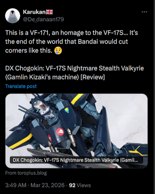
https://twitter.com/Tokyo_Incident/status/2035931211131232436
web-translated:

In other words we got owned by tamashii and bandai for their laziness and cost cutting measures.
-
Ankles/thrusters jutting out in fighter mode
Gerwalk mode is just horrible and has no resemblance to the OA
If this is not plain laziness on tamashii part to try and frankelstein the VF-171, i dunnoe what is
Is it me or the DX VF-17S is severely lacking in tampos department?
Guess this will be a one off release due to the poor sales and revenue


-
2 hours ago, sh9000 said:
This would look cool if it was the DX. Even HMR. Is this AI generated?
Yup it is
-
https://x.com/simsim5479/status/2034932024231043514?s=20
more pics by clumsy samurai
Now i kinda wish bandai made the legs on the VF-19 blazer slimmer since they are going that route with VF-17 or someone can do some snap ons to beef it up


-
If only Bandai DX-VF17S looks like this


-
Was browsing Amiami for new cospa stuff and saw that they have yukikaze t shirts and jackets for PO
-
4 hours ago, PsYcHoDyNaMiX said:
The Tornado Hobby head looks nice on the MB HiNu body (they did go a bit heavy handed with the panel lining in contrast to the MB body).
The Zero Plan head looks nice in its own way too, but looking at the pic where its mounted on a body I realized it (the head) looked off and then also realized the body wasn't the MB HiNu body, but probably a different 3rd party kit body (I think the Tiger or the Yujioland Hi-Nu).Yup zero plan looks abit oversized. Anyways both of these 3rd party heads can be used on MB Hi-Nu with a bit of mods
Wish i didnt have to go this route if the MB Hi-Nu head was somewhat true to the OA design, which was somewhat present in metal robot and RG grade designs


-
On 2/24/2026 at 1:10 AM, PsYcHoDyNaMiX said:
The 24 hour is a decent/nice version on the original artwork (pictured), but it still missed a few key spots if it was meant to reference that OA image. In reference to the OA image (pictured) the point of the visor over the eyes (front of the helm) has a curve or angle that starts earlier in front of the eyes and not right over/above the middle of the eyes, then the line (with a slight downward curve(?)) continues to meet behind the eyes with the bottom part.
Also with the top rear part of the sensor casing for the helm... the OA has a slight/subtle curve whereas the 24 hour version is just a straight flat line.
The eyes on the 24hr are fairly large in comparison to the OA.
The front cover for the V-fin is block on that OA, but it doesn't have that peak and flat spot that's designed on the 24 hr (the OA is appears to just be flat across with no change).
I'm sure whoever modeled up the 24 hr version used other artwork references of the Hi-Nu than this OA.
I know it's not meant to be an exact version of the reference OA, but it's still a nice take/addon for the MB Hi-NuAgree with the observations listed. I too do not quite like the design of this custom Hi Nu head
Came across two other interpretations of the Hi-Nu gundam head, Tornado Hobby which is quite close to that of the OA, RG and Metal Robot design and another by Zero Plan, which is an improvement but the details looks rather busy


-
Was looking for a replacement head for my MB Hi-Nu gundam so that its more manga accurate and came across this custom MB Hi-Nu Gundam


-
-
-
More pics of MBs and GFFMC reissues
-
1 hour ago, Scyla said:
Endless repaints?
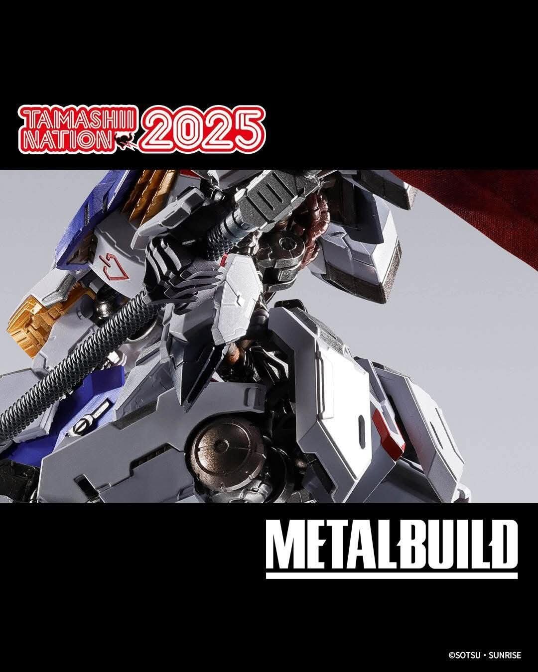
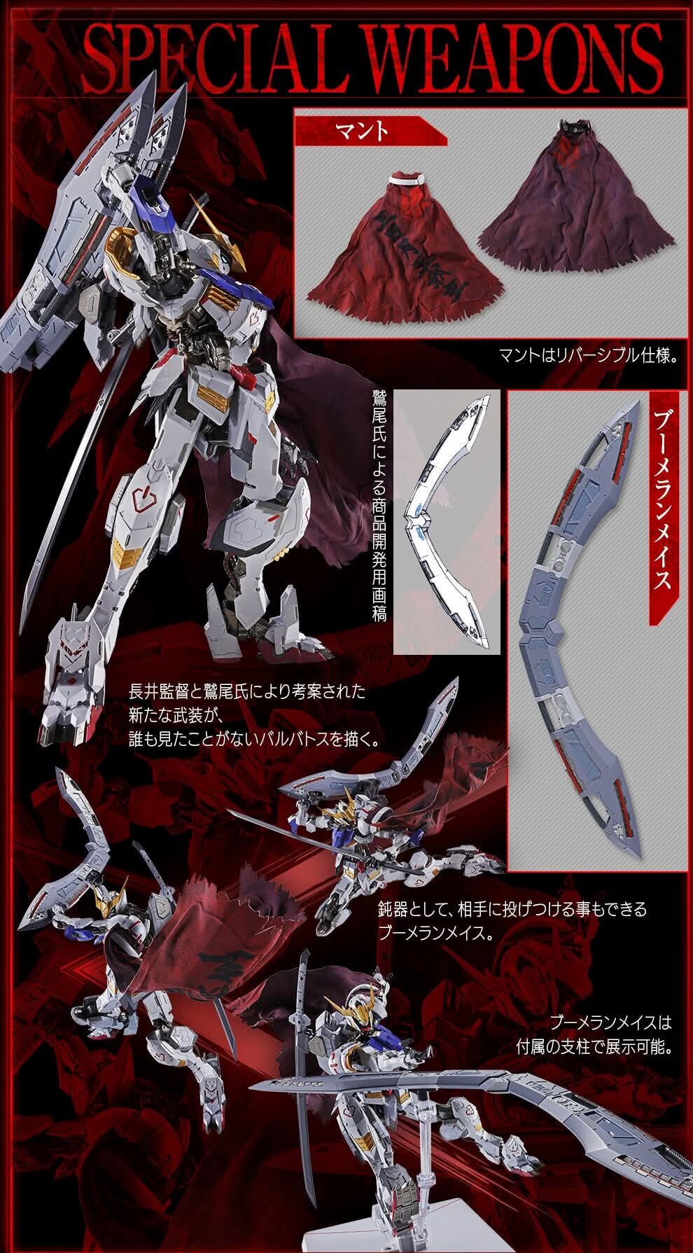
In all honesty I would love to get a Barbatos Lupus Rex in the Metal Build line.
Looks like your wish may come true soon
-
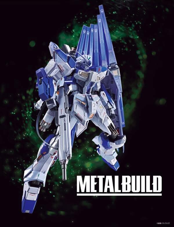
Something new in MB line is coming.
Guess what it is
-
2 hours ago, kajnrig said:
Tks. Secured one via HLJ cos amiami too slow
-
Woo yeah. Am going to get this
-
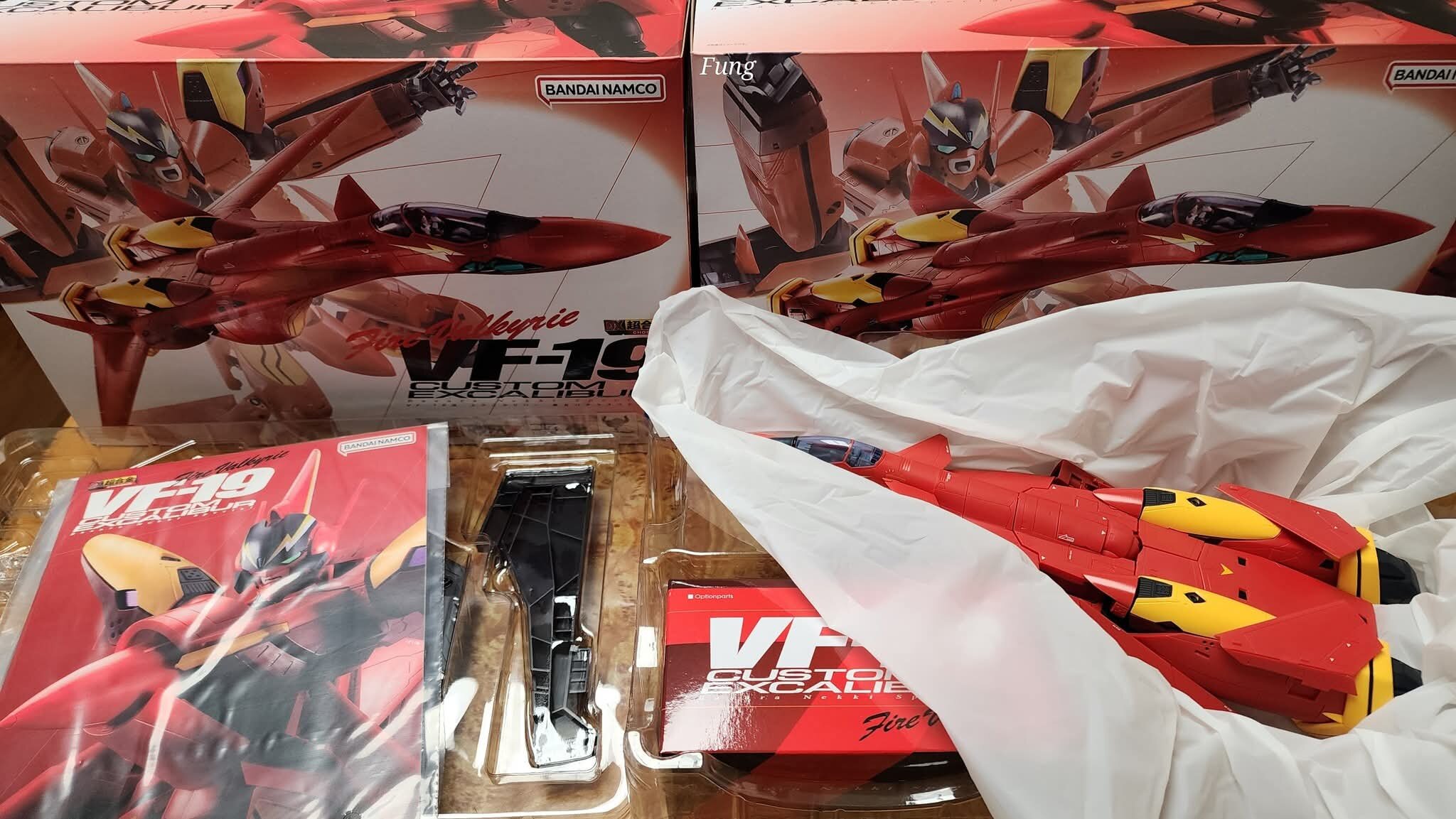
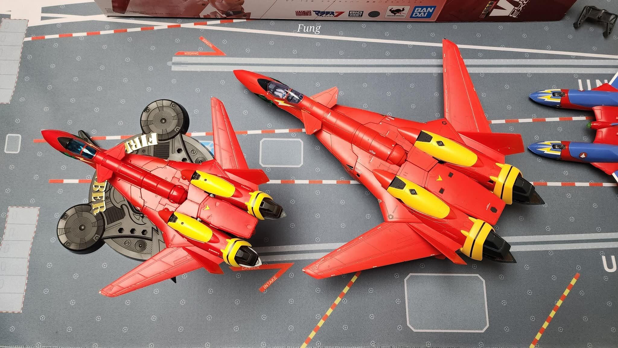
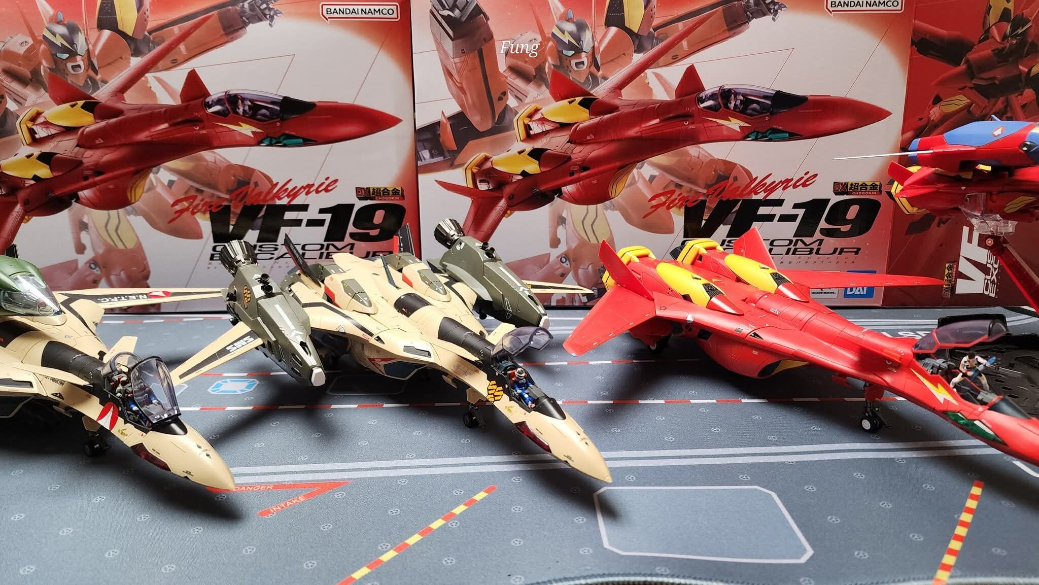
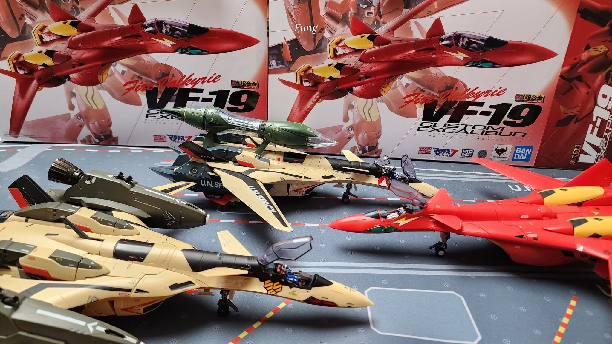
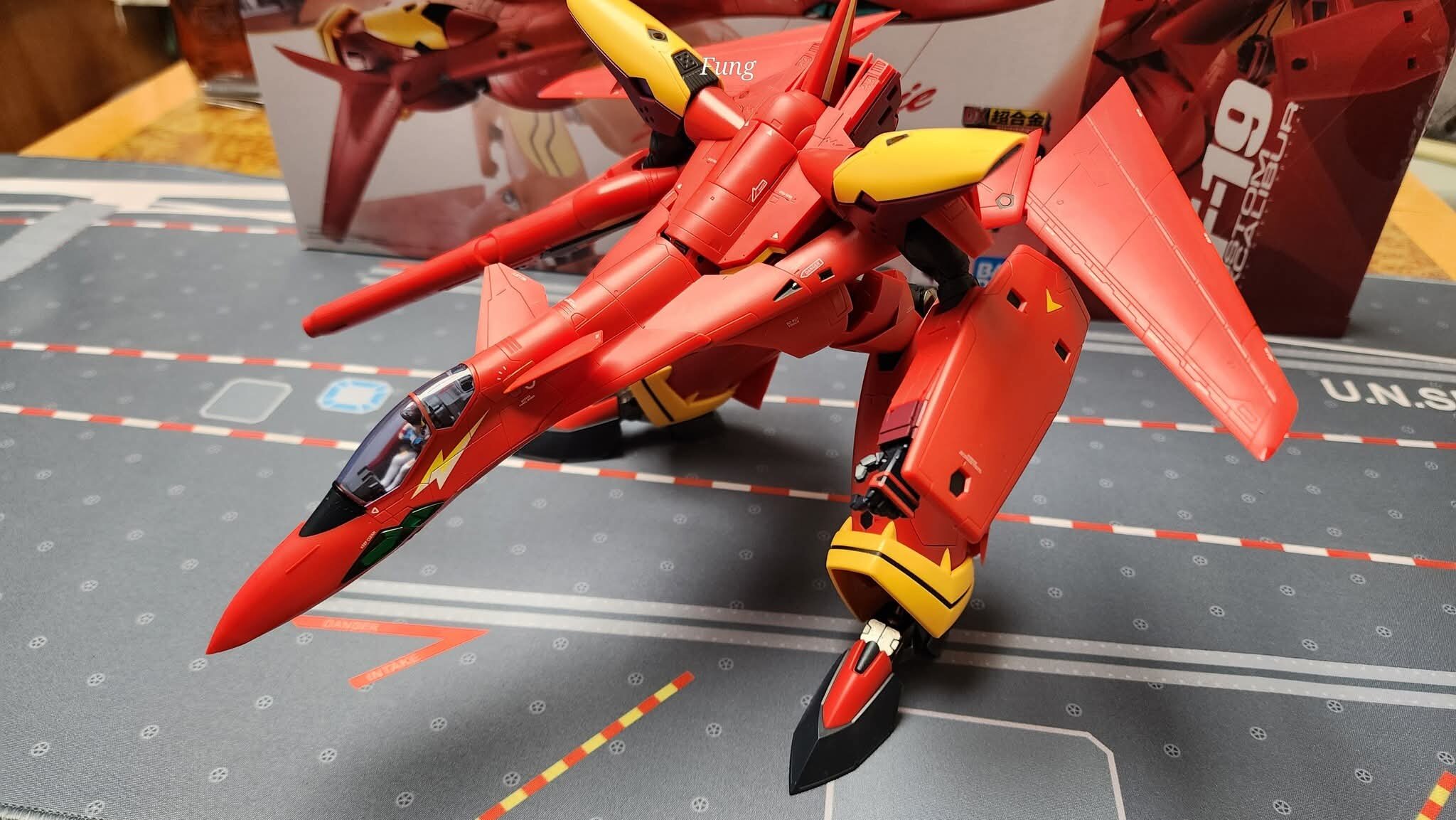
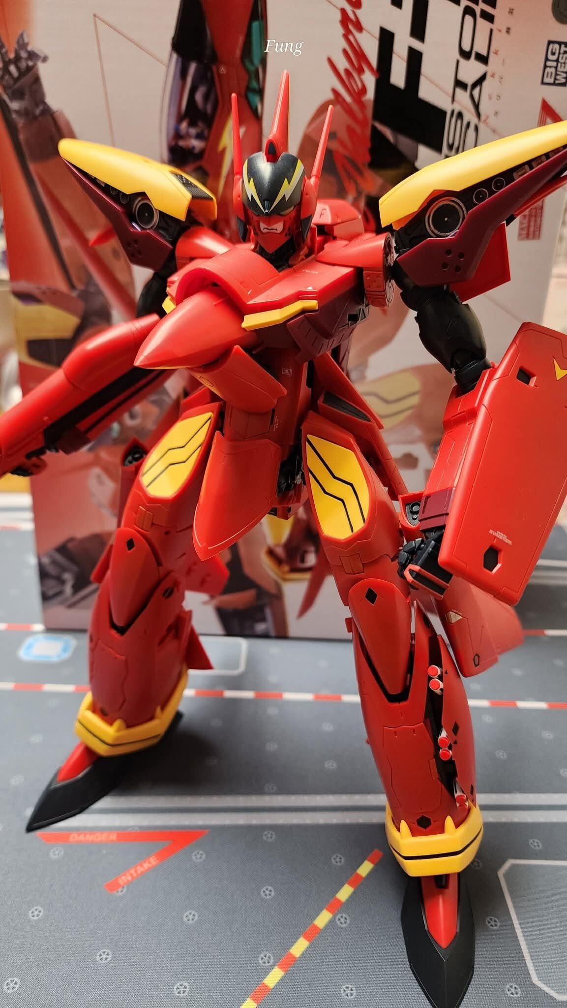
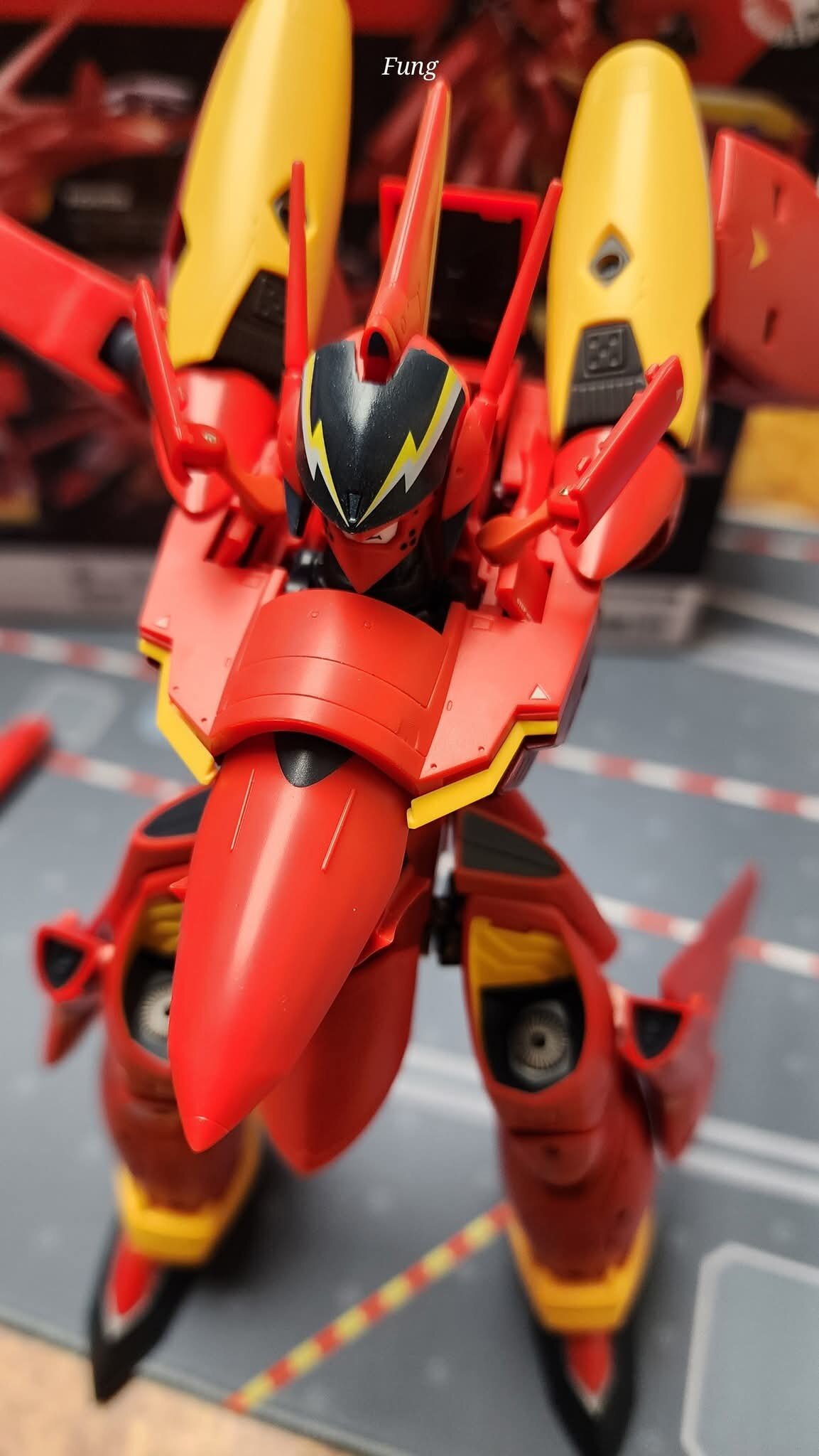
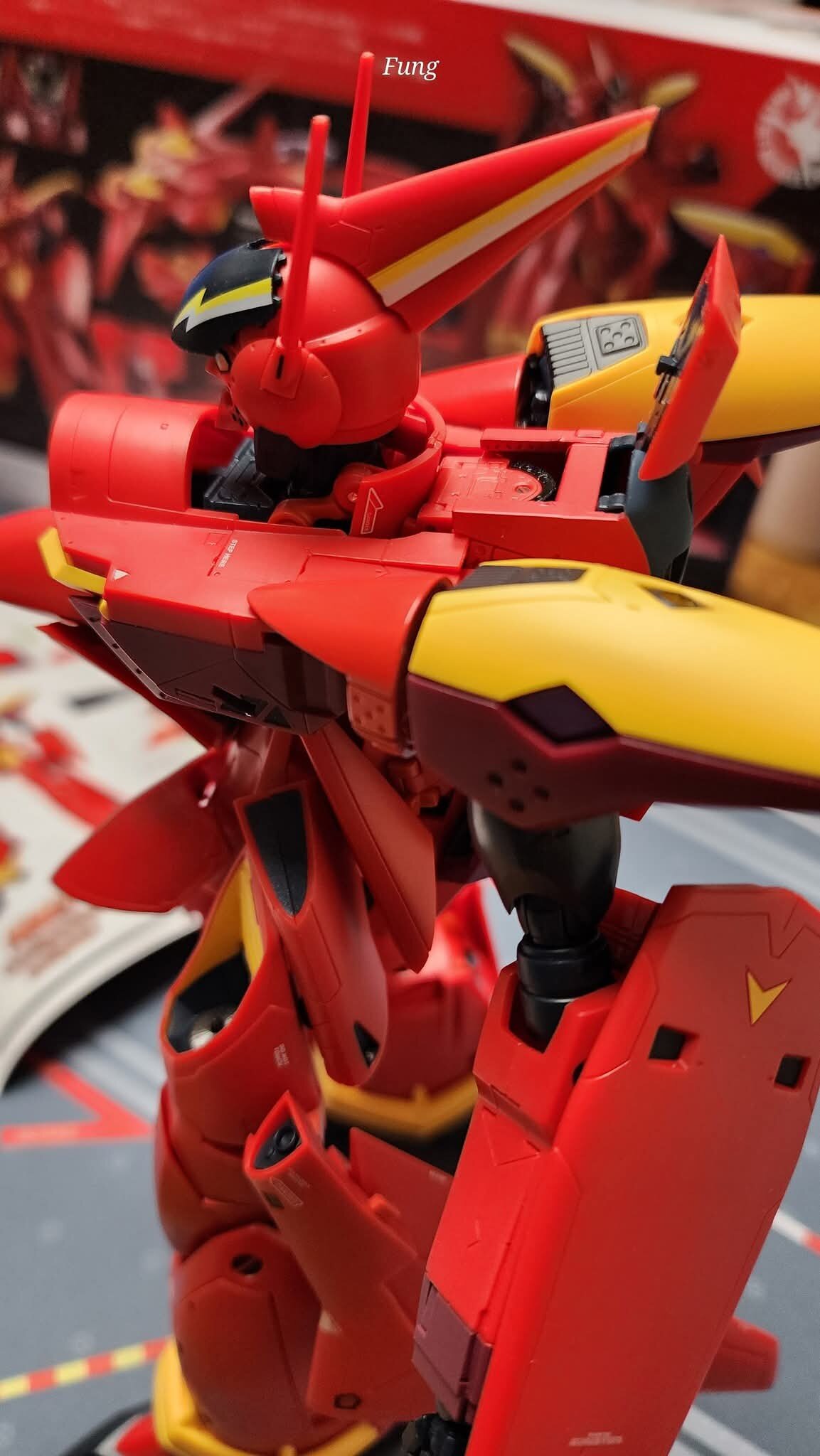
Some pics of the DX VF-19..Thanks to Kin Fung Chan for sharing
-


Bandai 1/60 VF-25 DX MESSIAH VALKYRIE Top Gun: Maverick Ver.
in Toys
Posted
Not sure how i feel about this variant. Will deliberate on it till the PO is up