

NeoverseOmega
-
Posts
196 -
Joined
-
Last visited
Content Type
Profiles
Forums
Events
Gallery
Posts posted by NeoverseOmega
-
-
Awesome, thanks Graham! Thanks again for making our voices heard and keeping us updated! (Heh, are you bugging them about Mospeada as well? Kinda off topic - but they could really blow those designs out of the water).
That sounds about like what I expected - lets face it, Big West just wanted to cash in on the Macross name when the original creators weren't interested and did something that they probably wouldn't have approved of. Thus: Macross II. I can see why revisiting that would rub Kamawori the wrong way.
That and the movie wasn't popular on either side of the ocean - heck, Bandai didn't even do much with the license when it was still running. One model kit? No toys? From Bandai? Yeah, I can see why Yamato wouldn't expect to make back the tooling costs on this one.
I still love the designs though!
And yes xrentonx it is about money, but part of the question is whether the little money that could be made on the VF-2SS and VF-2J would be worth possibly losing their connection to the creator of the original series. It sounds like they pride themselves on his approval and judging by his scratch marks on the early VF-4 cads he seems to have some input on the physical designs as well. There is a lot of love and passion in Yamato's designs, and they have always taken criticism seriously. While money is probably what makes the final decision, I think there's more than a little emotion in those decisions too, and I can't see them willingly straining the honor of having Kamawori inspect and approve their work. Of course at one point Yamato said they weren't likely to do an SDF-1 or VF-4 either. . . .its a matter of what they get to first, revisiting and improving more popular designs, or digging into the list of lesser known valks to try something different.
Unfortunately the Mac II valks have more than lack of popularity working against them. . . .
-
Anyone who's got the interviews to back this up, please fill in the references- this is just what I've gathered from watching the boards on the subject for far too long . . .
Aparently after Flashback 2012 and a gaming stint, Kamawori pretty much told any interviewers that brought it up that the Macross story was done, it no longer interested him, and he was moving on to other projects. Heh, and that Misa and Hikaru fell into a black hole . . . .
So Big West decided to make a Macross movie without him and it flopped. Aparrently Kamawori hated it so much that he decided to come back to Macross for the sole purpose of making sure that M2 could not ever be considered canon (heh, and possibly because no one would pay him to do any of his ideas unless they had the word "Macross" attached to them somewhere - so you might say he also came back so that if that universe was going to continue, it would be his way). He then went full bore into making both Macross Plus and Macross Seven. You might argue that if there hadn't been a Macross II, Kamawori would have never returned to his universe.
Of course the Hoary froating head kind of changed his tune later on. . . . When asked to explain how he handled the differences between the movies and the TV shows he took a very metafictional approach. The real Macross story is out there somewhere, but what the audience is watching are literally movies and television series from the Macross universe about historical events that happened in that universe. So neither one is actually accurate (any more than you can depend on war movies to tell you exactly what happened to real people in the war), only the real characters would ever know - and it doesn't look like they're around to ask!
Macross II eventually came to be accepted as kind of canon. At some point Kamawori said it was an alternate timeline. It is recognized in the compendium and if you go to the official Macross website under "series" Macross II: Lovers Again is listed as one of them).
So yes, Macross II is officially canon, just in an alternate universe that Kamawori has shown no interest in exploring -
I'm not sure, however, if that is just him accepting the fact that yes, the thing exists, or if his dislike of it has softened over time.
In short, yes, it COULD be political since it seems that Macross Plus, seven, and theoretically Zero and Frontier, all exist partly to negate Macross II.
Of course Kamawori just might be new age minded enough to say - hey, it's a another interpretation, if people enjoy it, let 'em. Only he and Yamato know.
-
Yep, the shoulder pauldrons appear to be fixed in position. Again, making those pauldrons slide forward and be able to rotate (Little things some of us have been saying for a while) would have improved the appearance AND the balance. Isn't there also some lineart that indicates that the boosters in the back of the pauldrons can fold down? I'll have to dig through my files . . . . Ooops, just checked it, no.
Heh, maybe if the web exclusive does well it's something that Yamato can revisit. Nonetheless, they've already outdone all the garage kits by a wide margin, and are making a VF that I thought would never get made. They've also done a remarkable job with proportions and details over all - its not as good as it COULD be, but its almost amazingly better than anything like this would be expected to be. Its the first VF-4 toy ever made, and one of the few variable fighters Yamato has made that didn't have earlier toy prototypes to study and improve on (also most of the material that is used is sketchy and officially unfinished). I try not to be an optimist or pessimist, but under the circumstances I'd say that while the glass isn't full to the brim it's mostly full, and if you like this kind of liquour the drinks pretty tasty too.

-
I'm all for it if they also release the Macross II VF-2JA!
Of course I also want to see the FZ-109, the Crusader, VF-5000, Variable Gluag . . . Not that I could afford any of these (I think I'll be able to save enough for the VF-4, but until the price is released I'm not sure which body parts I might need to sell) but there is something maniacally cool about the possibility that Yamato could have a collection of every variable Valkyrie Kamawori penned. Heh, Orguss Valk anyone?
The VF-2ss is VERY 90's, and while less convincing as a fighter than Kamawori's designs I do look at the unit very fondly - it IS a fun homage, and it does have a kind of sculptural artistic beauty to it.
It FEELS very anime-esque and does kinda capture an era and aesthetic. The VF-2JA, however, actually looks like it could have been a next generation Valkyrie, and it has some interesting twists turns and extras to its transformation that makes it a bit more than just a restyled VF-1. They are both nicely done transformable mecha, and do in their own rights deserve more than aging model kits. Normally, I'd say the audience is too small - but after the VF-4 (which makes me giddy), I dunno. Yamato has pretty much gone through all the comparatively "mainstream" valks already . . . . . well, after they redo the YF-19 that is.
-
And of course this beauty will be mine! It's just a matter of which opens up first, HLJ or a group buy. The only thing that worries me is how much time its gonna take me to save the money . . . . I'm hoping it's not going to be SDF Macross expensive, but we'll see.
-
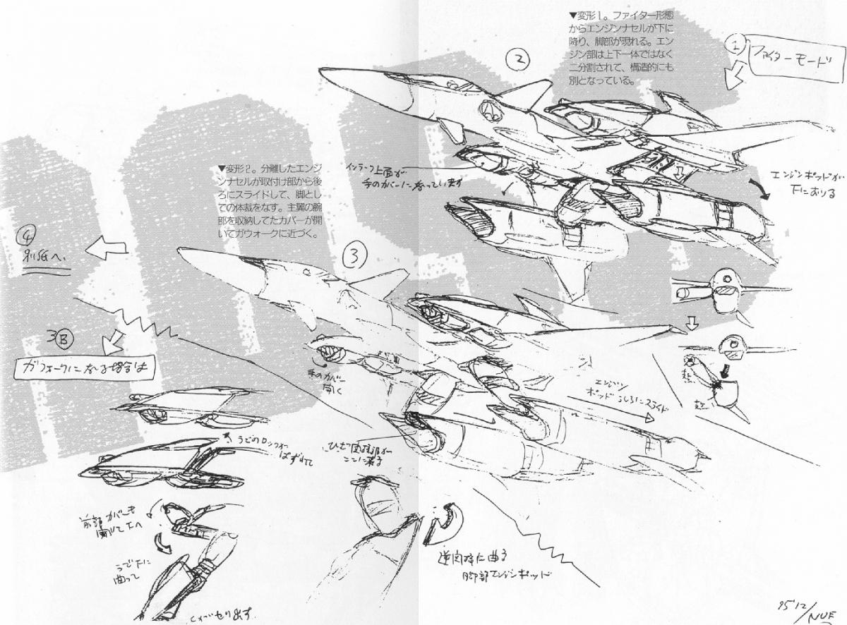
If it goes anything like the lineart (which it appears to) the thighs are going to fold to the side (you can see the metal hinge for that in the gerwalk pics) and the knee joint behind the fighter intake is going to rotate 90 degrees and then slide (or fold depending on how they handle it) backwards until it reaches that open piece in the lower leg that alows the thigh to lay across. Folding panels on the underside of the fighter are going to open up, swallow the thighs, and then close leaving a suprisingly smooth belly to the plane (all the resin kits just left them kinda hanging off the bottom so kudos to Yamato there).
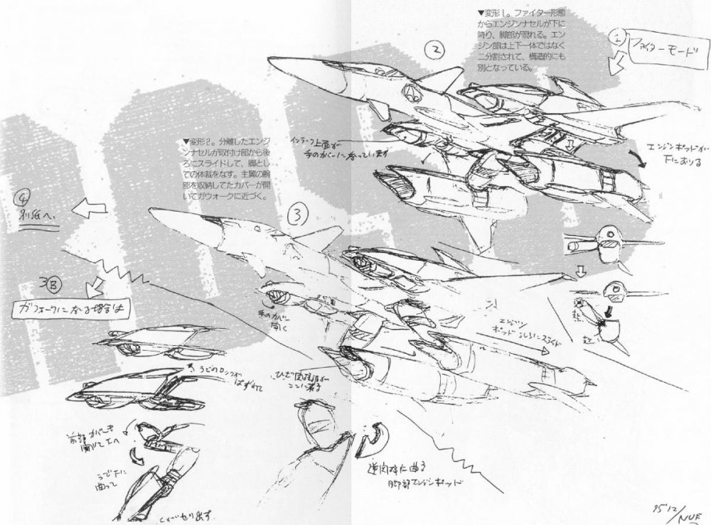
I suspect they did one of two things with the engine intake details - either there is a panel that folds up once the thigh parts are out of the way OR they are using a rotating joint for that whole shebang and it has engine details on it that become visible once everything is in the jet-mode position.
The double fold to get the whole thigh hinge area forward looks like its going to have a lot of solid metal, and has a pair of covers that fold behind it as well to help hide the ball-joint system.
-
Considering they've put NUNS stickers with the Mac7 VF-17's, I can't see why they wouldn't include the skulls with these.
At some point an unbuilt kit version would be cool - I mean, lets face it, the VF-X scheme alone has multiple variations (the promotional, intro animation, and game model all appear to have slight differences; didn't Yellow Submarines battroid kit have purple on the scheme they used for the cover shot?) - but initially at least I think most people want a complete toy. How many pages of hand wringing did we have on that very subject at the beginning of this thread again? Heh, I suppose its the same conundrum another gentleman on this forum was having over the SDF Macross - do you prefer the convenience (and confidence that you won't accidentally ruin it) of the premade toy, or the lower cost and customizability of the kit . . . . .
Of course considering that both the VF-X and 2012 regalia are mostly white, a finished solid white valk would be prettty easy to customize too.
Yamato could also just go berserk with the color variations: Pastelle blue Max! Navy blue Max! Midnight blue Max! Max with near naked Milia rendered minmei guard style along half his valkyrie! Ever seen Zorro the Gay Blade?
Actually the half naked Milia version sounds kinda sweet . . . .
-
Hmmm, maybe if I took the vibrating mechanism out of my cellphone and installed it in my valks nosecone we could make it mutually stimulating. . . . .
Awesome, I now have a project!
-
It's already been confirmed that this will NOT have the FB2012 Hikaru scheme, but instead Yamato will be using scheme from the VF-X video game (which appears to be what they have the license for). Here's the picture of the colors they are using, at least according to the Shizouka hobby show display (if they are true to the VF-X scheme, at least from the screenshots our resident VF-X expert posted, the yellow arrows will be red and the grey bands on the upper and lower legs will be red as well).
The discussion is actually further back on this thread, its a bit of a "CF" paintscheme for the VF-4. I personally still think it's a nice scheme and pretty close to the Hikaru colors, but it is missing the pale yellow and the all-important skulls. There are plenty of MW members that have already said no to this because it's not the 2012 paint scheme, but whether or not that paint scheme ever gets made is probably a matter of licensing and of course how successful this web-exclusive is. Other than getting the pale yellow to pop over the dark grey, this wouldn't be a terribly difficult customization, and I actually kinda like the colors they're using, but yes, it's disappointing that we couldn't actually get the 2012 scheme for 2012. Thus is life and licensing - I'm just happy to see such a beautiful VF-4 in fully transforming plasticky glory.
Of course the VF-X game also has Max and Milia schemes . . . . (I just hope if they do them, they go with the intro animation colors and not the pale pastels from the game itself )
-
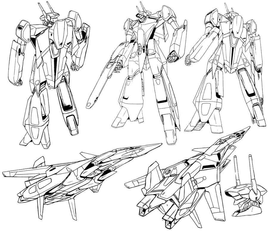
Those look pretty sweet in both modes - while I am a fan of complex transformations, in order to stay true to the original designs and pull of the limb modes I suspect these are about as complex as they need to be. They are certainly lightyears beyond the originals (there are some really nice touches in the transformations, the way the arms fold forward, unfold to become thinner and partially insert into the side to keep the planes reasonably streamlined is an elegant improvement over the 80's versions, and I suspect there are going to be some nice origami twists to the torso/head/cockpit assemblage, but at the very least there is going to be a lot of nice little robot details tucking away into the plane to bring it much closer to a believeable aircraft than Hasbro has been doing lately). Still wondering how they are going to handle Silverbolt - the concorde scares me a little, but how they've handled these two makes me fairly confident it will, again, be a huge improvement over the original.
These aren't exactly Valkyries, but considering the aerialbots were essentially plastic bricks with unfolding jet and robot parts on them a kamawori-esque transformation would end up with robots that look nothing like what they are trying to homage and probably wouldn't fit together into anything resembling super-ion.
I would love to see a valkyrie style assembler though! Heh, now theres a project for the big K with his legos . . . .
-
Anime is dead. Long live Anime!
Seriously, when I look back at the anime I loved and grew up with, most of it was garbage. When we are developing our tastes, ironically enough it often runs somewhat backwards - the things we like are what we use to construct an idea of what "good" is. In short our tastes end being used to teach us what's tasteful, at least initially. Over time meeting other people, exposure to different media, and sheer numbers of examples tend to refine these "tastes". For example, something that was cool to you once, but you've seen repeated so often and with so little variation can start to be tiresome, and even ridiculous. Of course someone seeing it for the first time isn't going to have that response, and they will be using the new media and new forms to develop their own tastes (which will be refined in time, perhaps in rejection of some of the things you love because they seem "tiresome and ridiculous" to them).
Wierdly enough that happened to me almost too early, when I hit my early twenties I was already missing the "old" days. When I hit my thirties I just decided, screw it, tastes change, people don't - if I try to find stuff to like, I will. While I do miss some of the dynamic lines and moving light of old school anime, I love how modern anime fixes a lot of the crazy inconsistencies and smooths the motion. I miss some of the mechanical design in old school anime, I like the clothing and textures in new anime. I liked the creative variation in character design in old-school anime, but I also hated how charicatured and goofy some of them looked - modern anime has much less of that charicatured goofiness, but sacrifices it for comparitively little visual variation from design to design. In short, I think legitimate issues in the anime we grew up with caused such an extreme backlash in the next generation that in fixing those problems they threw out some of the good that came with it - that's nothing new, happens in trends all the time.
Frankly, I think if someone carefully re-introduced some of that flashing light and line texture into modern anime it would look fresh and invigorating - it would seem new. I'm sure at some point theres going to be a rejection of some of anime's current tropes. Its just the way things tend to go.
After all, I watch cartoons. By most peoples standards that alone disqualifies me from ever making a quality judgement!

-
While I would LOVE to see a Yamato attempt at Mospeada mecha, I'm not sure how feasible it would be to just target Robotech fans. I go back and forth on it myself - part of me says that there was enough demand during the last big anniversary that if Yamato released really great stuff right out of the gate and just crushed any possible competition afterwards, they might do better than any of the three competitors did the last go-round. Also, if the toolings and molds on stuff like the Beagle ride-armors is already done, it would save on a lot of R&D cost. However, if you just target the Robotech market, you're dealing with people who are used to comparing prices in the U.S. toy market and who have a lot of overlap with transformers fans. Ever go to Transformers boards and see how fans react to masterpiece and 3rd party toys? Anything over 100 dollars is ludicrously expensive to them (and I suppose, rationally, should be ludicrously expensive to anyone but the hardcore fans like us - heh, what can I say, we're the crazy ones!).
Ironically, the people on this board would probably be a better target audience than Robotech fans . . . .
Of course, a Legioss is much smaller than a Valkyrie and has a considerably simpler tranformation, so they might be able to pull of making that particular item cheaper than a 1/60 VF. If being cost effective is the name of the game, maybe they can design their Legios to fit with a toynami Tread, and just include upgrade parts to improve the tread (folding chest cover for soldier mode, a piece to improve the gappy crotch, things of that sort). Of course I'd love to see Yamato approach the Tread from scratch - if a Yamato combo pack were close to the price of the CM's legios/tread combo it would actually be worth the money IMHO, but I'm not sure how large a fanbase they'd have to sell it to.
However, a market DOES exist, just a small one. I wish I knew exactly how small so we could kind of guage the risk versus the potential . . . . nonetheless Toynami doesn't seem interested in capitalizing on it, Beagle is gone, and CM's and Megahouse both got mediocre responses from their attempts (and as far as I can tell, neither company is known for going back and doing 2.0 versions of their designs). Yamato could theoretically corner that entire market with virtually no competition. Really, with whats already been done historically and Yamato's current level of engineering and quality, I suspect they are the only ones out there that really COULD make a healthy profit on Mospeada.
If they market these toys to EVERYONE who might have an interest, from Robotech fans to Mospeada fans to just high end mecha fans, I think Yamato could be successful.
Heh, I'm crossing my fingers, but not holding my breath . . . .
-
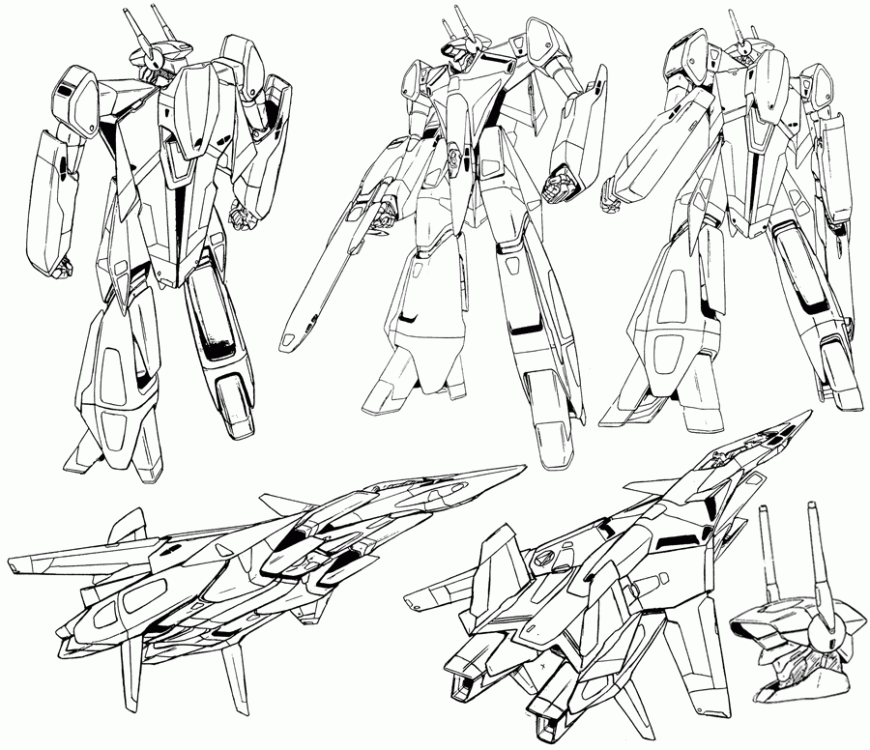
Gorgeous! They really captured the jet, and managed to keep all the other modes proportional and aesthetically pleasing. I like the sleek, lanky battroid - looks very dynamic for it's top heavy design. Like many I'm very pleasantly surprised by the Gerwalk - it looks extremely functional. I'm guessing the grey is ABS, the gold die-cast, and the black POM - looks like it's going to be pretty solid. It looks like they did a pretty good job of keeping the largest pieces of metal in its center of gravity - while I do worry a little about how those hips are going to hold up over time, if they handled it the way I think they did, a dab of nail polish now and then is all its gonna need.
Change Jug? Check!
Ramen Noodles? Check!
I.V. Fluids? Check!
Only six more months. . . .
-
While the side profile does look pretty good, It would be cool to see the torso up close and possibly from a few different angles like we've seen the jet proto. In the past the finished product almost always looked better than the CAD, and the CAD looks pretty good on this. I do kinda hope it comes with that stand, although I'm pretty sure it's not going to need it - the CAD shows spaces for landing gear and Yamato has been doing an fantastic job at jointing and balancing their valks lately. I hope they continue the trend and shock us by showing such a top heavy valk doing a crane kick without support.
Yes, the little superdeformed valkyrie does look pretty cute! Although I'm pretty sure its not transformable. . . . Heh, wasn't there a sketch for a transformable superdeformed VF-4 a while back too, that would make a pretty sweet toy for the people who like the big headed eggs.
As much as I would like to complain about how controlling Yamato is about pictures, at least now they ARE sharing things pretty regularly instead of just leaving six month dry spells. Perhaps it's a give and take thing, as long as they know they are in control of what gets shown and when, then they feel more comfortable as a company sharing more often. If that's the case, I'm perfectly happy with waiting a little after fairs and showings if I know that those aren't going to be the only times we find out anything.
If they hadn't been sharing CAD so readily over the past few months I'd worry that it was possible that someone else has the rights to FB 2012, and because Yamato only has rights to the VF-X version, they're afraid someone will take a look at the designs and say "hey, we weren't going to do this before because it looked like a pain in the a$$, but lookie here, finished prototype!". I suppose another way to think of it, is that as long as they can prove to themselves they are in control of the design process of something that isn't likely to be used by another company, they might feel more comfortable once they start working on something that could . . . .
-
Once you see valks with sidecovers, valks WITHOUT sidecovers look like Oreo cookies without the creamy middle. Sure, I love chocolate cookies, but I've had the friggin' Oreos - and now hollow oreos just don't work my friends.
We'll only pay you if you stuff our Oreos Yamato!
Wait a minute, that sounds a little off color somehow . . . .
-
She's a lovely ship - Yamato has achieved a beautiful sculpt so far! The rings from the prototype process are pretty obvious, so there are certainly going to be some changes to the final product. The CAD tells us at the very least the foot paddles are going to be different, and odds are those panels on the inside of the intakes are going to show jet turbines when all is said and done. I'm guessing the rectangular insets on the VF-4's fuselage are going to be locking tabs for the torso transformation (that bodes well for stability). The battroid CAD looks really good - while I do think they could have engineered the chest "cowling" to slide back a bit more and can think of a visually cleaner ways to approach the arms, they really captured the deadly crusader look and managed to balance the longer nosecone and legs with the torso and arms - that and I suspect their approach is going to be rock solid and playable. Yamato does really manage to give you the feeling that this is how it was always supposed to look.
Didn't both the VF-X promo poster and screencaps show the VF-4 with a white nosecone? I thought the arrows were red there too? Well, I'm hardly a VF-X expert, and frankly, I love the sculpt so far way too much to bring myself to gripe about the paintscheme.
As far as the tailfins, if there are multiple different depictions they might have decided to just leave that area blank and print more stickers so buyers can decorate it to their tastes. I can't see why they wouldn't include jolly roger markings on a sticker sheet, heck, it wouldn't even surprise me to see NUNS markings.
While I was hoping for the Hikaru scheme, I do nonetheless really like this as well. It's funny, in other circumstances we would have people clamoring for white or grey schemes for customizing - this does make a pretty sweet CF VF-4. Still, I can see how some people are going to be disappointed - not getting the 2012 scheme for 2012 when that's the last valk we get to see Hikaru in is a bit of a letdown. This bird is a bittersweet beauty to begin with.
Being, heh, well below medium income and not having anyone who's going to be giving me holiday or birthday gifts, I usually only get the paint schemes I like the most with the Valk that is most representative of an era for me. Personally all I have in my collection so far are the V2 Hikaru 1J and the Isamu Dyson YF-19 valkyries. However I've wanted a VF-4 for a LONG time - after all it was a poster from Flashback 2012 that first alerted me to the fact that Macross existed outside and beyond the Rowboat-ech I grew up with. That beautiful plane and the elegant character designs stuck in my brain until I finally got online to find out more. So the sheer possibility of this being the only release means I'm going to get it regardless of whether it's Hikaru's or not. If they release a Hikaru down the pike, I will get that as well.
For a guy that has an almost pathalogical aversion to buying repaints thats saying a LOT. Keep in mind this will probably require Top-Ramen and an IV.
-
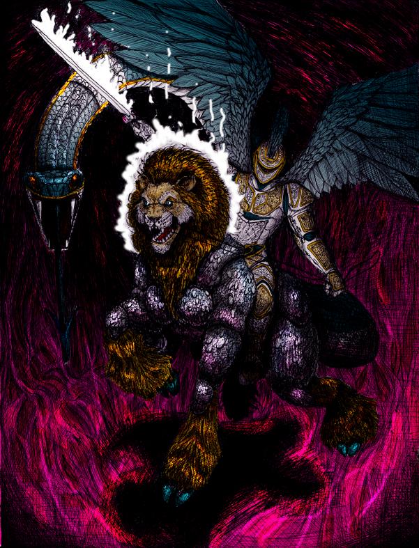
Wonderful image, love your hatching style - gives all of your work a sense of both energy and texture.
Visited Asplenia Studios and I have to say I like what I see. Very elegant and easy to navigate, subtle and well put together. Loved your latest Max and Milia image - good line variation (from the very fine lines in Max's helmet and clothing folds to the very thick ones on his outside arm). If there are any complaints, the background looks pixellated and grey compared to the very clean image of the duo and their valkyries. Also, while there is a lot of excellent line variation, somehow the lines seem to lose their crispness on the valks - did you enlarge them? It looks like they were drawn with a much thicker pen. I love their dynamism and you did a fantastic job at capturing that captivating anime rippling of light and shadow, but they seem to lack the fine internal finishing lines you lavished on Max's uniform. Nonetheless, I love the compositional choices, the subtle use of gradients, and the very human character in their expressions. Lighting everything from below and matching it up with the thruster wash gives a sense of drama and intensity to the image- it also make Milia look darn imposing . . . . Always good to see a little Macross art!
The Dashbots were a great primer for the mecha enthusiast - a little Megazone, a dash of Mazinger, some Tetsujin 28, Gundam, . . . . very playful and very well done. You managed to get a great balance between silliness (The little guy holding a mechanical pencil, or the endearingly clunky thunderhead) and simply cool (The sleek powerslide and the very Queadlun-reau/five star story Callidus). Again, I love how you handle reflection on your mecha - it flows along their form in a very natural and still dynamic fashion, giving a lot of movement to even a static pose.
Well enough blabbing for the moment - I do tend to go on.
Fantastic work - looking forward to seeing what else gets posted up here!
-
Thanks man! It means a lot to get positive input from another artist.
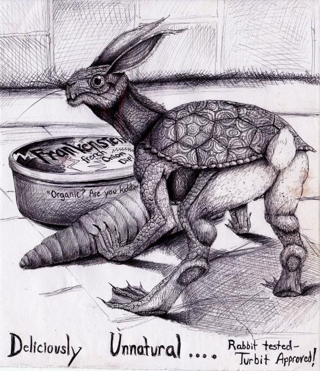
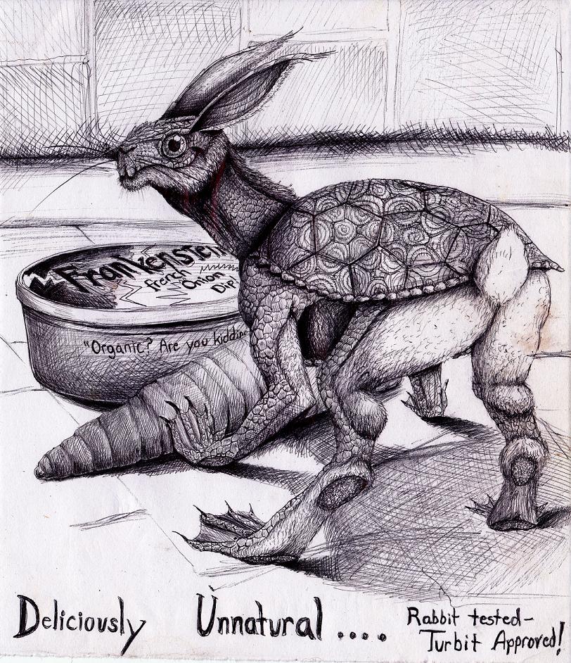
Heh, the Turbit was fun, even if putting in all those scales made my eyeballs cross. It's wierd how inspiration hits sometimes - I overheard people talking about organic food and couldn't help but comment that all organic means is carbon based (pencil lead, for example, is carbon based). This somehow lead to the notion of some bizzare chimerea trying to sell foods that nobody in their right mind would ever eat. Thus the Turbit hawking Frankensteins French Onion dip: rabbit tested, turbit approved!
Enjoy looking over your work as well, there are a LOT of talented people on this site. I'm really impressed with what you can do with color and texture. You seem to have a knack for catching the eye with warm and cool contrasts and then softening the image with really subtle shades and shifts. Makes a man want to play with markers more . . . .
Do you deal with much marker bleed with your work, and if so is there a way to correct it?
Looking forward to more art filling up this thread. It keeps us interested and motivated!
-
Very cool stuff - its nice to see the professionals at work here!
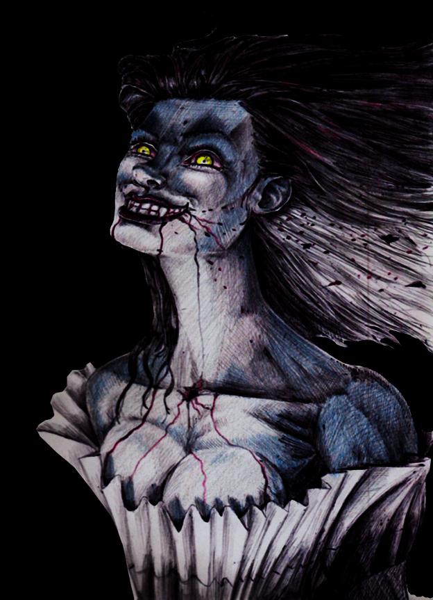
Heh, I'm pretty much self taught, so most of my work is scribbled in a little 9 by 10 cheapie Schnucks bought sketchbook with a bic pen. Just to stay out of the dark ages I'm teaching myself some computer editing though - the first two were given the technicolor treatment with colored pencils and touched it up a little with gimp. The last two are colored entirely in Gimp - probably a little overly stark and the anatomy on the ladies bug me (usually the necks aren't a problem, and with the Vampiress it works because she was actually hung at one point, but both just look so long necked its jarring. Wierd, not one of my usual problems.). Generally my style is more sci-fi, but since working on Eloquent Scars with a goth metal-head, I've been experimenting with dark fantasy. Fun times! Feedback and criticism is welcome (just try not to be TOO brutal, I'm learning).


She eats twilight vampires for breakfast............Ondurauk: part dragon, part vulture, part spider - all nasty.

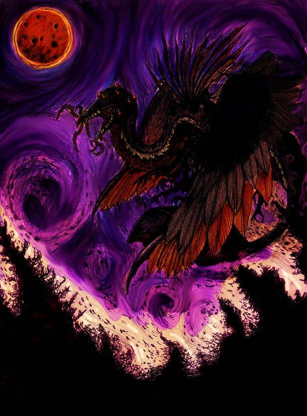
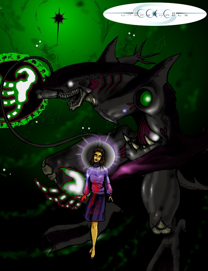
Undead archangel, quite a story behind that . . . . Thuvaunu is the dark star, the sharks are its thoughts, and the lady is possessed.
(Just 'cuz I love this wierd little dude).

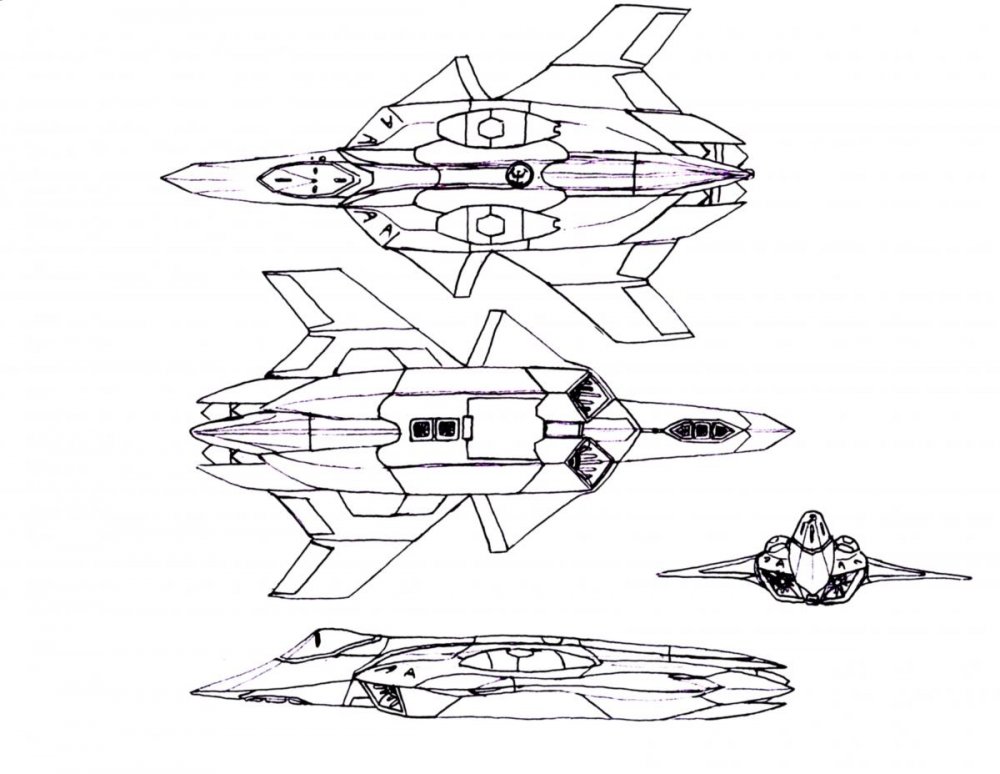
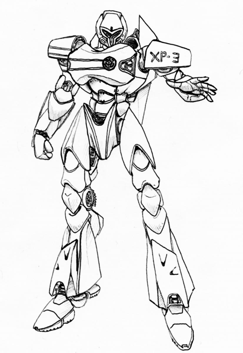
(Some of you saw this before - I'm actually revamping this but it isn't scanned yet. Just had to throw out a bit of mecha art, especially since the Oberon here was the first bit of mecha design I've done in years. Hopefully once I get my scanner behaving properly I can upload the updated version with the transformation).
There, hopefully that doesn't fill up too much space with the detritus from my scrambled brains!
-
Excellent update on the slope of the nosecone! I'm guessing the open space below and behind the cockpit is going to house the landing gear- right in line with this by the looks of things:
It's impressive how they handle the transformation without breaking up the battroid chestplate with the hinge (most of the previous designs just put a huge metal joint there that cuts into the bottom of that silver plate)- they are definitely paying attention to all modes at least in that area, which is heartening.
So far I'm impressed. Still looking forward to more detail though- particularly on the wings, thrusters, and the arms, (I think, and hope, that those areas were just rough geometry in order to help them focus on the real origami work of the main-body transformation. Being someone who likes the battroid mode too, the CAD made the arms unnecessarily skinny and the hands even more chickeny than previous valks, which is uncalled for with all that space both in the shoulder boosters and forearm units. Heh, Yamato shoulders and arms are always the scariest area . . . .).
So far it looks like they are approaching it with the same intensity and engineering they brough to the VF-19's, which makes me hopefull that this will be another true piece of toy art.
Going by the color scheme on the CAD, it looks like despite the licensing choice they are making Hikaru's valk, or at least something close enough that a few carefully selected stickers would finish the job. The pale yellow nosecone and square deco on the battroid chest cowling fits that scheme perfectly. It also looks like they are molding the conformal missiles as separate pieces of geometry which is critical. Having them sitting firmly and magnetically in their conformal wells would be sweetness.
Many thanks to the people at Yamato not only for approaching this tough beautiful bird, but for sharing bits and pieces along the way! In the past knowing that something was coming out in December just meant month after dry month of curiousity and uncertainty until a tradeshow hit. They are doing a fantastic job at not only whetting our appetites but helping those of us interested in it see the progression from rough layout to detailed and metal boned masterpiece.
Of course I still want more juicy pics!
Of course I say thank you now - but I strongly suspect my wallet, bank account, and more than likely my food coffers will all be spewing expletives (possibly every expletive, in multiple languages) by November.
-
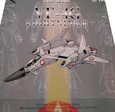
Beautiful box art!
If only Yamato could get Tenjin to do their box art . . . . but wait, that would probably bring the price even higher!
Still, it would kind of be cool to have box art that you actually WANT to hang on your wall.
Sigh, Yamato could knock a Legioss toy out of the park, they're smaller and simpler than most valkyries - the only tough parts are detail and proportion and Yamato is a master at that. They have so many examples to work from and improve upon, and there are a lot of canon recolor options (not to mention non-canon ones - heh, brownie CF VF-1 paint scheme just cuz' they can . . . . ).
Heck, all they have to do is order one from Captain America to get a good visual reference!
Someday Yamato, please.
-
Sorry, I do have a knack for tangents (although you can't say I didn't integrate the VF-4 in there).
Back to our lovely three hulled hellraiser.
I think a lot of us agree that a rotating shoulder pauldron makes sense. If they make the shoulder assembly light enough and use a metal hinge and frame (I've always been a fan of using a kind of die-cast skeleton encased by plastic on these things) it should work. They might end up having to put the hinge slightly off center to leave room for the upper thigh to cross over, but thats doable. Not that there aren't other options - in the lineart gerwalk and battroid pics the arm is pushed forward to the point that it looks like its coming out almost right behind the shoulder cannon. For the upper arm to stay as long as it is, it would have to push back into that cavity a good way. One option is to make the grey inset for the shoulder cannon the VF-4's actual shoulder and make that rotate (it would be logical for the transformation anyway, that way you could rotate the arm clear of the leg entirely (instead of having it hang a little into the intake cavity like the lineart shows) and then just slide the whole mess back. However I still like the rotating shoulder pauldrons better - not only does it give you significantly more range of motion, but it just seems to make sense that you should be able to angle those big horking guns (heh, assuming that's what they are, the stats only describe two beam guns but in battroid it looks like it's got four - unless the foream cannons only work when they're connected to the shoulder assembly, but then the flap folding on top of it makes no sense at all).
Both rotating shoulder pauldrons and a rotating shoulder within the pauldron itself would be ideal IMHO, that way you get a clear intake, and you can shoot the Zentran standing behind you in the face . . . . .
Is anyone else a little annoyed that they seem to be using the SHE solution to the forearms? Just having dangling pieces that slide over the forarm and hand works but it takes away from the very smooth clean look we see in the lineart. They could simply make the forarm shell unhinge so the hand can slide up and back to where it has more space and then lock back closed, OR they could just have the wedge shaped protrusion with the hand rotate back then slide forward so it fits neatly inside the wedge shaped forearm cannon (a little tricky, but I think doable. Every way I look at the lineart for this thing, it looks like the forearm sheilds essentially ARE the forearms with a little doohickey underneath for the hand to fold out of. Most of the previous designs, and yes the Yamato CAD, look like they just built a generic robot arm and attached a hing for the forearm shield to flop around on. That's essentially backwards. Easy yes, but less elegant looking, and certainly inaccurate for the VF-4.
Heh, since we've already talked about the feet, the angles for the wings and fins, the nosecone, and the head, just had to throw another nitpick into the mix!
I really like to think Yamato reads this stuff and says hey, that might work! More likely they see big block of text and say "A-hole" . . . .
-
Cool, somehow I ended up on the internet chatting with two of my favorite reviewers. They say technology keeps us from connecting . . .
Well, off topic (I'll bring it back to the VF-4, believe you me)-
The last two times a new Legioss was made the results were lackluster at best. The first was reasonably anime accurate and ambitious, but it was horribly overengineered, used die-cast in the most senseless manner possible, and had a fit, finish, and build that was so pathetic that it literally self destructed most of the time. It didn't help that it was tied to a company that many people hate and, well, it took them HOW MANY YEARS to release what they said they were going to release? The second was rock solid and came with a Tread - but it threw anime-accuracy out the window and while the fit, finish, and build were all great, the design and engineering choices left a LOT to be desired. The jet mode was a floppy mess and all the modes had odd gaps and protrusions. CM's unit was also, by almost any standard, ludicrously expensive for what it was.
So yeah, those were products that only the most hard-core Mospeada lovers would touch outside of a bargain bin.
Theoretically a rock solid, anime accurate Legioss from a company that actually shows that they pay attention to their customers and their past performance could do well. If people actually WANT to support a release they will (look at how well the VF-19 Kai did despite all the people who don't like the design, the pilot, or Mac-7. Many people bought it to support future releases and because it was just so well made).
Part of what is essential, however, is timing. The first new legioss was released after a failed masterpiece VF-1 line, and it didn't exactly get glowing reviews out of the gate. And they didn't improve anything from release to release. And they kept promising things that turned into vaporware or finally made it out the gate years later. Any enthusiasm for the product would be pretty much dead by then. The second was released after a glut of mospeada merchandise all competing with each other for an already small market with, again, lackluster toys.
Part of what hurt the VF-11 and the VF-22 is timing - although they are fantastic designs and fabulously engineered, they are tertiary mecha (I say that with chagrin, cuz' Max's powder blue-gazer aint tertiary ta nobody) that happened to be released just before people realized how far Yamato had come in terms of designing a TOY. People still had the VF-0 exploding shoulders, floppy SV-51, and rising toy prices on the brain. The VF-21 was just starting to get its due when a smaller VF-11 gets released at the same price . . . . again, timing.
Now Yamato has been hitting it out of the park with release after release - the Macross itself, the VF-19, the VF-17 - people trust that the product will be simultaneously as anime-accurate and as sturdy as humanly possible. I don't know if there's going to be another anniversary for Mospeada coming up soon, but part of me says - release something BEFORE that time. Don't compete with a bunch of lackluster attempts to drain a brief resurgence, snap up all the people who were dissappointed by the previous releases.
After all, a Legioss is much smaller than a Valkyrie, and while it does require complex engineering, its nowhere near as crazy as stuff Yamato has already done. And they have lots of models, toys, and failed practices to study and learn from.
The VF-4 has only ever been a garage kit and while some of us (myself definitely included) LOVE the design, it showed up in video games and for a few minutes on a music video. While Mospead isn't exactly the most successfull mecha anime of all time, it has a following and I can't help but think that what is essentially the main mecha for a show has to be able to do at least as well as the VF-4 would - especially if they design something that makes everyone who even has a little liking for the design say: "Finally, now that's what I'm talking about!"
That being said, if they consider doing the Legioss, I hope it sits on the burner behind the work on the VF-4. This mecha is probably the ultimate challenge as far as Valkyrie designs, and I'm already worrying about what kinds of decisions are being made in Yamato design offices.
-
Heh, if Yamato ever announces that they are going to do a Legioss, the black market will be glutted with kidneys from poor Macrossworlders . . . . .
I might have to come up with another organ though because I suspect the kidney's going to the Lightning III. If Yamato goes into the Mospeada market I'd probably end up on life support (Legioss and Tread alone would probably require most of my innards) . . . . . but I'd be playing with some pretty cool toys in that hospital bed!
Oh the expression on those doctors faces!
Again, opinions opinions, but I do kind of agree that the Legioss pulls off the heavily armored soldier look a bit better but at the cost of a blocky and in some ways less convincing jet (how do those intakes connect to the boosters anyway? Do they even? I mean, does a space jet technically need intakes?).
But the Legioss doesn't look like it could do the medieval crusader thing (even if it does have the sword for it -erm, in a dream anyway).
Of course part of the appeal of the VF-4 is the transformation - the fighter doesn't even look like it should be ABLE to become a robot (that's probably why it's so easy to perpetuate the myth that it wasn't originally intended to). Not only does it transform, but it does so in a way thats unique and ends up with a robot which looks so much tougher than you'd expect from that jet design (again, if its done well - I already kind of have some issues with how they appear to be handling the arms and the feet, but so much is unfinished on the CAD model its difficult to say much).
VF-4 does blocky AND elegant - and it wears its sunglasses at night . . . . . .


Any chance of a vf-2ss?
in Toys
Posted
Thanks Jenius!
Any stink was unintended and any attempt to blow it out much appreciated - it does get hard after a while to weed out the quotes from the paraphrases from the conjectures. It's interesting that he didn't even see Mac II until much after its initial release. That does kind of kill the whole myth of him just outright hating it - Studio Nue did declare it an alternate universe instead of simply saying "never happened".
Although it is interesting that at least in the past Kamawori wouldn't have liked it if they did the VF-2SS - of course as far as we know he might have just been thinking "my god, so many intakes" and not "These were the bad guys that messed up Macross". Macross II is a far cry from his sense of aesthetics.
I still have a soft spot for those designs though. ;P