demolition skunk
-
Posts
3 -
Joined
-
Last visited
Content Type
Profiles
Forums
Events
Gallery
Everything posted by demolition skunk
-
I totally agree. The nosecone in the 1/60 v2 battroid mode is plenty short! The nosecone and the wings in the battroid line art are impossibly short and should not be aspired to. Also, its limbs are too thick, hands too big, etc. It's meant to capture gesture, anyway. IMHO, the 1/60 v2 is the best looking battroid ever. That includes all the super poseable figures, model kits, everything! Nothing else looks as right and as realistic.
-
No worries. I didn't take it as a flame I didn't mean to disparage the line art. I happen to like it a lot, except for that one front view of the battriod which I've never seen in any of the art books, btw. It seems that when the animators had to animate the fighter to battriod transition frame-by-frame, they realized how the battroid should look based on the fighter's proportions. Keep in mind, I'm thinking of the best animated episodes (the Max vs Miria dogfight in the series is a prime example). It's interesting how the battroids in those episodes really look a lot closer to what the 1/48 and 1/60 v2 turned out to be. As far as the collar goes...I don't see it in the line art or the animation (there are a few instances when Hikaru's 1S head sits higher in order for it to look down in a low angle shot). The collar never bothered me, and I hardly noticed it until a friend pointed it out. It's just one of those compromises that has to be made. However, in the side-by-side comparo between the 1/48 1S and the 1/60 1S, I suddenly noticed that the 1/48 neck looks more substantial and more like the anime. The 1/60 1S neck looks a bit scrawny. Anyone else see this?
-
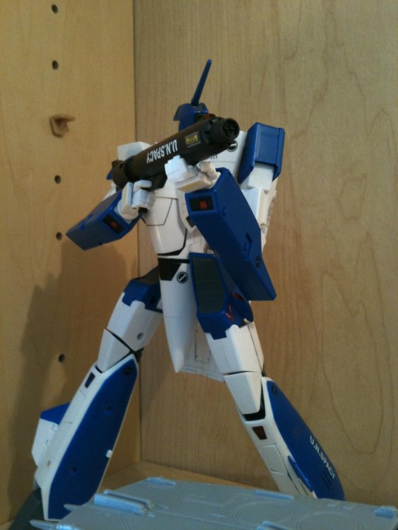
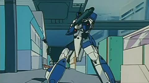
I wish people would stop using that funky battroid line art as a gauge of how accurate a VF-1 sculpt is. At no point in the anime is a battroid ever drawn like that. Animators are really good at maintaining consistent proportions while animating character or mecha designs. They drew the VF-1 in battroid mode (in most episodes) much closer to how it would actually look, and it's no coincidence that this is what the 1/48s and 1/60s look like as well. In other words, once the animators got familiar with the design, they drew it more accurately than Kawamori himself did. The 1/60 v2 does an excellent, almost uncanny, job of capturing how the VF-1 is depicted in the anime. That's much more important (and more attainable) than the line art. In attached pic, note the slender, long nosecone, the smallish, unexaggerated hands, and the realistic length of the wings. The VF-1 is drawn this way throughout this outstanding episode and in several others, and it is far better than the line art versions. 1/60 comparison: Bottom line: line art is HUGELY over-rated. And this is coming from an animator, btw