
the white drew carey
-
Posts
2922 -
Joined
-
Last visited
Content Type
Profiles
Forums
Events
Gallery
Posts posted by the white drew carey
-
-
Gakken's first point (which Danth just quoted above) is a big sticking point for me.
Also, there are enough changes that affect the very nature of the book: cleverness often outweighs brute force. All of the points in the book where Bilbo uses this have been altered to the point where it doesn't mean anything. His well-crafted plan to free the dwarves from the wood elves after weeks of thought (and the fact the he compounds the effect of the plan by returning the keys to the jailer, providing a puzzler for the elves) is lost because Jackson wanted another useless chase scene featuring Legolas 'snowboarding' down hills on objects and dead orcs.
And then Bilbo's cleverness in keeping Smaug interested long enough to not kill him by using riddles and hidden clues is gone (or altered beyond recognition) because we had to have a stupid Geonosis Droid Factory Part II action sequence with dwarves flying around in mining equipment.
The more I think on it, the more I begin to hate the movie. I'm already waiting for the fan-edit when the third one is out where all of the useless crap Jackson put in is taken back out, leaving a nice, solid 2.5-3 hour movie which is actually, you know, about a hobbit. -
totally not sitting through this in the theater. Will wait for VUDU or Redbox, whichever comes first. Although I must say, as a huge fan of the LOTR trilogy (extended editions to boot) it does seem like he is adding a lot of superfluous crap to the Hobbit movies. just for the sake of making them run longer.
Yeah. I mean, him and his team did an excellent job condensing LotR into three films, and only two changes they made ever bothered me (Arwen's increased role [which I can get past], and Faramir's change [which was awful]). Now imagine a film full of Faramir changes and made-up Arwen-type stuff, and you'll get the idea.
-
Just saw Desolation. Man, did that suck.
I'm not going to spoiler tag this stuff below because if you've gotten this far in the thread, you've heard enough.
Jackson was applauded for fitting LotR into three (very long) films. But I still don't get why the heck he felt the need to turn The Hobbit into a three (over-long) films. Even adding in the stuff from the appendices would only justify two.
Instead we get a retread of a dwarf infatuated with an elf, characters who are different than they are in the book, and needless action scenes (I almost walked out when Thorin was running under Smaug with the wheelbarrow).
Plus, there are tons of wild inconsistencies regarding the crap that Jackson added in, especially regarding the stuff in Laketown.
Hey, these Laketown people are happy to see the dwarves, and provided us with weapons and supplies to assist us in our quest! Uh-oh, Kili is sick. Knock knock. 'Bard! You're the only one who can help!!! Not any of the other people who are actually happy to see us!'
Bard spends hours in his house with sick Kili and the other two dwarves. HE IS AT HOME. Yet the moment he leaves, the guards are like 'Hey Bard, we've been looking for you!' Needless chase scene.
30 orcs attack Bard's house in Laketown. No one notices a bunch of clumsy orcs running along their rooftops. Tauriel and Legolas have a fight with them and Legolas continues the fight for a decent amount of time through Laketown, yet no one raises a cry and no guards show up.
Ugh... -
Looking good!
Do you still want me to post the logos without the background (or, better yet, e-mail the actual file to you)? -
So, using the two fonts I posted before, this is what I've come up with. I know that I cut the color of the space fighter, but I think a grey scale is more in line with the font itself, leaving the color for the spiral you created but, of course, that can be changed back.
In hindsight I would've made the wings and stabs of the fighter overlap the text, while the spiral stayed behind.
I also nicked the part of the spiral that was coming out of the trail that lead to the fighter... thought ti didn't work.
-
KH355hamdi - nice stuff! Sometimes unfinished works tend to be more effective in their presentation! I like how well you've captured the details of the face without overdoing it.
Knight26 - getting there! Sketchley's right (again)- you should be able to keep everything as independent or linked layers in Photoshop and be able to do all of the moving around and resizing much easier in there.I have two criticisms with the newer images: the first is that I think you went all the way through to the other side when altering the bright center of the galaxy in the background. Now it is such a solid brownish-orange that it just looks like a puddle of... well... something.
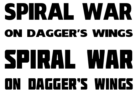
I like the bold solid fonts over the first one (I know you put a lot of effort into making it, so I feel bad knocking on it, but it just rubs me wrong). However, I'm kind of against the outer glow you are using, how dark the background spiral in the logo is, and the color choice. If there is one thing you want to pop on the cover of your book, it is the title, and I think you have a good chance to make a recurring series logo here (spiral shape, space fighter, and SPIRAL WAR being the constant, with the book name underneath).
If you'd care to, shoot me a copy of the whole logo (or at least the spiral and space fighter), and I'll show you what I mean. -
Oh... I don't know. Digging through my cache of DL'ed fonts, Insolent and Molot come to mind.
Insolent (the top one) is thick and strong. Basic, but it gets the point across, especially since I am a firm believer that if your going to put the spiral and spaceship in the logo, the text should not detract from it (unlike the Dirty Pair, I don't prefer to go 'Over the Top!').
Molot (at the bottom) is a bit more 70s-ish, so a tad more flair, but still less distracting.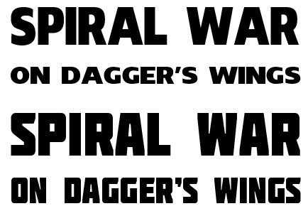
-
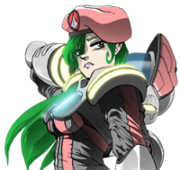
What Sketchley said. Also, and I am in no way knocking Exo's drawing because I'm always lamenting how good his work is, but the pose of the characters seems a bit pedestrian. The image with the space fighters in a near-vertical position to the viewer and the angle of the galaxy make the start for a dramatic composition. And then you have these three characters just standing there, looking bored.
I have two main problems with the logo:
1) The logo blends too much with the background. I can see what you want, but I would prefer that it be a solid color without the 'reflected light'. Also, I only just noticed the spiral and space fighter are part of the logo. VERY hard to see, and would be 100x cooler if it was clear that they are there.
2) I hate the font. I simply detest it. It looks very amateurish and, to be honest, reminds me of the font some garage hair metal band would've used in the 80's. SPIRAL WAR sounds so grand that I would rather imagine a strong, thick font that embodies the words 'ominous' and 'vast'. -
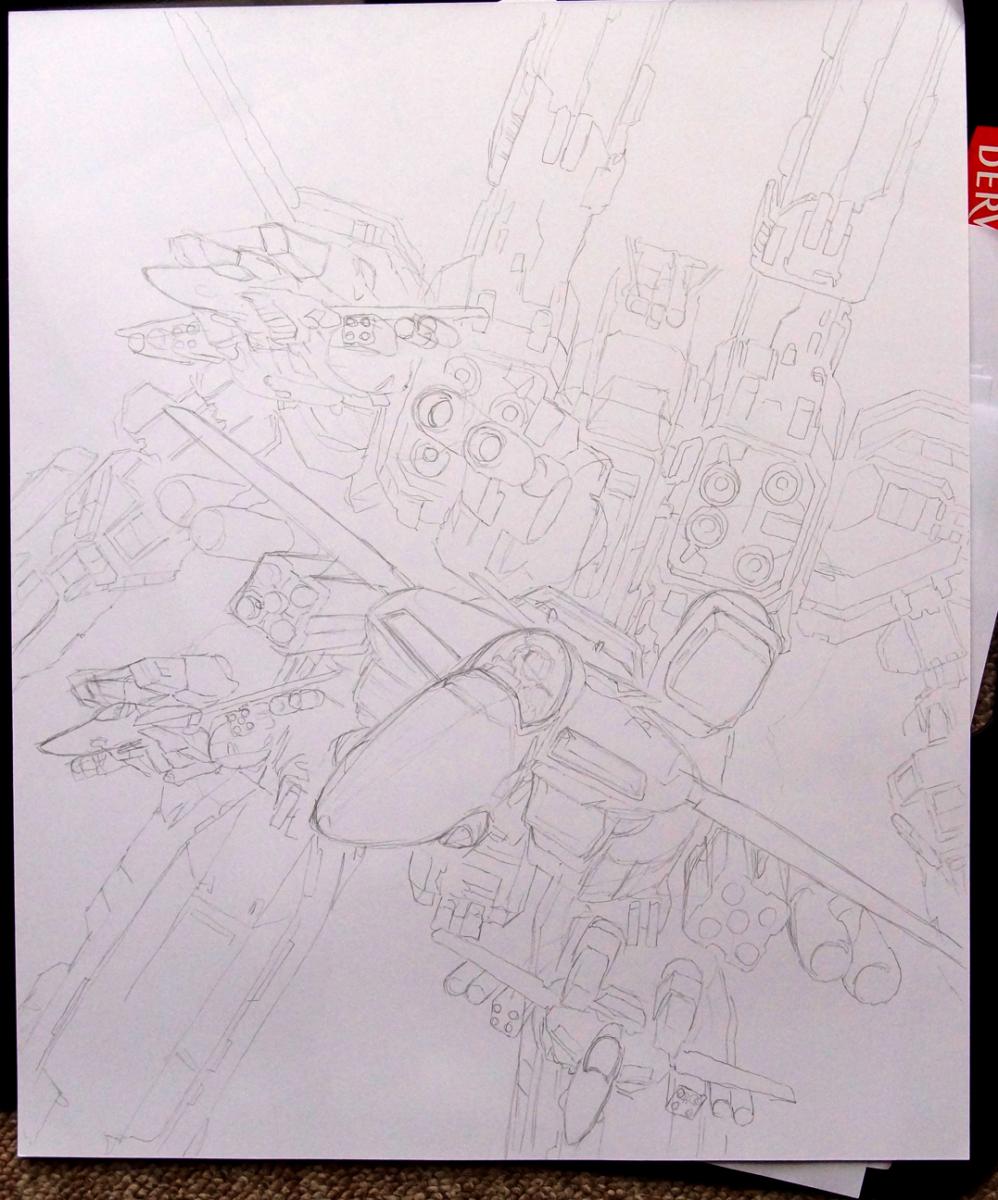
In between my full-time job (damn you, work!), trying to keep up my newly-self-imposed semi-weekly schedule of GAMERGEEKDADDY comic strips, and some freelance projects I have been working on, I have started to put together the following WIP. It is roughly A3-size, and will be entirely in pen and marker.
It may be awhile until it reaches fruition, but I hope it doesn't take too long...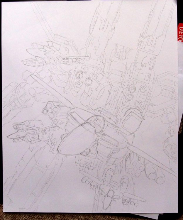
-
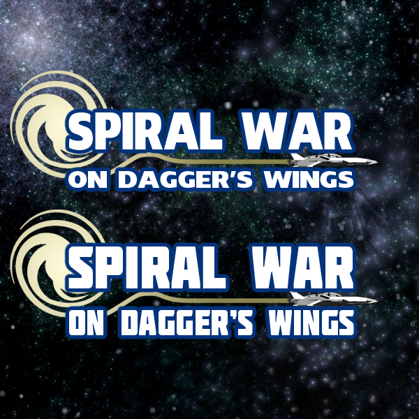
A lot of what Phyrox said I agree with, especially aliased lines. The concept is sound, but the execution needs more work.
I find the galaxy of stars in the background EXTREMELY distracting, Maybe tone it down a bit?
The font for the logo and author's name are very difficult.
The text for the back cover is hard to read. Maybe think about darkening the image behind, or making the text black and lightening the image.
Can't wait to see where it goes!!! -
Is it me or are the first few pledge levels basically giving you the same thing?
-
What is Sabretooth doing on Mars?
-
Some cool photos in this post over at EnglishRussia:
http://englishrussia.com/2013/09/17/shooting-planes-from-the-ramp-of-an-12/ -
The one thing I REALLY like about Patlabor is how the Ingrams look functional. No (or very few) parts of the design look like they are there just to be cool and stylish (which, IMHO, was part of the reason the Type-0 was such a sleek and stylized design... to set it apart from our work-a-day Ingrams).
That thing up there, and the new design for the live action... not so much. -
Watching Project Runway with the wife.
-
Yeah. Better than the promo photo, but a bunch of useless greeblies added on for no discernible effect.
The thing I always loved about the Ingram design was that it was visually smooth and sleek, which separated it from the work-a-day labors it was built to contend with, as well as the military labors and then the ultra-sleek and stylish Griffon.
It just looked like it was designed in mind with the knowledge that it had to be functional, but was also going to be the very visible face of which ever police departments were using it.
This? "Let's throw giant lug nuts on the shoulder... just because."
Give me a new animated movie, please. This time focusing on Section 2, unlike WXIII (which was well-animated, but only really Patlabor by the inclusion of Section 2 in a few key action scenes). -
Yeah, I liked that, too.
-
I couldn't really ground myself where the fighter mode first person perspective was located. Was it the inside of the cockpit? Also, I think it's a bit weird to have legitimate first person view in battroid mode, since a pilot would be located internally in the torso region, which cameras for targeting.
Nit picking aside though, looks very cool
 First Person mech combat is something I've been dreaming of for ages.
 In other news, Fire Emblem Awakening is INSANELY good. This game alone is a reason to pick up the 3ds. This is my first experience with Fire Emblem, and man, it's been a blast. I'm a total noob when it comes to sRPGs, but even I'm having tons of fun (in casual mode, I think I'd tear my hair out replaying chapters with classic
)I think the initial difficult in fighter mode is simply that the creator ddn't (wasn't able to?) create a faithful reproduction? It seems like the pilot is sitting a bit high, but maybe he just wanted to demonstrate how much you could see?
I really like the 1st person in battroid. It is something rarely (ever? I don't know) done with Macross games, and I really feel that it put me in the valk. There are some obvious issues about making the entire thing work in battroid mode (where the heck is the gunpod pointing?), but those can be worked out.
All things considered, that short video blew my mind with what a Macross game can be like. I'm tired of the 3rd person views. While they allow you to see the valks in all their glory, I always feel separate.
-
Ummm... did we miss this?
http://kotaku.com/theres-a-macross-game-on-the-oculus-rift-958606454
Sure, it is a fanmade homebrew but, dayamn! The first person views gave me chills. -
I am so game for this.
I also didn't notice any sounds that weren't supposed to be there in the second trailer. Everything you hear is either transmitted via radio, or via vibrations through physical contact, like when Explorer gets hit there is a boom that would be heard by anyone in physical contact with the shuttle (ie- Bullock's character).
-
Interesting fact that I learned the other day: Sam Mendes is an alumnus of Magdalen College School, which is where I work.
-
The AV-98 Ingram design is timeless. There will never be a reason to update it. It is, IMHO, one of the best mecha designs ever.
-
At this point they are announcing two dead, and scores with varying levels of injuries.
I guess the plane was too low and the tail section clipped the seawall. I'm sure footage will be released soon.
The tragedy of this event is mitigated by the amount who have survived, quite a few with no injuries at all. I hope there is a speedy recovery to all those who are hospitalized. -
Not that I dislike him as an actor or anything, but William Fichtner as The Shredder?!?
O/T Artwork
in Anime or Science Fiction
Posted
Challenge, my a$$. Your shading is top-notch and a shining example that I aspire to.